BiraBiro
BiraBiro
From Cup to Classroom
The Story
Many of us lean on coffee to kick start our day, but what if your morning coffee could do more than just wake you up? BiraBiro focuses on crafting coffee with a purpose, curating products of entirely African single origin beans and giving profits back to the coffee growing communities through funding Education and Infrastructure.
The Challenge
Our challenge was to deliver a brand identity that was premium and reflective of the craft and expertise behind BiraBiro’s single origin coffee, while also communicating the deep rooted ethical goals of the business. The identity needed to balance sophistication with soul, ensuring the brand's ethical mission was as clear and compelling as the quality of the coffee itself.
Our Approach
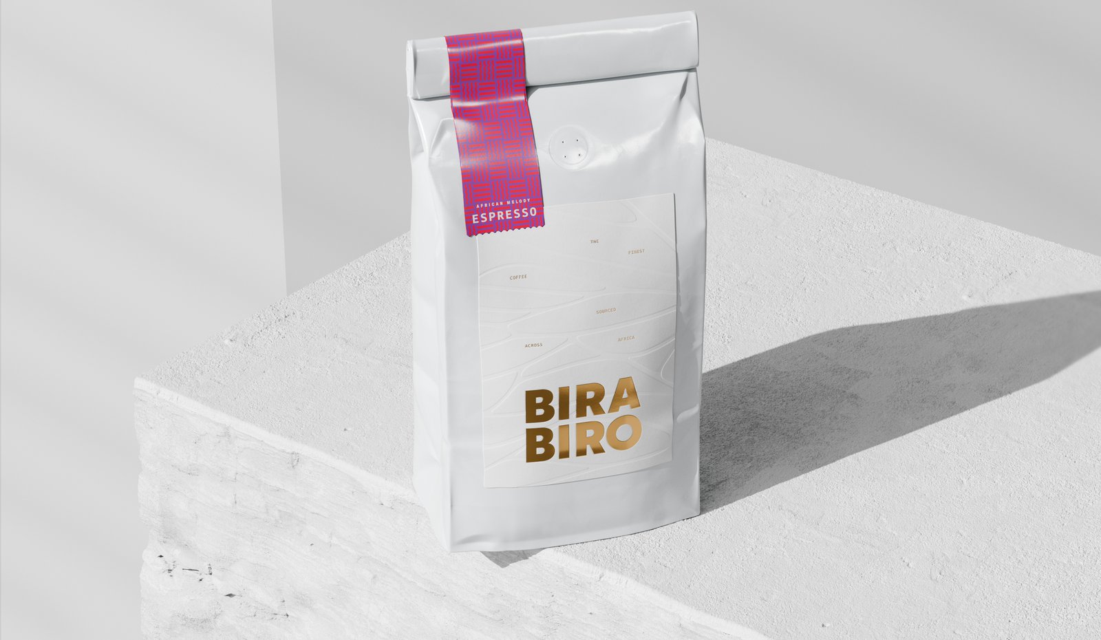
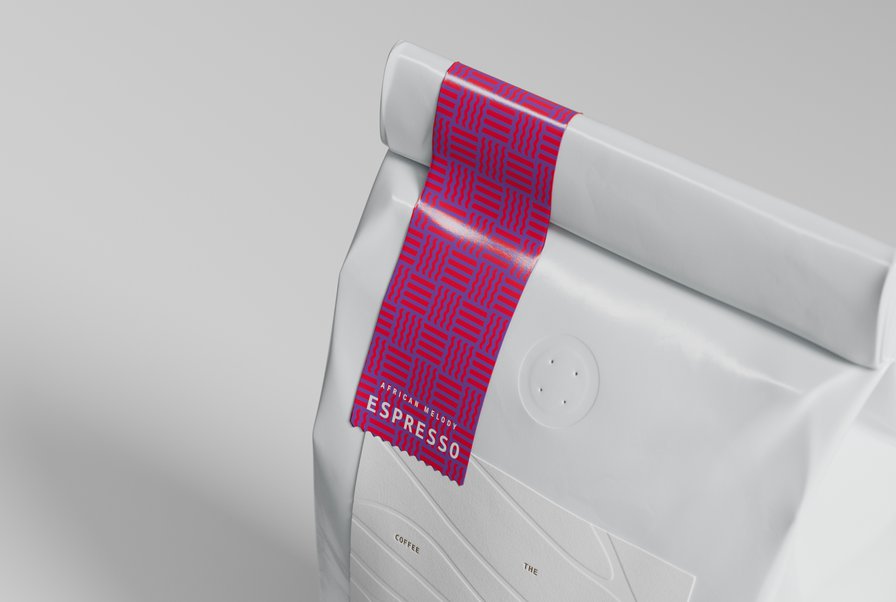
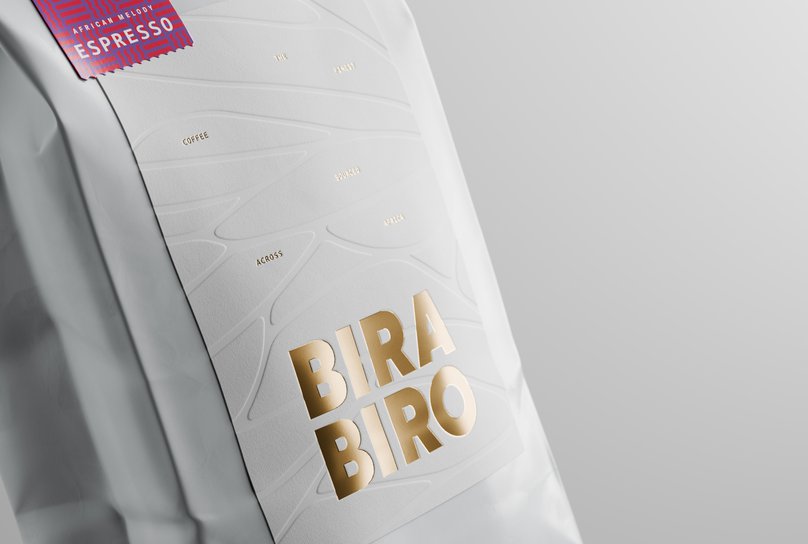
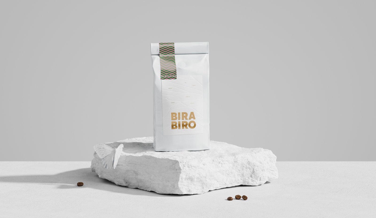
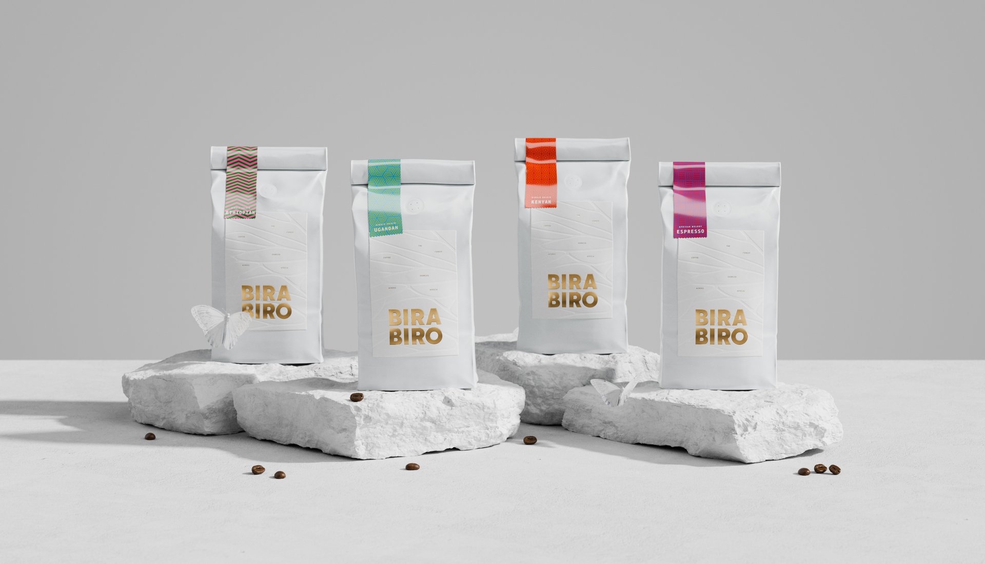
For the brand name, we took inspiration from Amharic, the official language of Ethiopia, where coffee is believed to originate from, and used their word for ‘butterfly’ - BiraBiro. The butterfly symbolises transformation and positive change, further reflecting the company's mission within communities. Using the butterfly concept as the foundation, we designed a label using a crop of the butterfly’s wings to mimic land terroirs, a graphic language often seen in coffee.
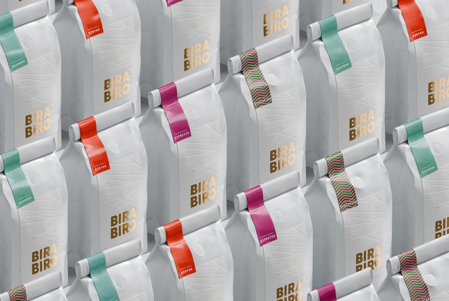
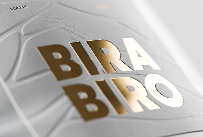
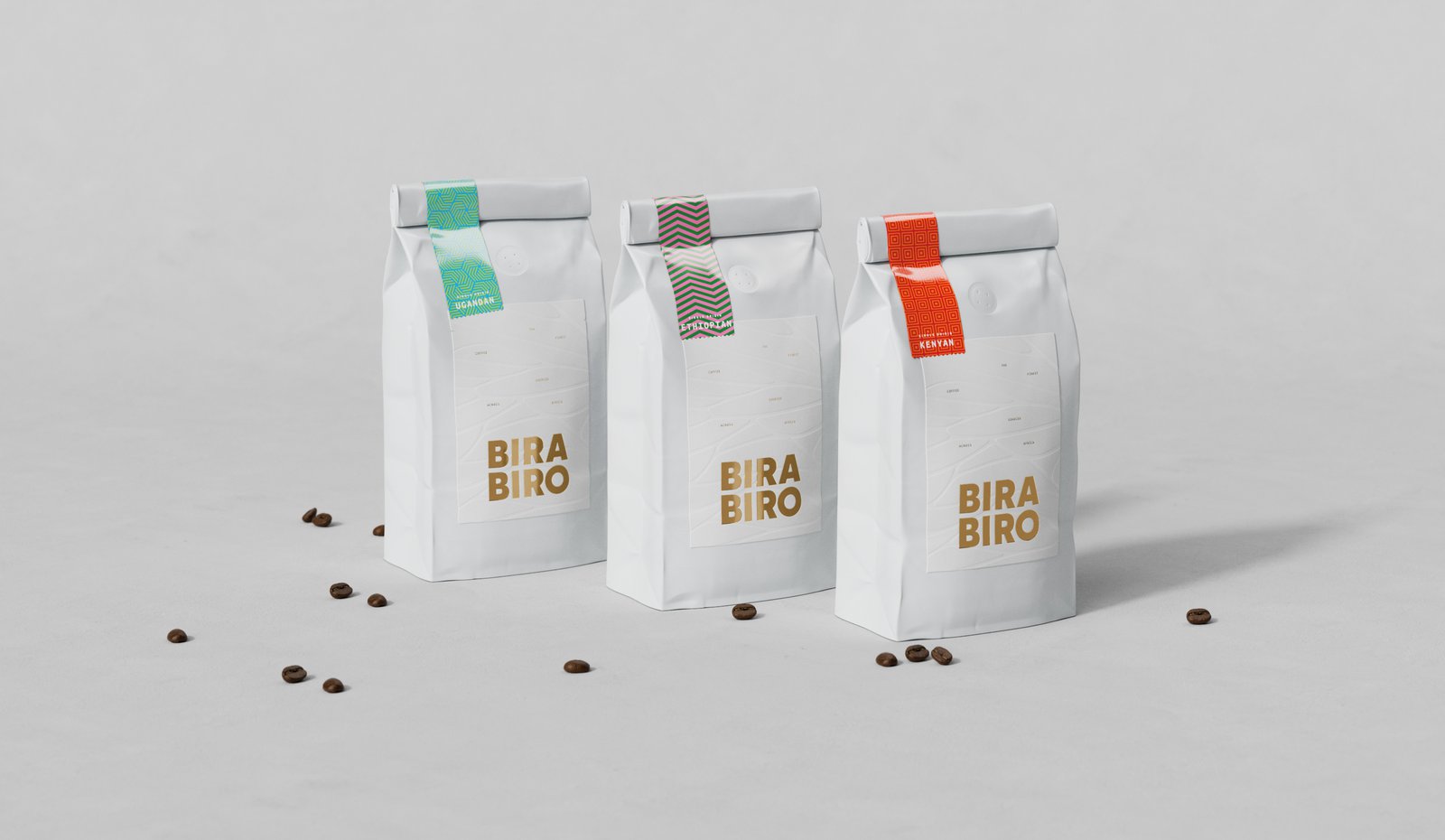
This pairs with bold African-inspired patterns inspired from traditional clothing, featuring bright geometric designs that act as cultural reference points against the stark cleanliness of the packaging. The premium positioning reflects the single-origin quality, creating packaging worthy of the exceptional coffee within.
The Impact
BiraBiro doesn’t just look good on the shelf, it does good at the source. The brand offers coffee consumers a tangible way to make a difference with their daily brew. Founder Joseph’s belief in the power of education drives the mission, and the design makes that mission impossible to ignore.
Many of us lean on coffee to kick start our day, but what if your morning coffee could do more than just wake you up? BiraBiro focuses on crafting coffee with a purpose, curating products of entirely African single origin beans and giving profits back to the coffee growing communities through funding Education and Infrastructure.
The Challenge
Our challenge was to deliver a brand identity that was premium and reflective of the craft and expertise behind BiraBiro’s single origin coffee, while also communicating the deep rooted ethical goals of the business. The identity needed to balance sophistication with soul, ensuring the brand's ethical mission was as clear and compelling as the quality of the coffee itself.
Our Approach
For the brand name, we took inspiration from Amharic, the official language of Ethiopia, where coffee is believed to originate from, and used their word for ‘butterfly’ - BiraBiro. The butterfly symbolises transformation and positive change, further reflecting the company's mission within communities. Using the butterfly concept as the foundation, we designed a label using a crop of the butterfly’s wings to mimic land terroirs, a graphic language often seen in coffee.
This pairs with bold African-inspired patterns inspired from traditional clothing, featuring bright geometric designs that act as cultural reference points against the stark cleanliness of the packaging. The premium positioning reflects the single-origin quality, creating packaging worthy of the exceptional coffee within.
The Impact
BiraBiro doesn’t just look good on the shelf, it does good at the source. The brand offers coffee consumers a tangible way to make a difference with their daily brew. Founder Joseph’s belief in the power of education drives the mission, and the design makes that mission impossible to ignore.