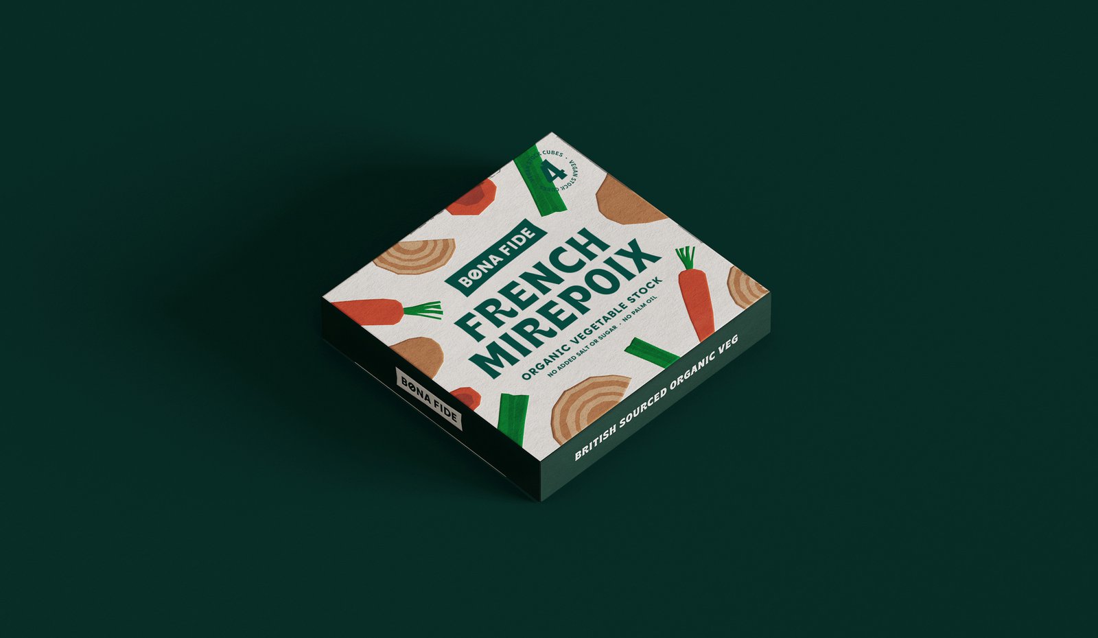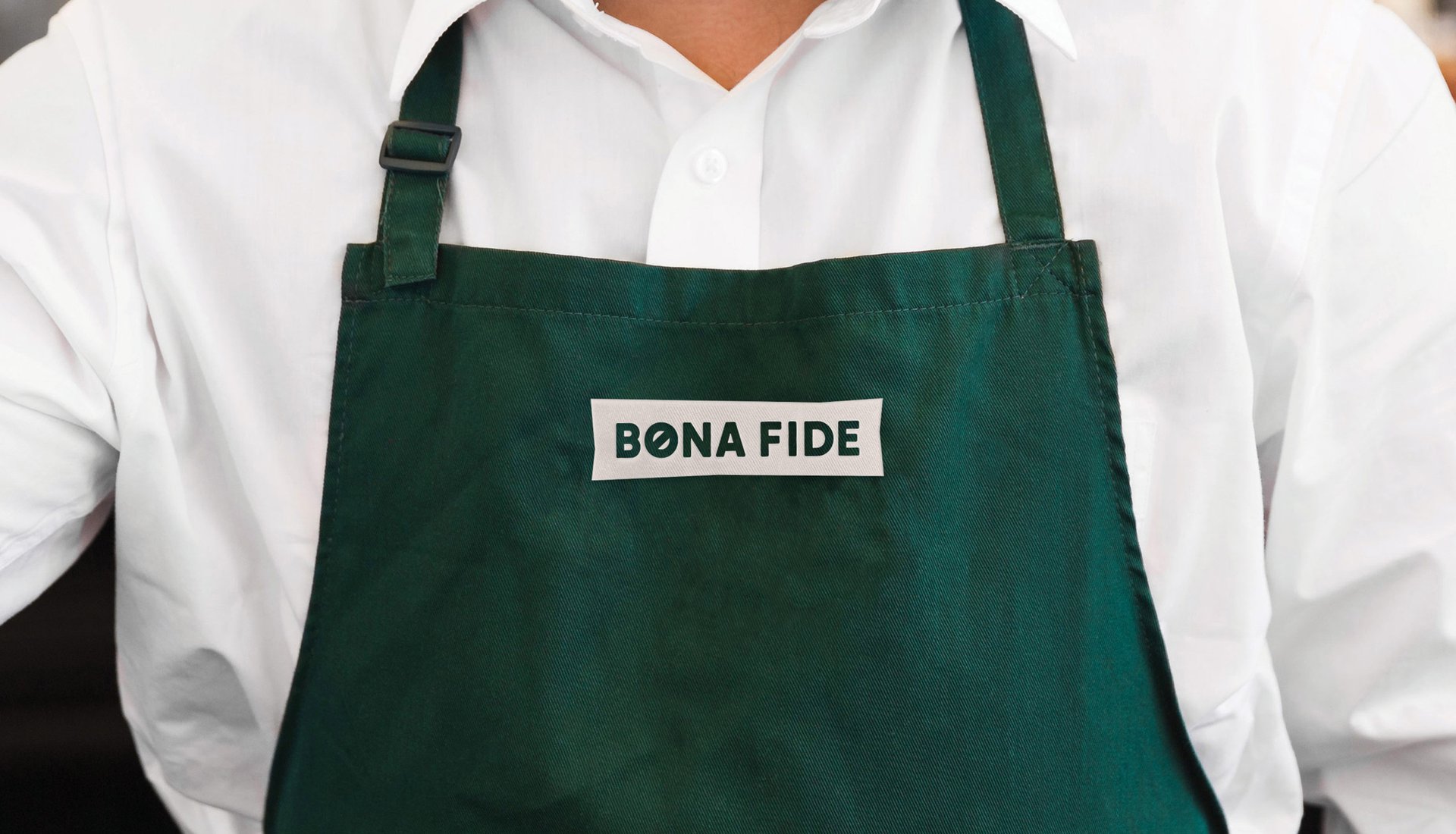
BonaFide
BonaFide
Stock cubes with nothing to hide
THE STORY
When exploring how to disrupt the stock cube market, we uncovered a problem hiding in plain sight. Behind the convenience of traditional stock cubes lurked unnecessary additives and sky-high salt levels. This sparked a concept for something different: real flavour that came from real ingredients. No compromises, no hidden nasties – just honest-to-goodness taste that home cooks could trust.
THE CHALLENGE
Stock cubes have been a kitchen staple for over a century, with consumers valuing convenience over ingredients. Our task? Design a concept that would challenge this established market by making people care about what's in their stock cubes, while creating a brand that would stand out in a category dominated by big names and familiar formats.
OUR APPROACH
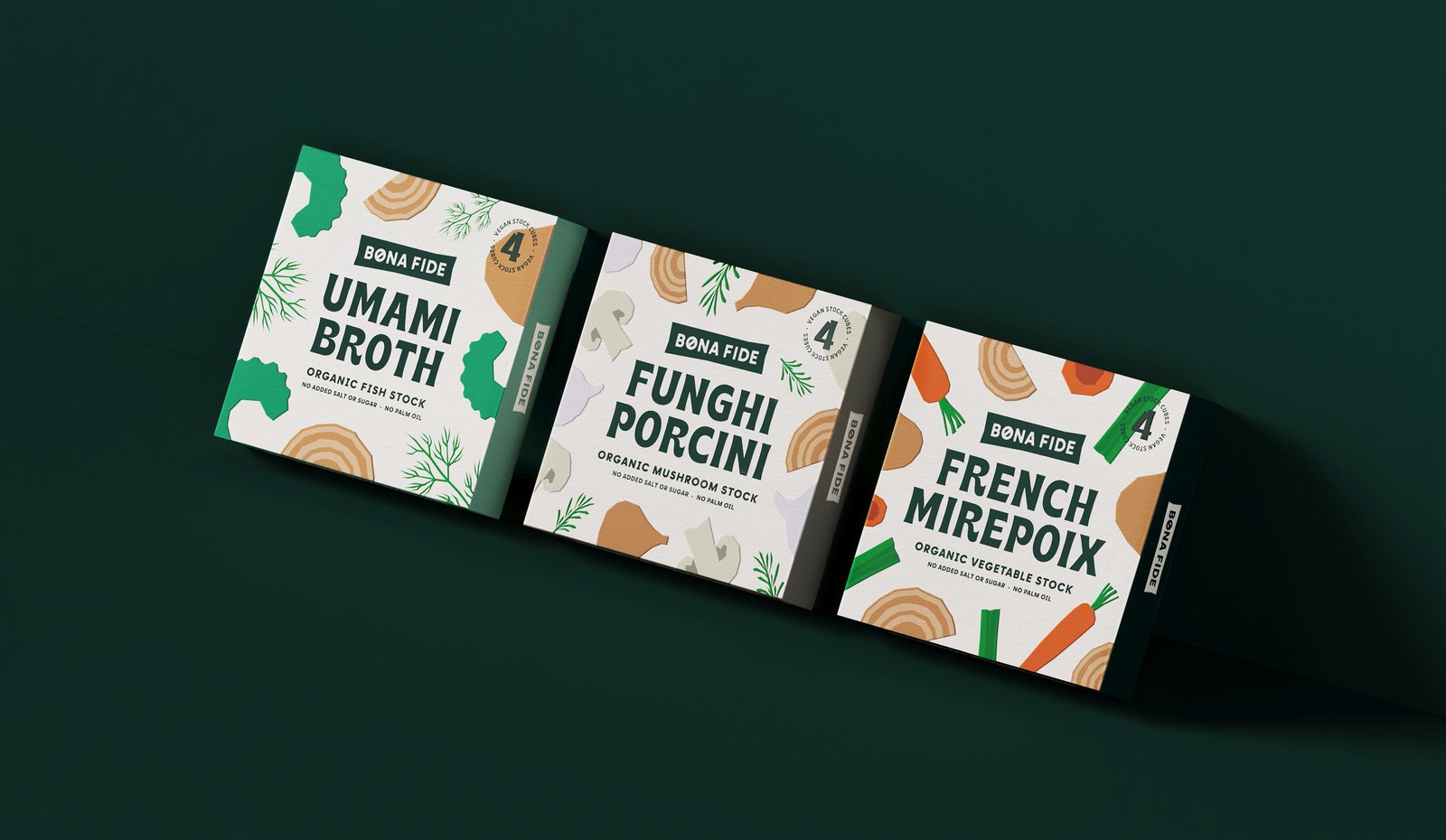
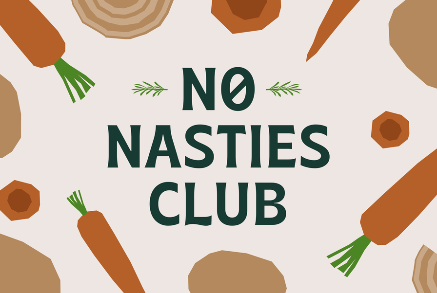
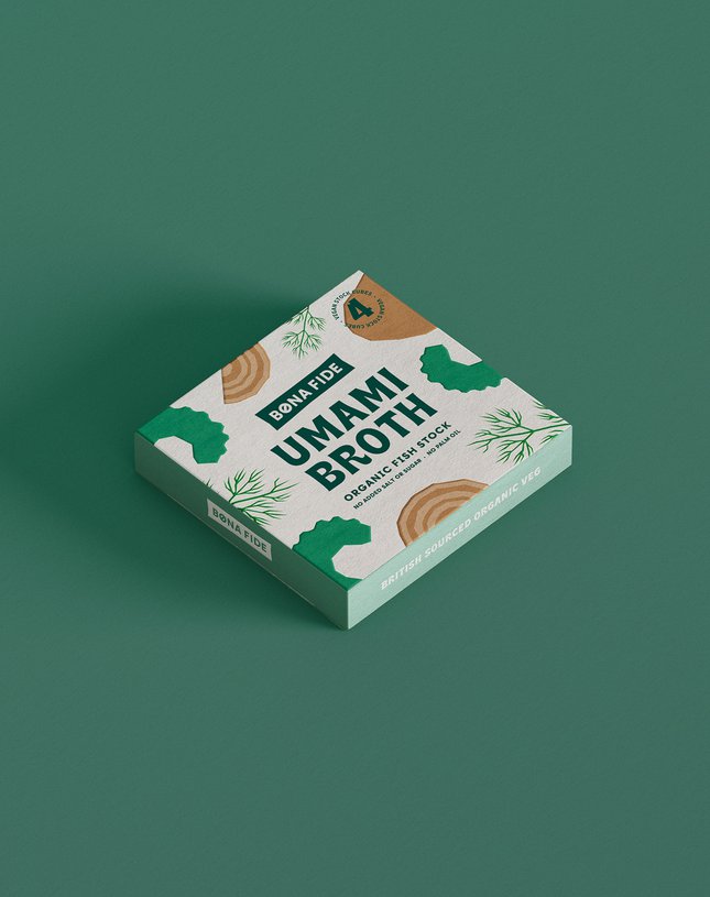
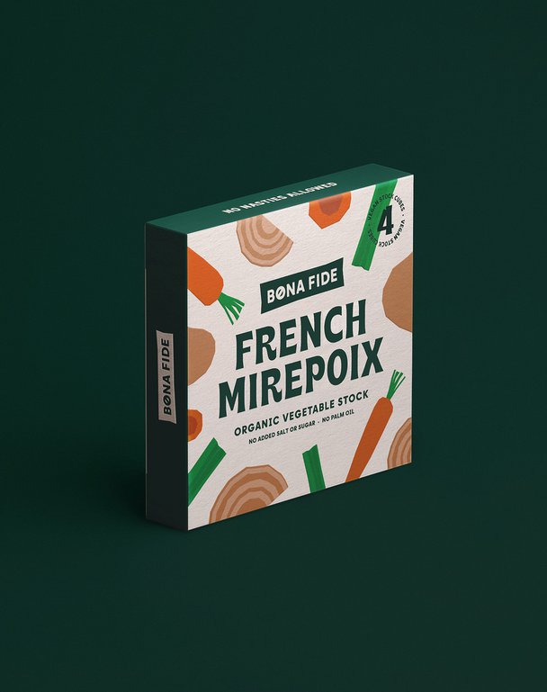
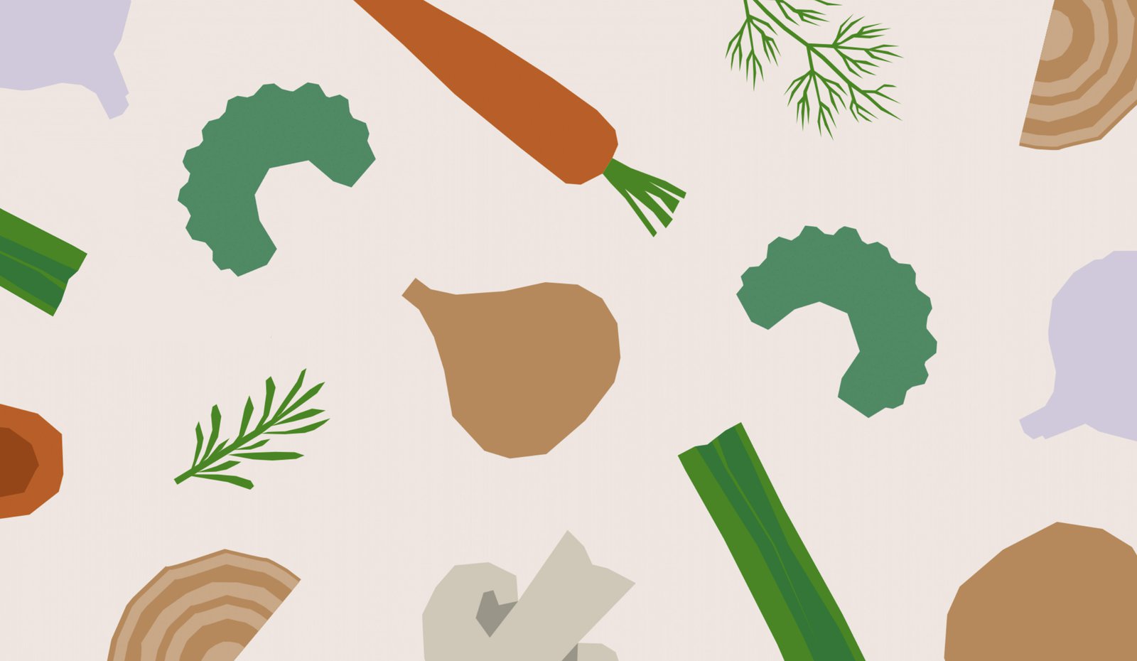
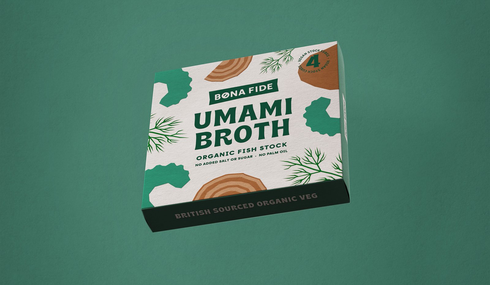
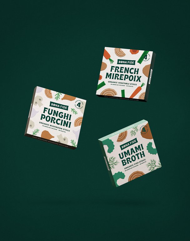
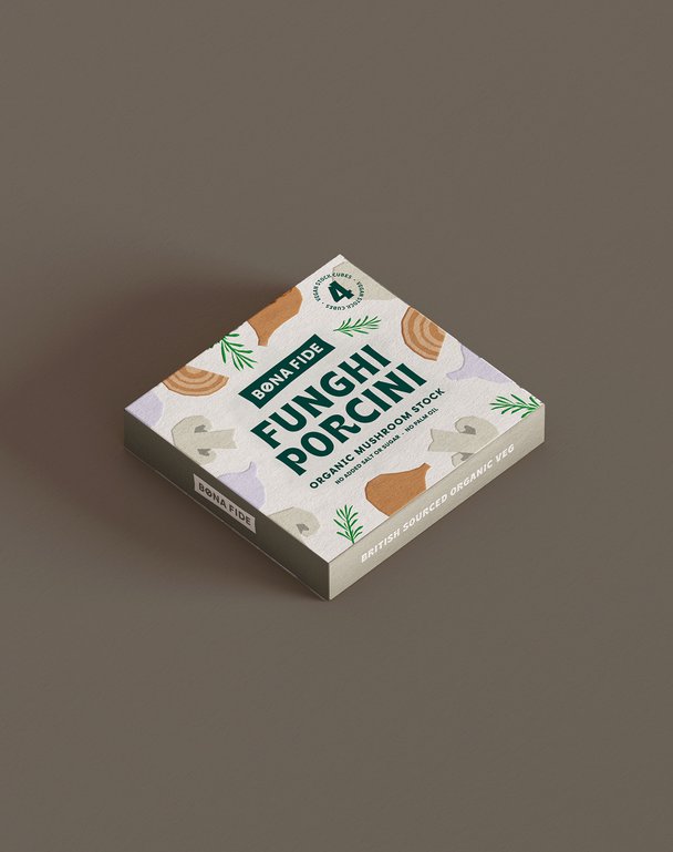
We started with the name – BonaFide – a promise of authenticity in every cube. Then we turned the category's 'dirty secret' into our hero message. While other brands hide their ingredients in small print, we celebrated ours. The logo features a bold 'no-entry' sign in the 'O', making our 'no nasties' stance unmissable. Using an illustrative paper-cut style, we created distinctive packaging that puts ingredients centre stage, with earthy tones and dark green accents that feel natural but never worthy.
THE IMPACT
The design concept shows how challenger brands could transform everyday essentials through honest, purpose-driven design. By turning transparency into a design feature, we created a blueprint for how brands might disrupt established categories – proving that even the humblest kitchen staples can be revolutionary when reimagined with purpose.
When exploring how to disrupt the stock cube market, we uncovered a problem hiding in plain sight. Behind the convenience of traditional stock cubes lurked unnecessary additives and sky-high salt levels. This sparked a concept for something different: real flavour that came from real ingredients. No compromises, no hidden nasties – just honest-to-goodness taste that home cooks could trust.
THE CHALLENGE
Stock cubes have been a kitchen staple for over a century, with consumers valuing convenience over ingredients. Our task? Design a concept that would challenge this established market by making people care about what's in their stock cubes, while creating a brand that would stand out in a category dominated by big names and familiar formats.
OUR APPROACH
We started with the name – BonaFide – a promise of authenticity in every cube. Then we turned the category's 'dirty secret' into our hero message. While other brands hide their ingredients in small print, we celebrated ours. The logo features a bold 'no-entry' sign in the 'O', making our 'no nasties' stance unmissable. Using an illustrative paper-cut style, we created distinctive packaging that puts ingredients centre stage, with earthy tones and dark green accents that feel natural but never worthy.
THE IMPACT
The design concept shows how challenger brands could transform everyday essentials through honest, purpose-driven design. By turning transparency into a design feature, we created a blueprint for how brands might disrupt established categories – proving that even the humblest kitchen staples can be revolutionary when reimagined with purpose.