Circus Gin
Circus Gin
Showstopping Spirit
The Story
What if there was a gin called Circus Gin?
That was our starting point for a little creative exercise. With the gin category packed with botanicals, craft cues and familiar premium codes, we wanted to explore something a bit different. So we turned to the spectacle, drama and nostalgia of the circus to see what a gin brand inspired by that world might look like.
The Friction
A little more personality, please.
There are plenty of beautifully designed gin bottles out there, but many follow a similar formula. Botanical illustrations, sophisticated colours and plenty of references to craft. We wanted to see how far we could take the personality of Circus Gin while still creating something that felt at home among premium spirits.
The Shift
The greatest show on the shelf.
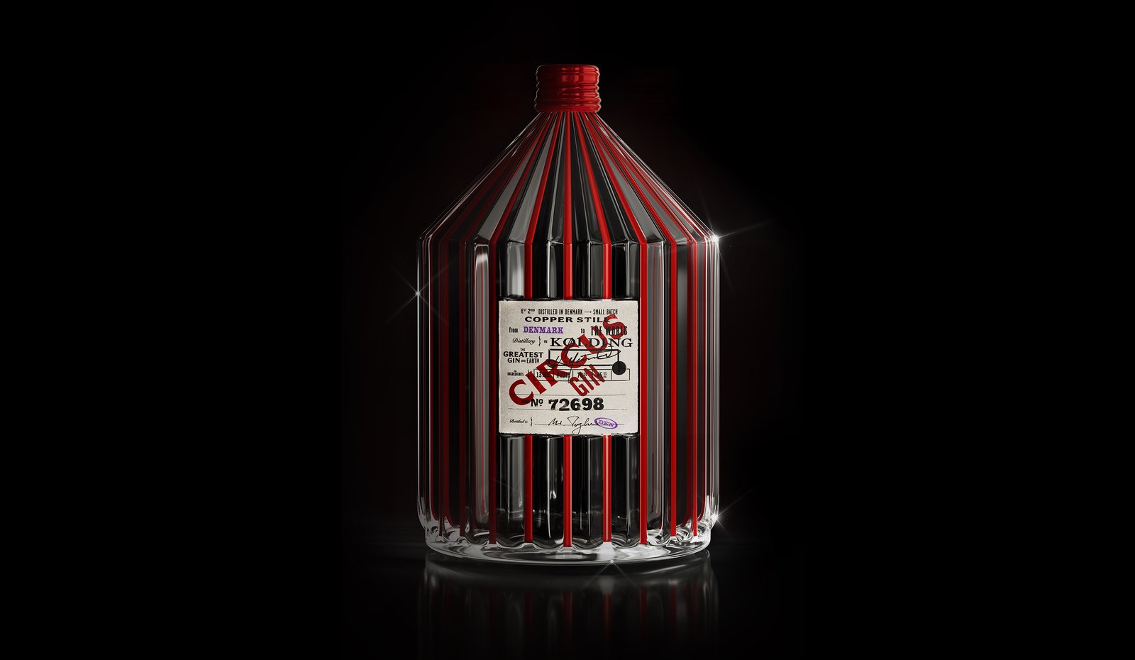
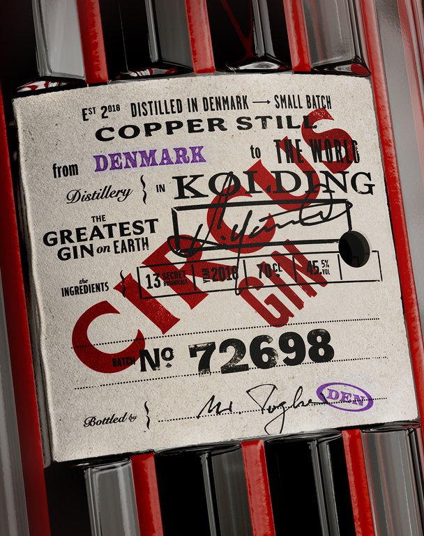
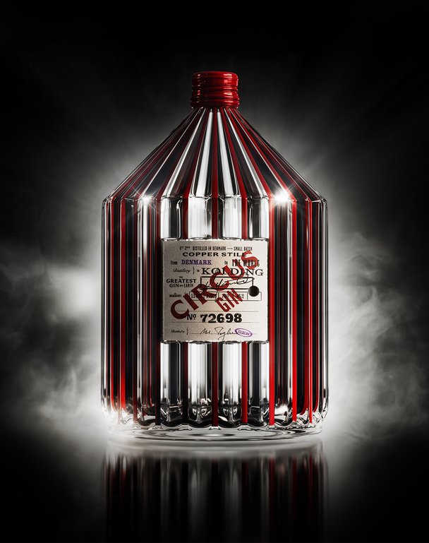
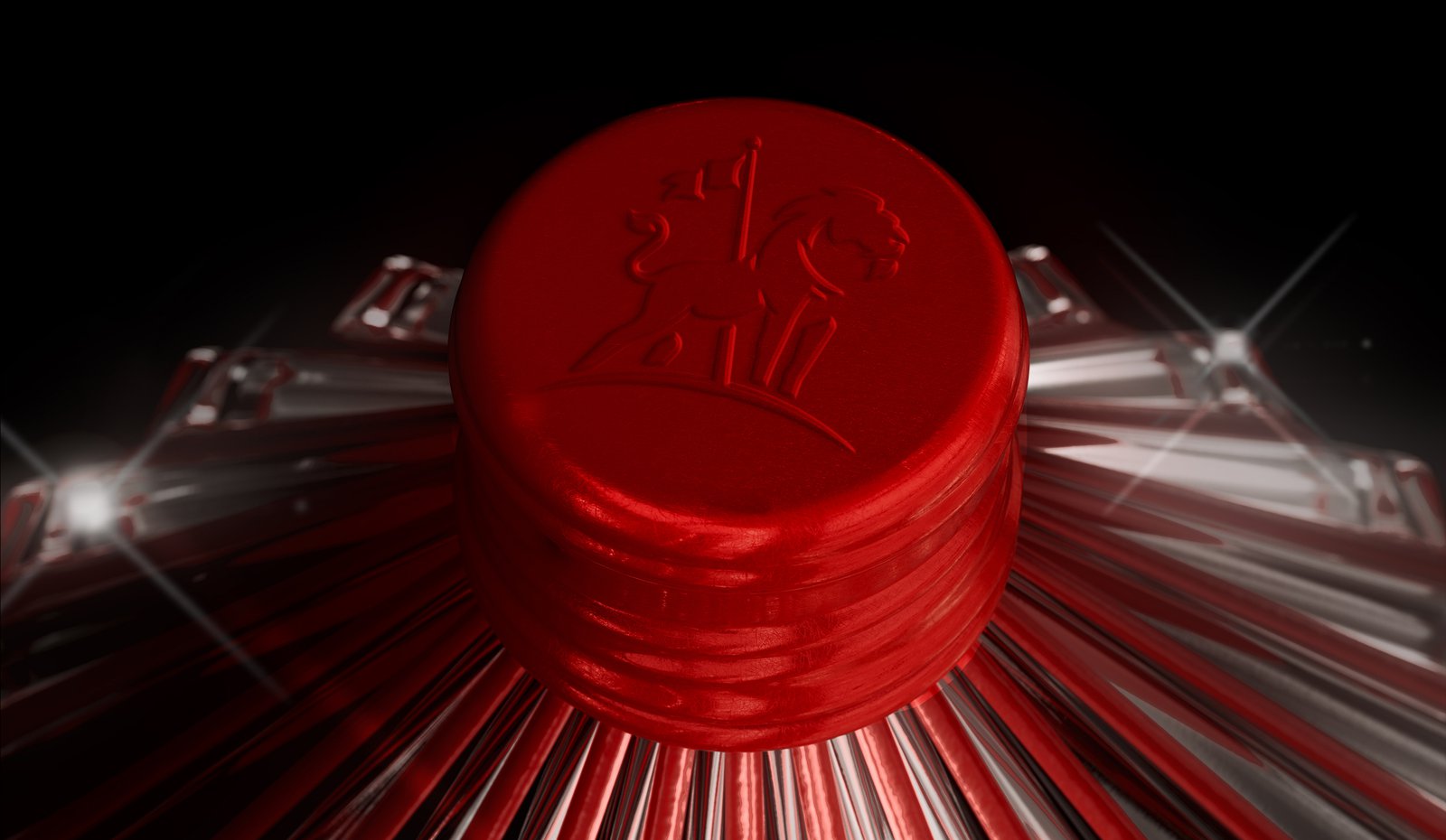
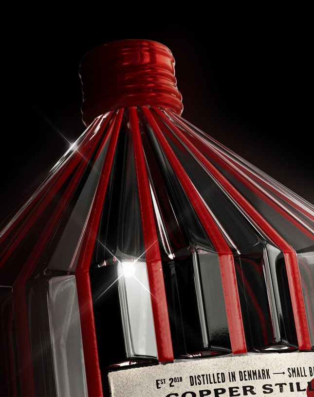
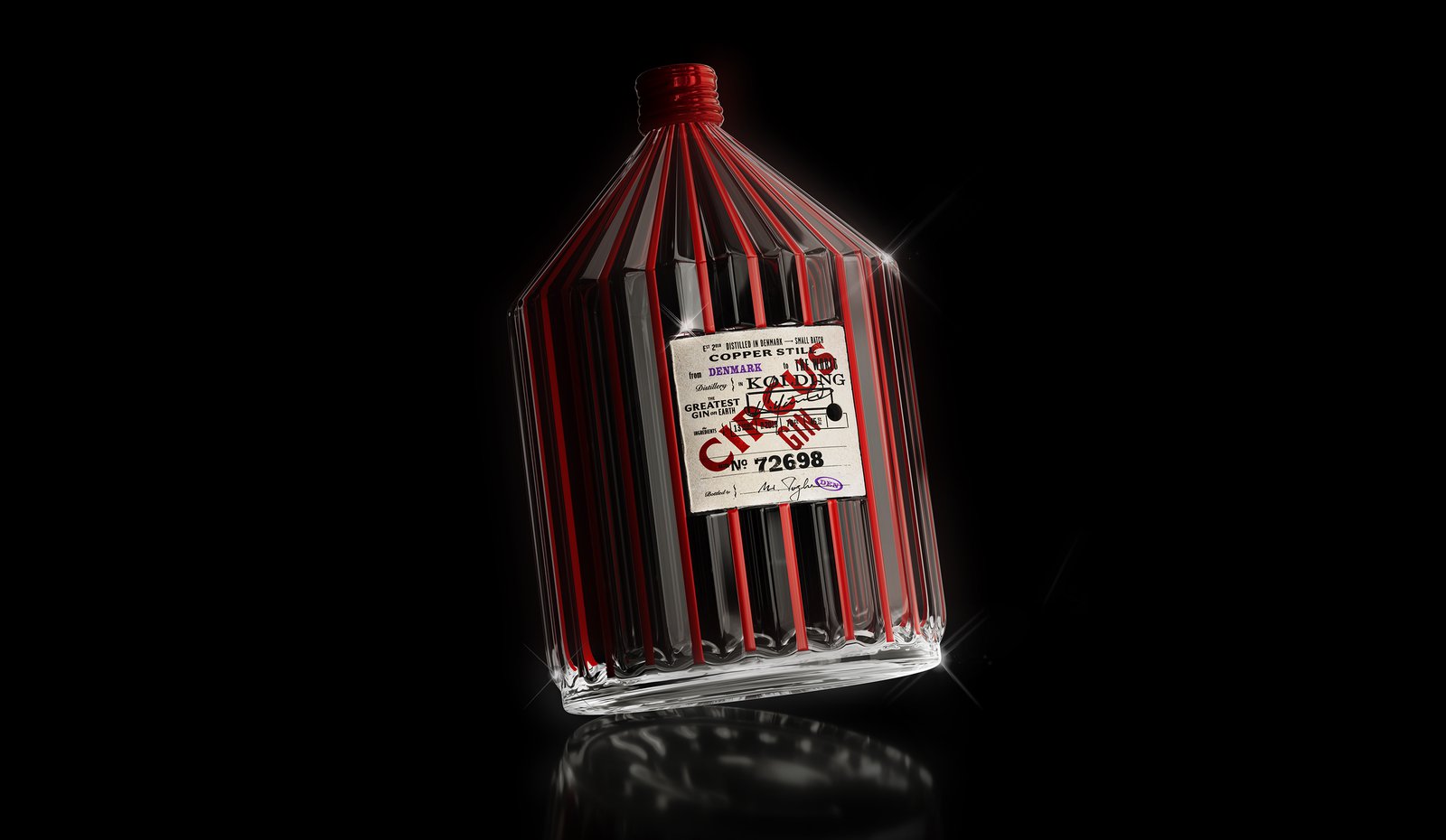
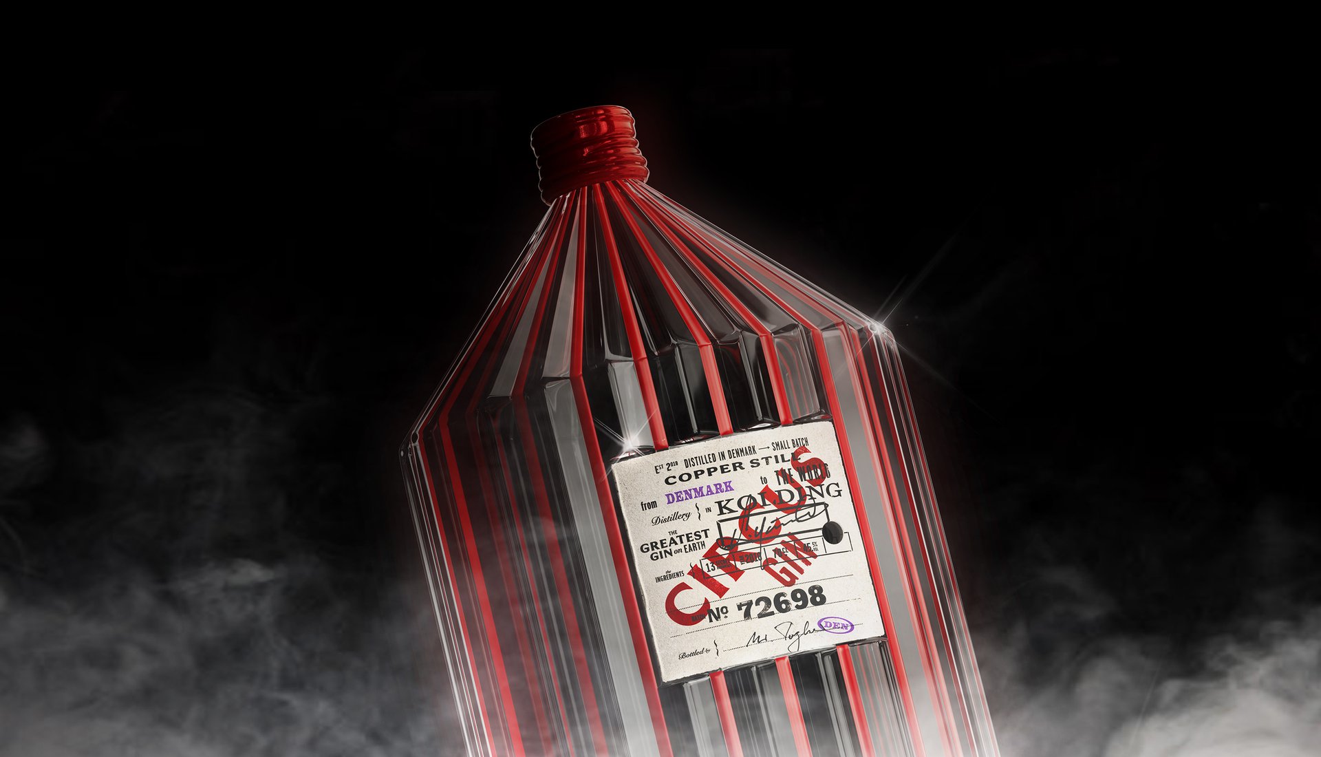
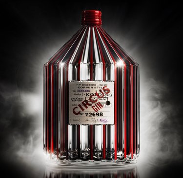
We leaned into the most recognisable part of the circus, the big top itself. The bottle takes its shape from the iconic tent, complete with bold red stripes and a dramatic peaked crown. An inset label references a vintage circus ticket, while a lion-shaped cap adds a final bit of theatre.
By making the bottle itself the centre of the idea, we created something that feels unmistakably Circus Gin, even before you've read the label.
The bottle takes its shape from a circus tent, complete with a peaked top and bold red stripes. An inset label borrows from vintage admission tickets, while a lion-shaped cap adds a little extra theatre.
It's a deliberately playful take on premium spirits, where the packaging becomes part of the entertainment. Because sometimes the best way to stand out is to stop taking the category quite so seriously.
What if there was a gin called Circus Gin?
That was our starting point for a little creative exercise. With the gin category packed with botanicals, craft cues and familiar premium codes, we wanted to explore something a bit different. So we turned to the spectacle, drama and nostalgia of the circus to see what a gin brand inspired by that world might look like.
The Friction
A little more personality, please.
There are plenty of beautifully designed gin bottles out there, but many follow a similar formula. Botanical illustrations, sophisticated colours and plenty of references to craft. We wanted to see how far we could take the personality of Circus Gin while still creating something that felt at home among premium spirits.
The Shift
The greatest show on the shelf.
We leaned into the most recognisable part of the circus, the big top itself. The bottle takes its shape from the iconic tent, complete with bold red stripes and a dramatic peaked crown. An inset label references a vintage circus ticket, while a lion-shaped cap adds a final bit of theatre.
By making the bottle itself the centre of the idea, we created something that feels unmistakably Circus Gin, even before you've read the label.
The bottle takes its shape from a circus tent, complete with a peaked top and bold red stripes. An inset label borrows from vintage admission tickets, while a lion-shaped cap adds a little extra theatre.
It's a deliberately playful take on premium spirits, where the packaging becomes part of the entertainment. Because sometimes the best way to stand out is to stop taking the category quite so seriously.