Clara
Clara
No more BS in vitamins
THE STORY
Let's be honest – women's vitamins are a mess of mixed messages and miracle promises. Every other month there's a new must-have supplement that claims to solve everything (spoiler: it probably doesn't). Clara came to us with a refreshingly different approach: actual science, clearly explained, with zero fluff. They wanted to create multivitamins that tell women exactly what they're getting and why it matters at different life stages. No fairy dust, just facts.
THE CHALLENGE
How do you make science sexy? Okay, maybe not sexy, but at least engaging enough that people actually want to understand what's in their vitamins? We needed to create a brand that would cut through all the wellness waffle, turn real nutritional science into something visually interesting, and help women make informed choices about their health. All while looking good enough to earn pride of place in their bathroom cabinet.
OUR APPROACH
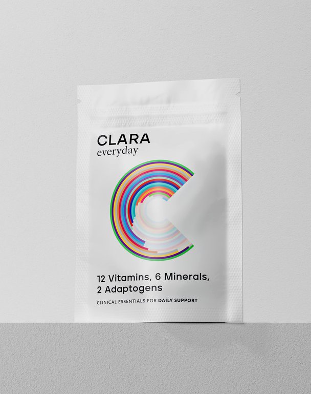
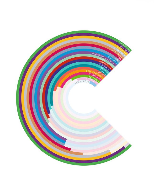
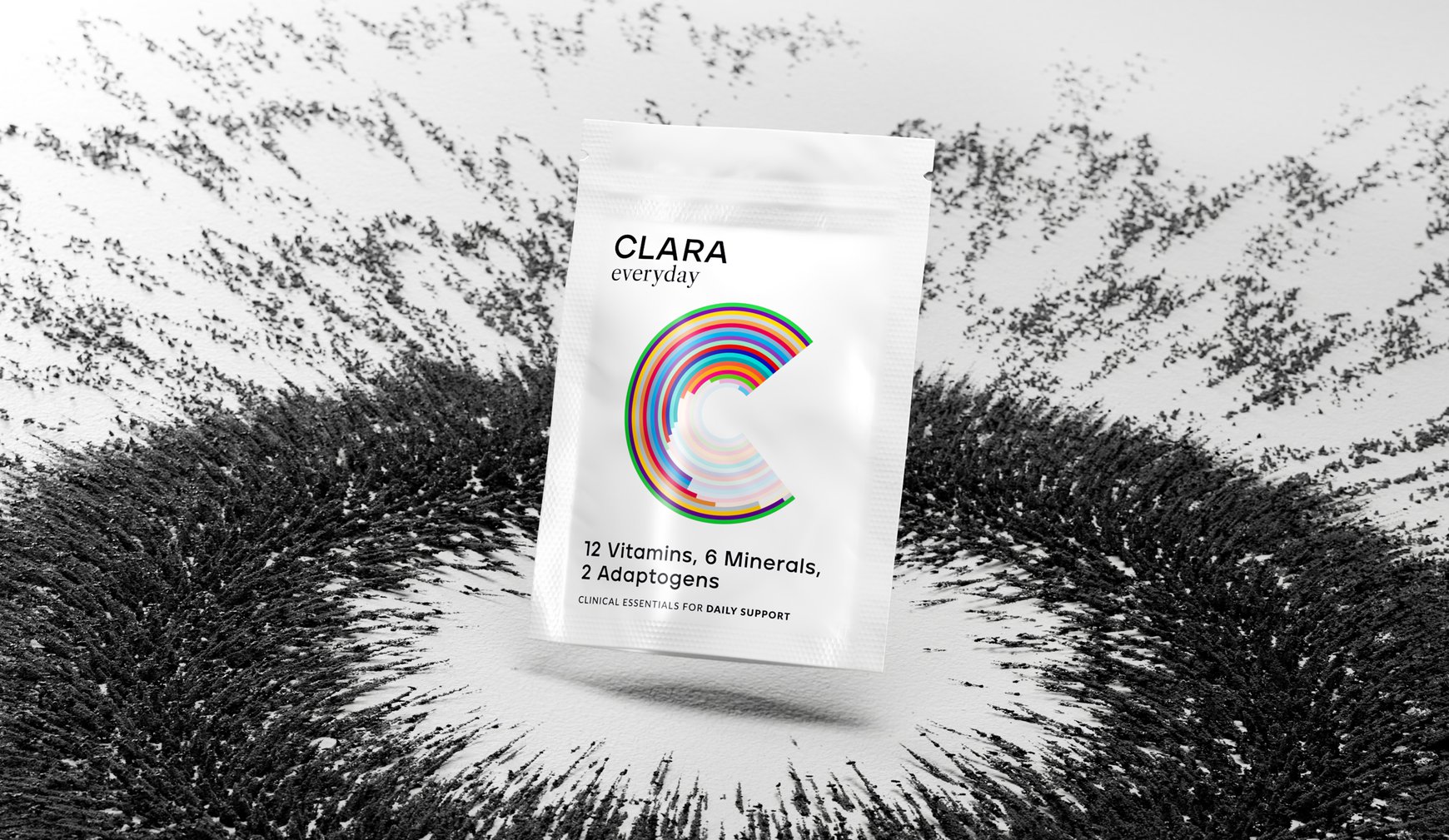
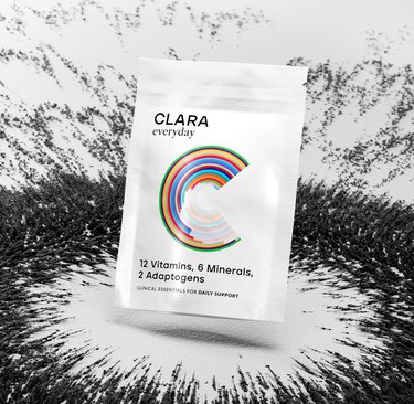
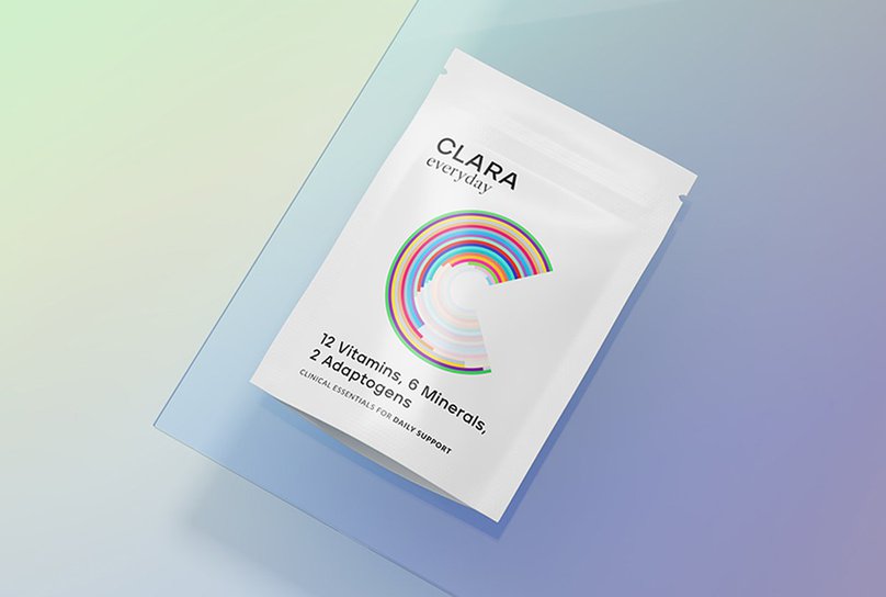
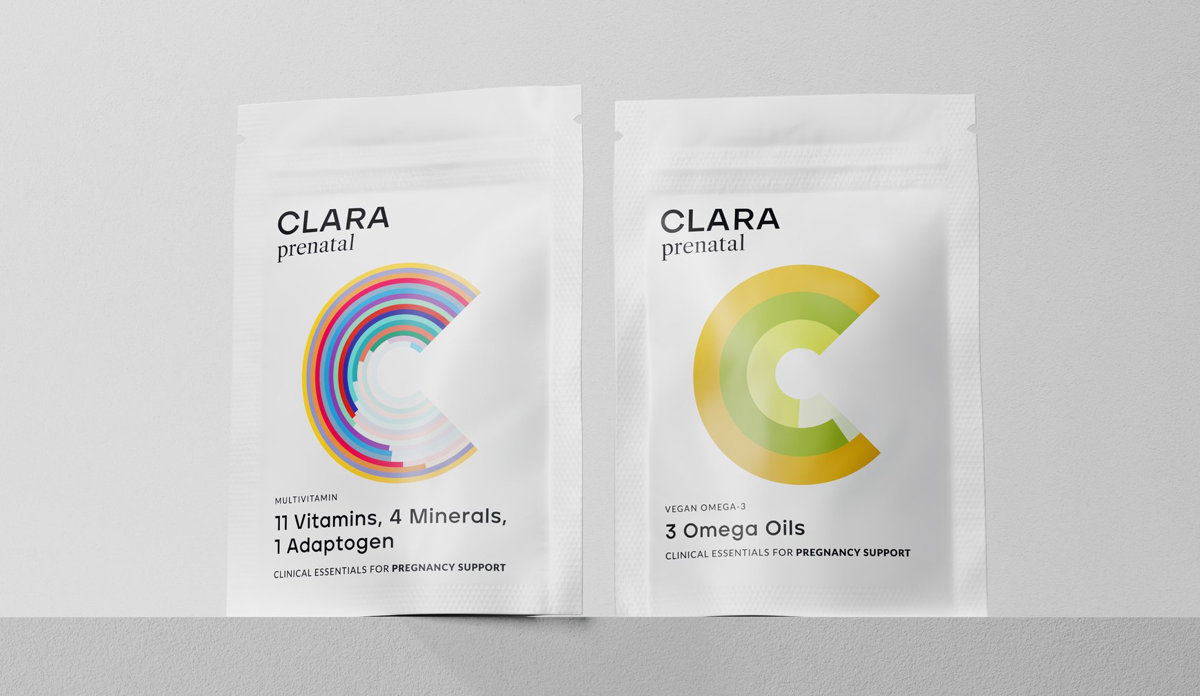
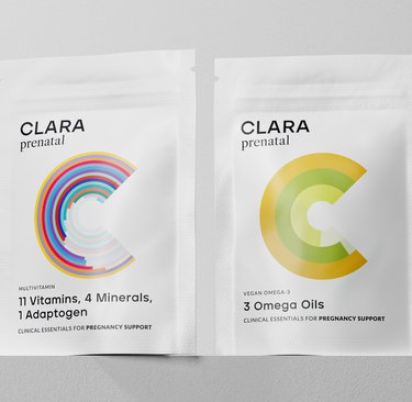
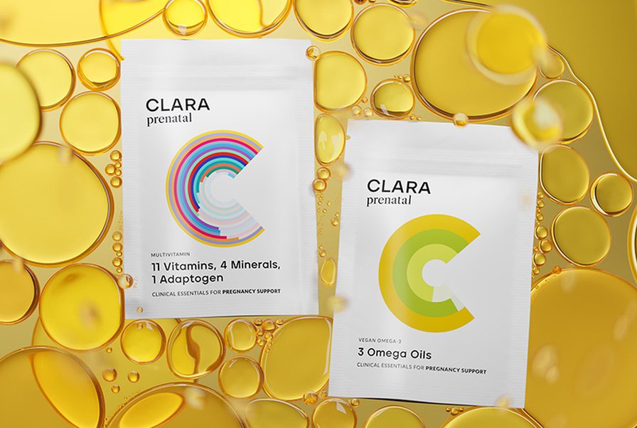
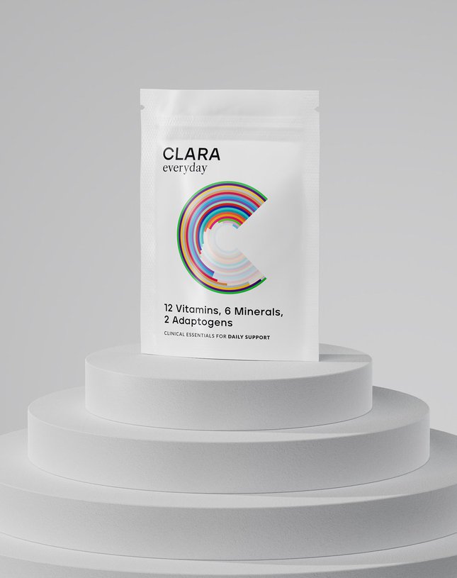
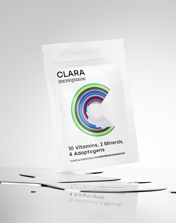
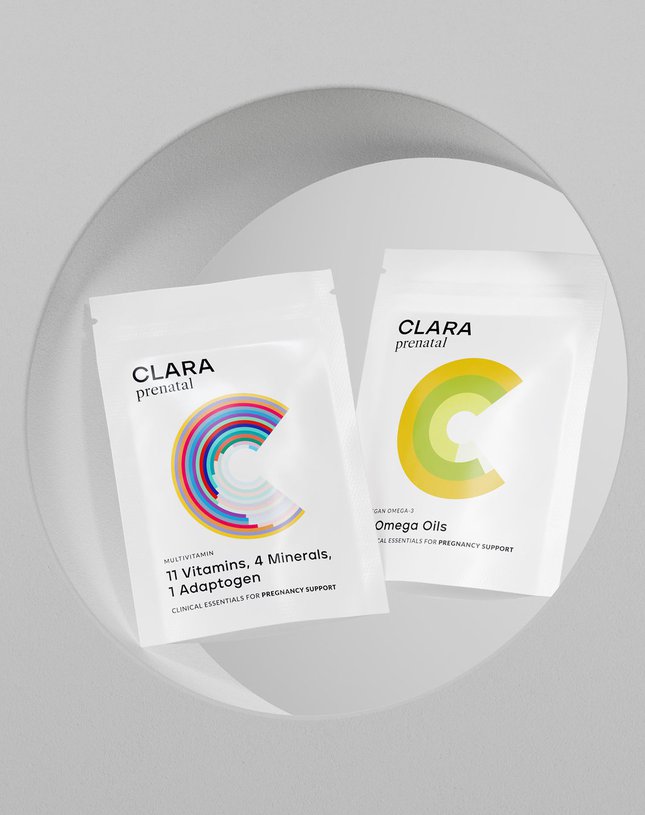
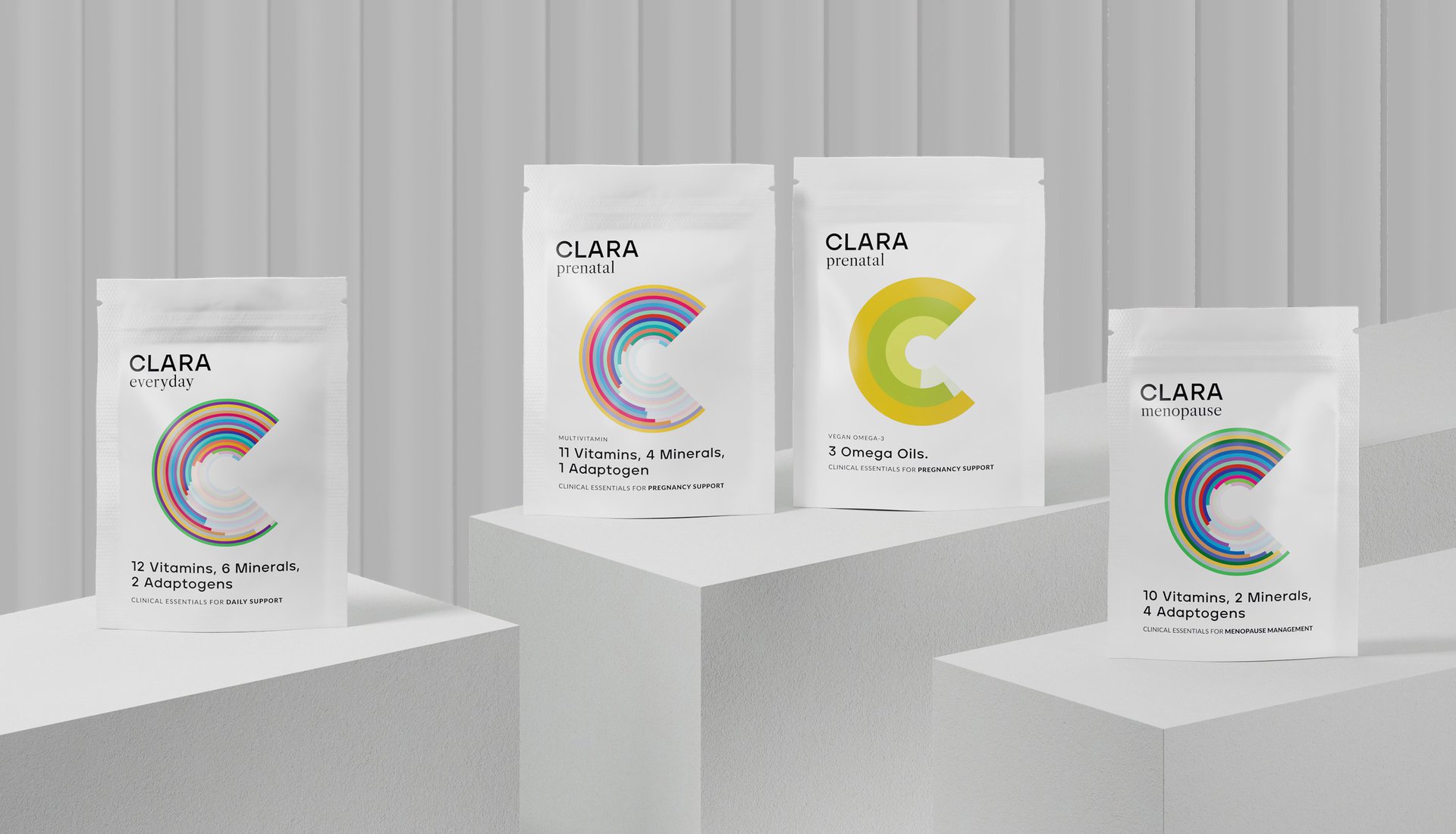
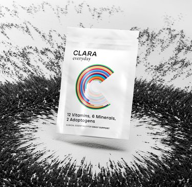
We decided to make information the hero, but make it look damn good doing it. Each multivitamin got its own 'C' infographic – think scientific data meets modern art. This wasn't just about making pretty patterns; it was about showing exactly what's inside each vitamin in a way that actually makes sense.
We created a colour-coding system that works like a helpful friend guiding you to the right choice, while an informative postcard insert gives you the deeper details (if you're into that kind of thing). Every design decision was about stripping away the confusion and building confidence, because nobody needs another mysterious wellness product in their life.
Want to geek out on the science? The website's got all the nitty-gritty details. Want to just know you're taking the right stuff? The packaging tells you what you need to know at a glance.
THE IMPACT
Clara now stands as proof that you don't need to dumb down science or dress it up in pseudo-wellness speak – you just need to make it clear and accessible. By turning transparency into something visually exciting, we've helped create a brand that treats women like the intelligent beings they are. Because making informed choices about your health shouldn't feel like solving a puzzle.
Let's be honest – women's vitamins are a mess of mixed messages and miracle promises. Every other month there's a new must-have supplement that claims to solve everything (spoiler: it probably doesn't). Clara came to us with a refreshingly different approach: actual science, clearly explained, with zero fluff. They wanted to create multivitamins that tell women exactly what they're getting and why it matters at different life stages. No fairy dust, just facts.
THE CHALLENGE
How do you make science sexy? Okay, maybe not sexy, but at least engaging enough that people actually want to understand what's in their vitamins? We needed to create a brand that would cut through all the wellness waffle, turn real nutritional science into something visually interesting, and help women make informed choices about their health. All while looking good enough to earn pride of place in their bathroom cabinet.
OUR APPROACH
We decided to make information the hero, but make it look damn good doing it. Each multivitamin got its own 'C' infographic – think scientific data meets modern art. This wasn't just about making pretty patterns; it was about showing exactly what's inside each vitamin in a way that actually makes sense.
We created a colour-coding system that works like a helpful friend guiding you to the right choice, while an informative postcard insert gives you the deeper details (if you're into that kind of thing). Every design decision was about stripping away the confusion and building confidence, because nobody needs another mysterious wellness product in their life.
Want to geek out on the science? The website's got all the nitty-gritty details. Want to just know you're taking the right stuff? The packaging tells you what you need to know at a glance.
THE IMPACT
Clara now stands as proof that you don't need to dumb down science or dress it up in pseudo-wellness speak – you just need to make it clear and accessible. By turning transparency into something visually exciting, we've helped create a brand that treats women like the intelligent beings they are. Because making informed choices about your health shouldn't feel like solving a puzzle.