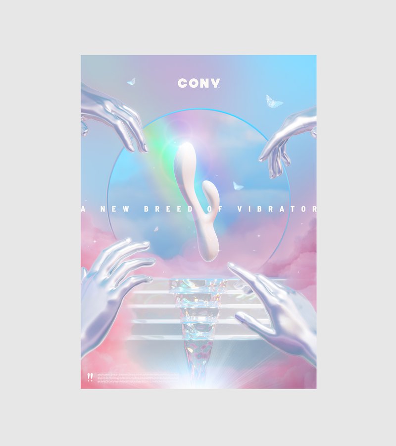
Cony
Cony
A new breed of vibrators
THE STORY
Let's talk about sex, baby. Actually, let's talk about why we're not talking about sex – especially female pleasure. In a world full of discreet packaging and shameful whispers, we explored how design could help flip the script on female sexuality. This concept imagined a brand that would celebrate pleasure instead of hiding it, making the conversation as natural as the act itself.
THE CHALLENGE
How do you design for pleasure without falling into cliché territory? Most brands in this space either go full sin-and-seduction or hide behind coy euphemisms. We wanted to explore something different: what if female pleasure wasn't taboo or titillating, but simply... heavenly? Our concept needed to be bold enough to start conversations but sophisticated enough to sit proudly on a bedside table."
OUR APPROACH
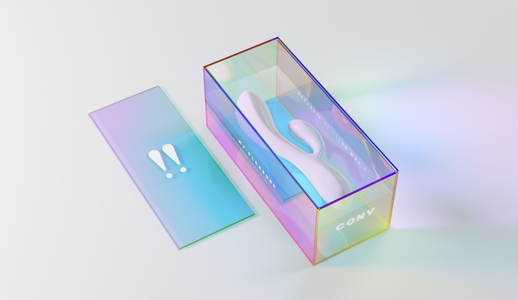
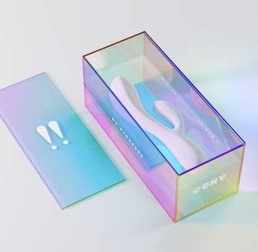
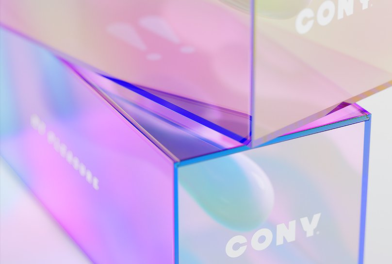
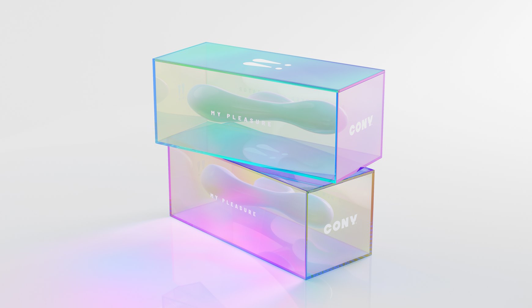
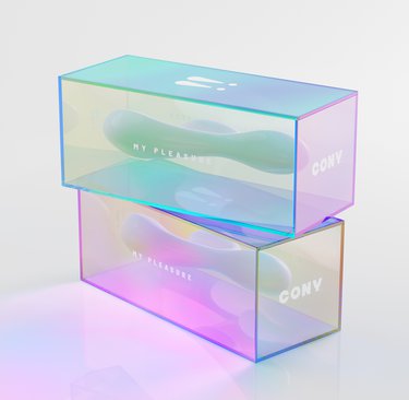
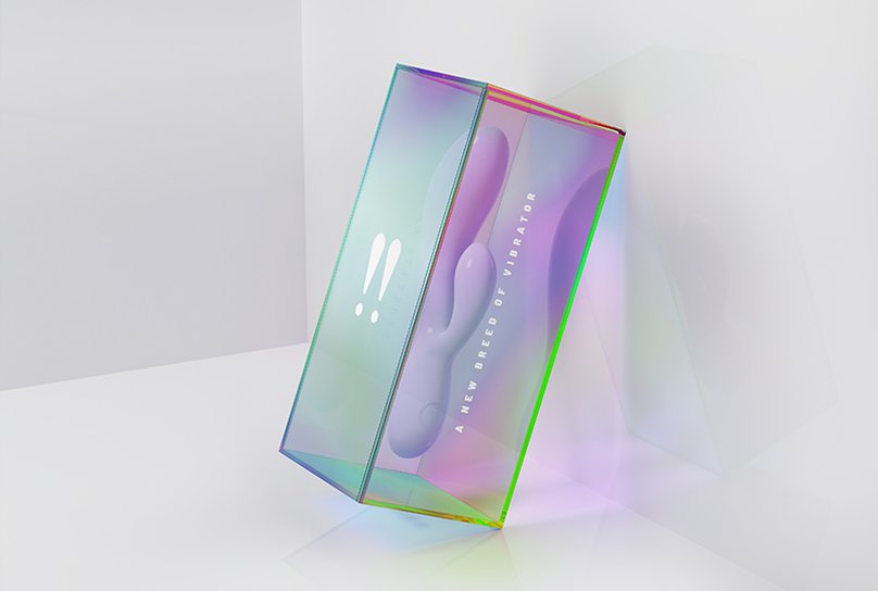
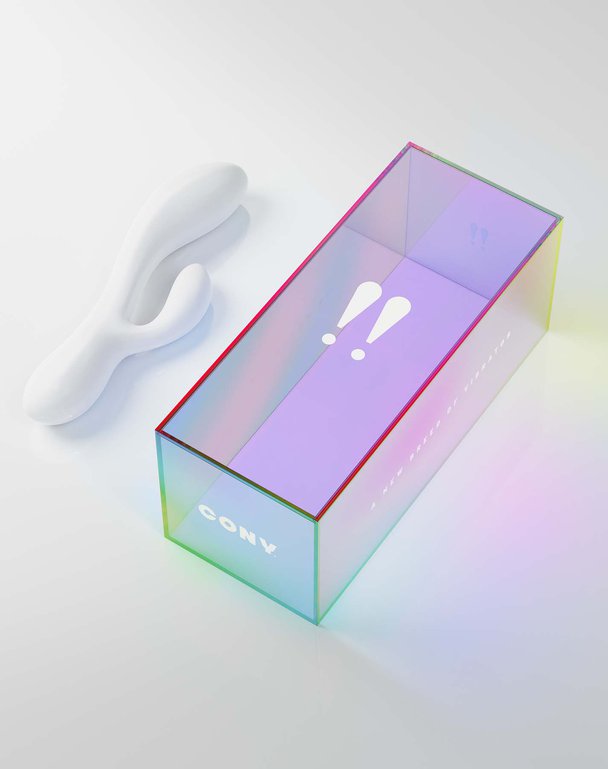
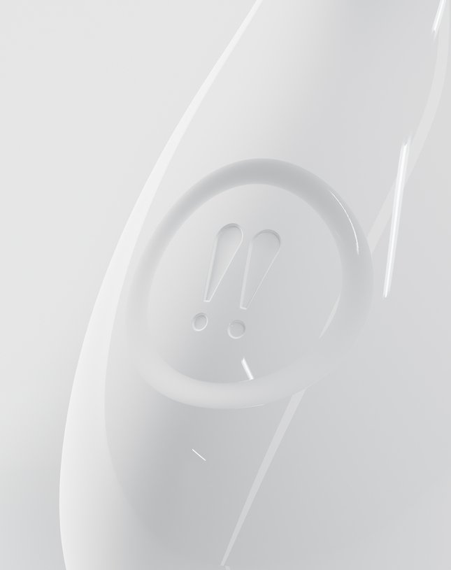
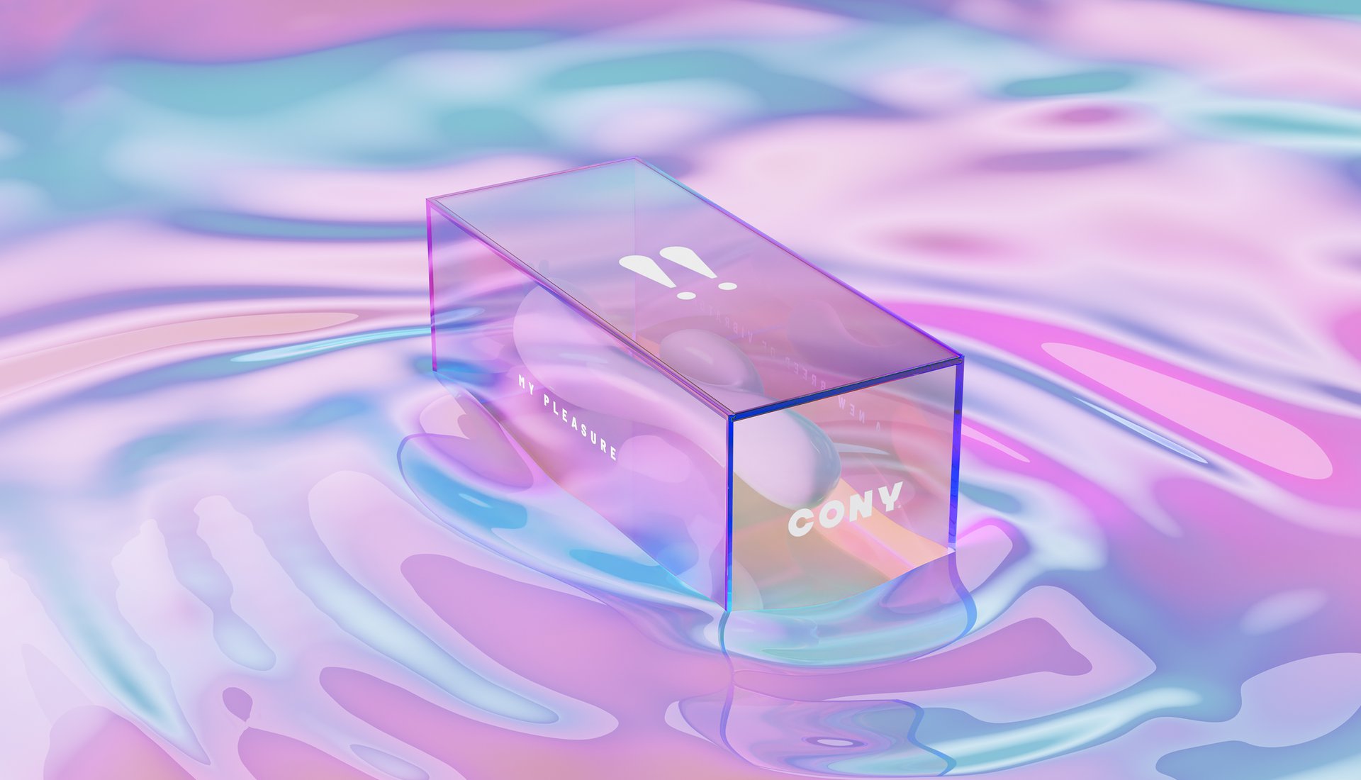
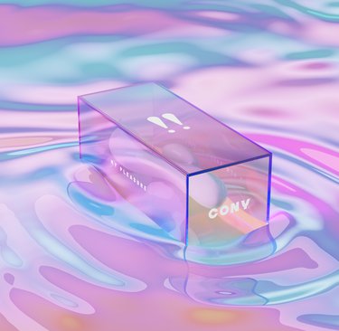
First came the name, a middle english word for rabbit – Cony – and with it, a playful visual twist. We created a logo using two exclamation marks that, on closer inspection, reveal a rabbit's eyes and ears (if you know, you know). Instead of the usual black boxes and peepholes that scream 'hide me!', we went transparent. Because pleasure shouldn't need a permission slip.
The whole design approach takes a more celestial route, treating pleasure as something divine rather than deviant. It's about elevating the experience from something whispered about to something celebrated. No shame, no shadows – just pure joy.
THE IMPACT
This design concept shows how breaking taboos can be beautiful. By reimagining pleasure products through a lens of celebration rather than shame, we've explored how design could help change not just how these products look, but how we talk about female sexuality itself. Because good design isn't just about aesthetics – sometimes it's about starting the conversations we need to have.
Let's talk about sex, baby. Actually, let's talk about why we're not talking about sex – especially female pleasure. In a world full of discreet packaging and shameful whispers, we explored how design could help flip the script on female sexuality. This concept imagined a brand that would celebrate pleasure instead of hiding it, making the conversation as natural as the act itself.
THE CHALLENGE
How do you design for pleasure without falling into cliché territory? Most brands in this space either go full sin-and-seduction or hide behind coy euphemisms. We wanted to explore something different: what if female pleasure wasn't taboo or titillating, but simply... heavenly? Our concept needed to be bold enough to start conversations but sophisticated enough to sit proudly on a bedside table."
OUR APPROACH
First came the name, a middle english word for rabbit – Cony – and with it, a playful visual twist. We created a logo using two exclamation marks that, on closer inspection, reveal a rabbit's eyes and ears (if you know, you know). Instead of the usual black boxes and peepholes that scream 'hide me!', we went transparent. Because pleasure shouldn't need a permission slip.
The whole design approach takes a more celestial route, treating pleasure as something divine rather than deviant. It's about elevating the experience from something whispered about to something celebrated. No shame, no shadows – just pure joy.
THE IMPACT
This design concept shows how breaking taboos can be beautiful. By reimagining pleasure products through a lens of celebration rather than shame, we've explored how design could help change not just how these products look, but how we talk about female sexuality itself. Because good design isn't just about aesthetics – sometimes it's about starting the conversations we need to have.