Cool Beans
Cool Beans
Making coffee too cool for school
THE STORY
Ever noticed that weird gap between energy drink rebels and coffee shop regulars? Cool Beans did. They came to us with a mission: create an iced coffee that would bridge that caffeine canyon – something for people who've outgrown the energy drink phase but aren't ready for their Costa loyalty card. We explored how to make coffee cool again, literally and figuratively."
THE CHALLENGE
How do you design something that sits between Red Bull energy and coffee shop zen? Our concept needed to create a brand that would feel fresh in a saturated market, speak to the in-betweeners, and not take itself too seriously. Plus, make coffee feel cool without trying too hard (which, as we all know, is the least cool thing you can do).
OUR APPROACH
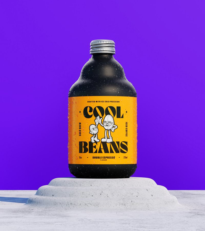
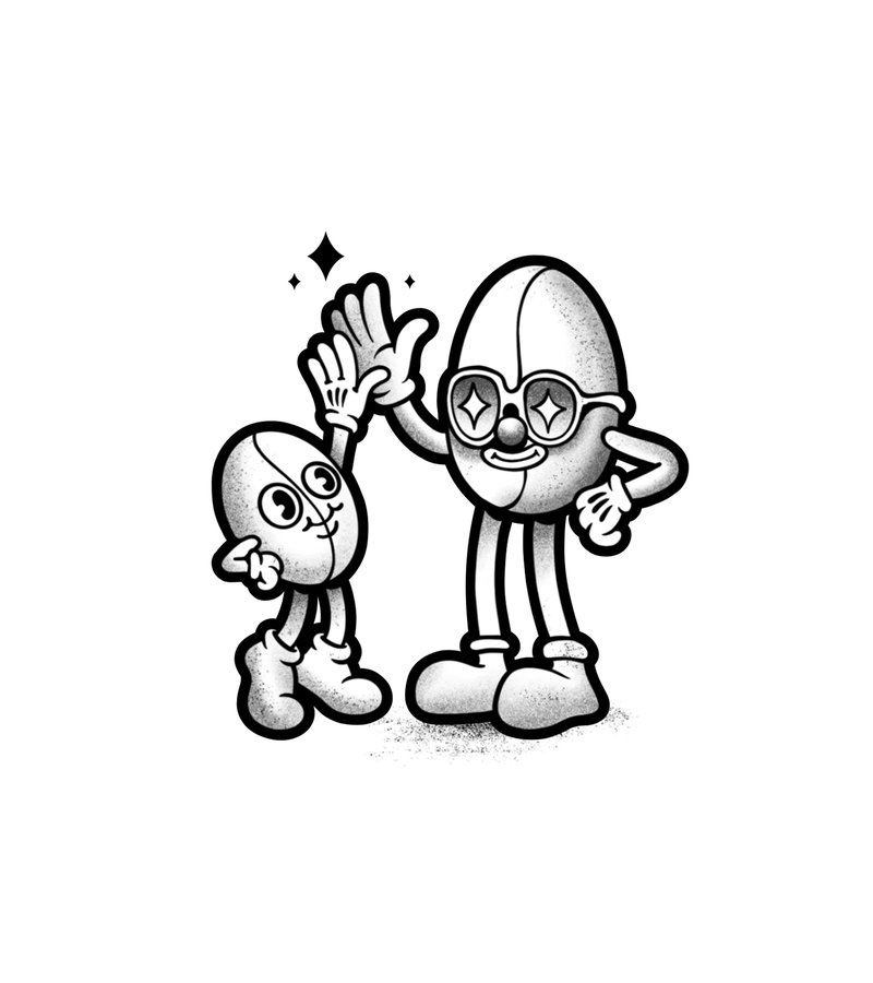
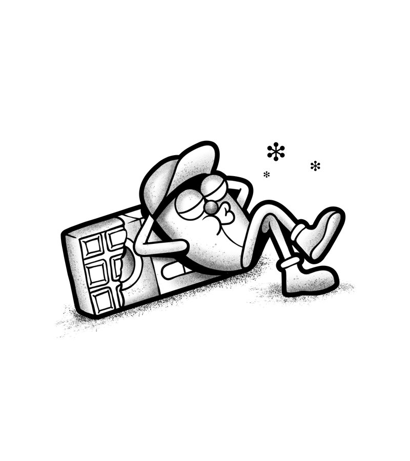
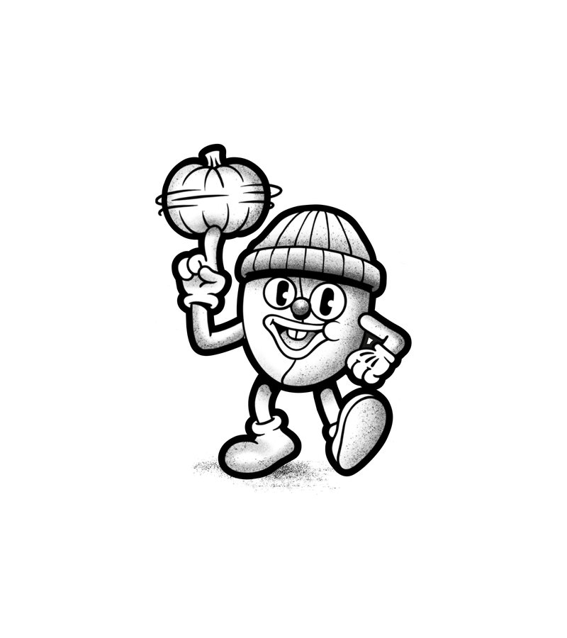
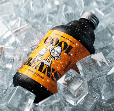
First up, the name 'Cool Beans' – a knowing wink at those cringe-worthy attempts to sound hip. We dove into late 80s and early 90s hip hop culture for inspiration, creating bean characters with more swagger than your average coffee bean.
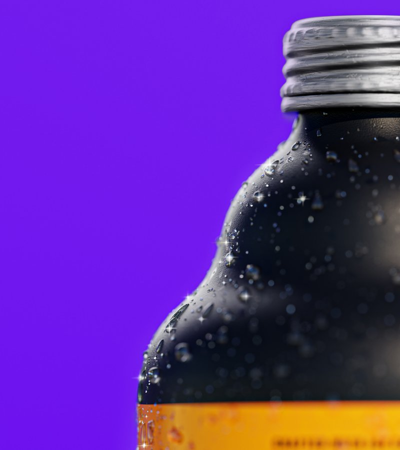
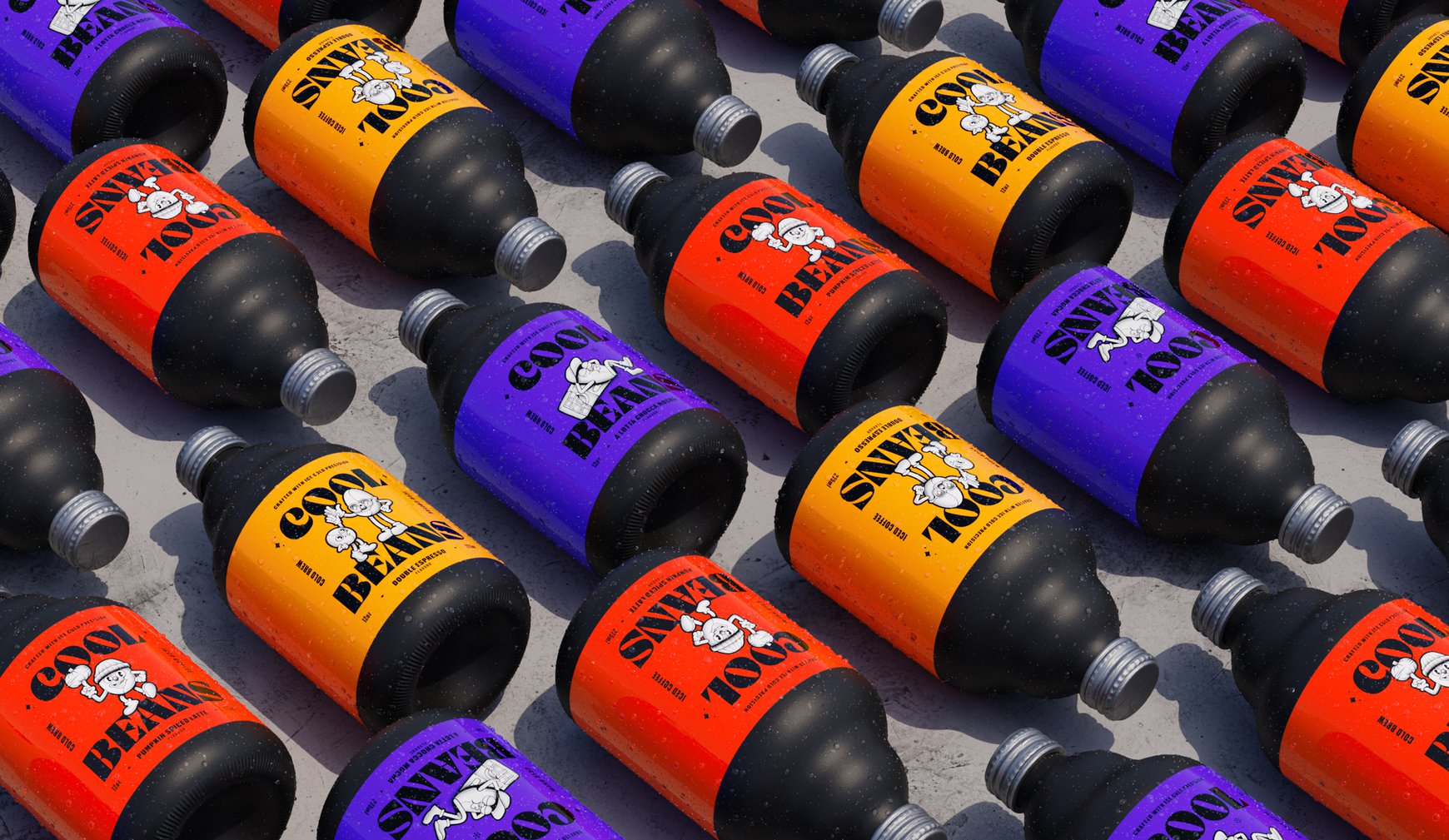
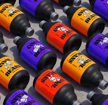
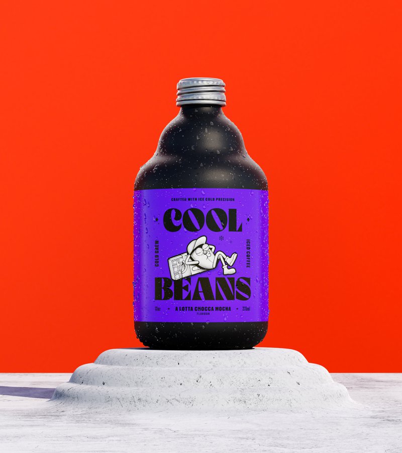
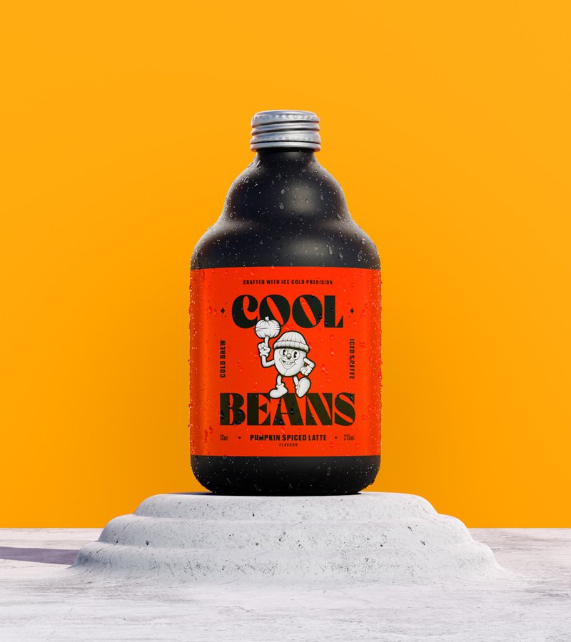
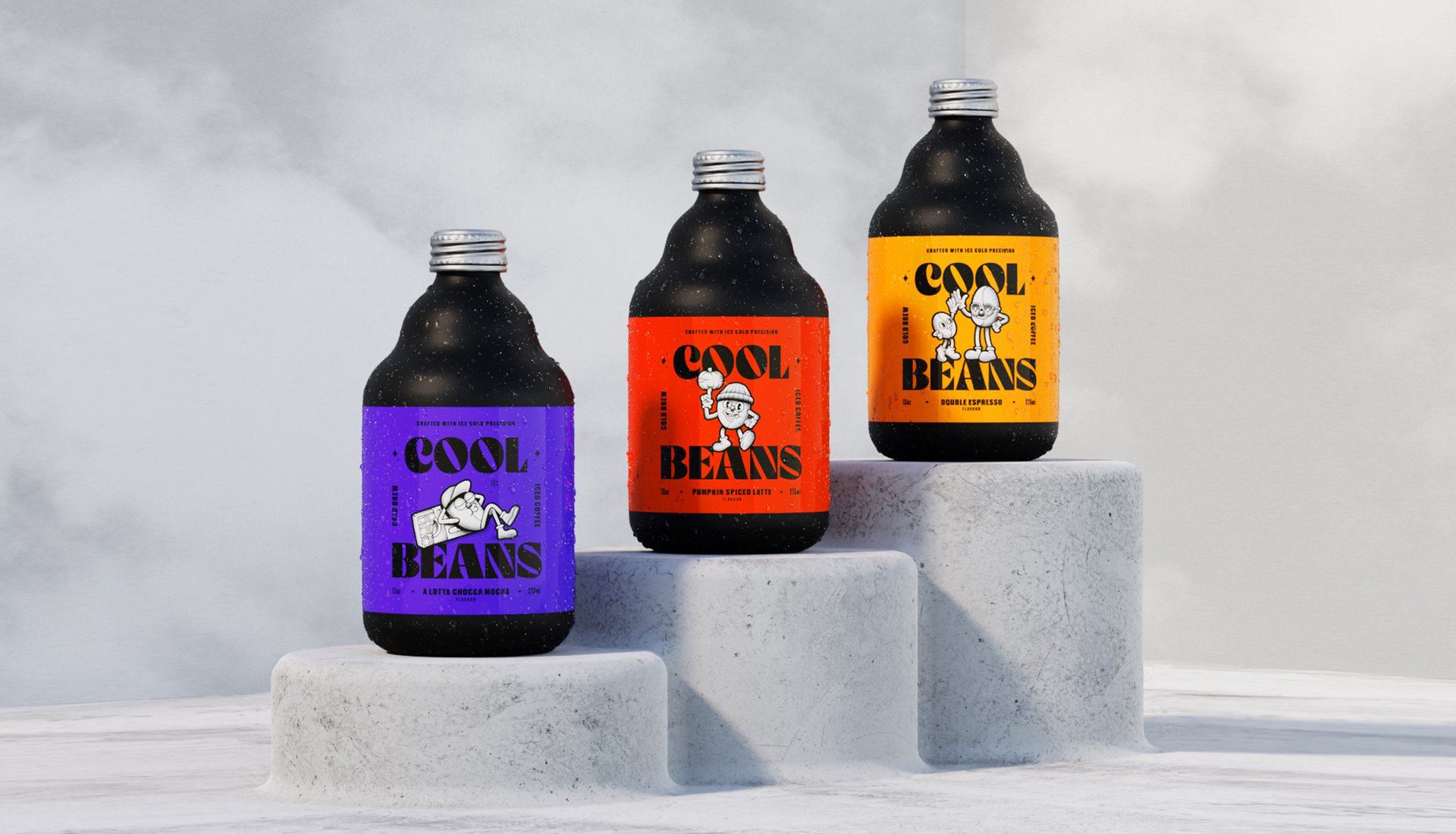
The bottle design itself? That's where things got interesting. We took cues from actual coffee beans, matching their rich colours and even mimicking that distinctive crack in the bean through the bottle's neck curve. Topped it off with glossy labels against matte black glass, because sometimes opposites just work.
THE IMPACT
This design exploration shows what happens when you stop trying to fit in and start trying to stand out. By creating a concept that sits confidently between energy drinks and coffee shops, we proved that sometimes the sweet spot is right in the middle – especially if you're not afraid to have a little fun getting there.
Ever noticed that weird gap between energy drink rebels and coffee shop regulars? Cool Beans did. They came to us with a mission: create an iced coffee that would bridge that caffeine canyon – something for people who've outgrown the energy drink phase but aren't ready for their Costa loyalty card. We explored how to make coffee cool again, literally and figuratively."
THE CHALLENGE
How do you design something that sits between Red Bull energy and coffee shop zen? Our concept needed to create a brand that would feel fresh in a saturated market, speak to the in-betweeners, and not take itself too seriously. Plus, make coffee feel cool without trying too hard (which, as we all know, is the least cool thing you can do).
OUR APPROACH
First up, the name 'Cool Beans' – a knowing wink at those cringe-worthy attempts to sound hip. We dove into late 80s and early 90s hip hop culture for inspiration, creating bean characters with more swagger than your average coffee bean.
The bottle design itself? That's where things got interesting. We took cues from actual coffee beans, matching their rich colours and even mimicking that distinctive crack in the bean through the bottle's neck curve. Topped it off with glossy labels against matte black glass, because sometimes opposites just work.
THE IMPACT
This design exploration shows what happens when you stop trying to fit in and start trying to stand out. By creating a concept that sits confidently between energy drinks and coffee shops, we proved that sometimes the sweet spot is right in the middle – especially if you're not afraid to have a little fun getting there.