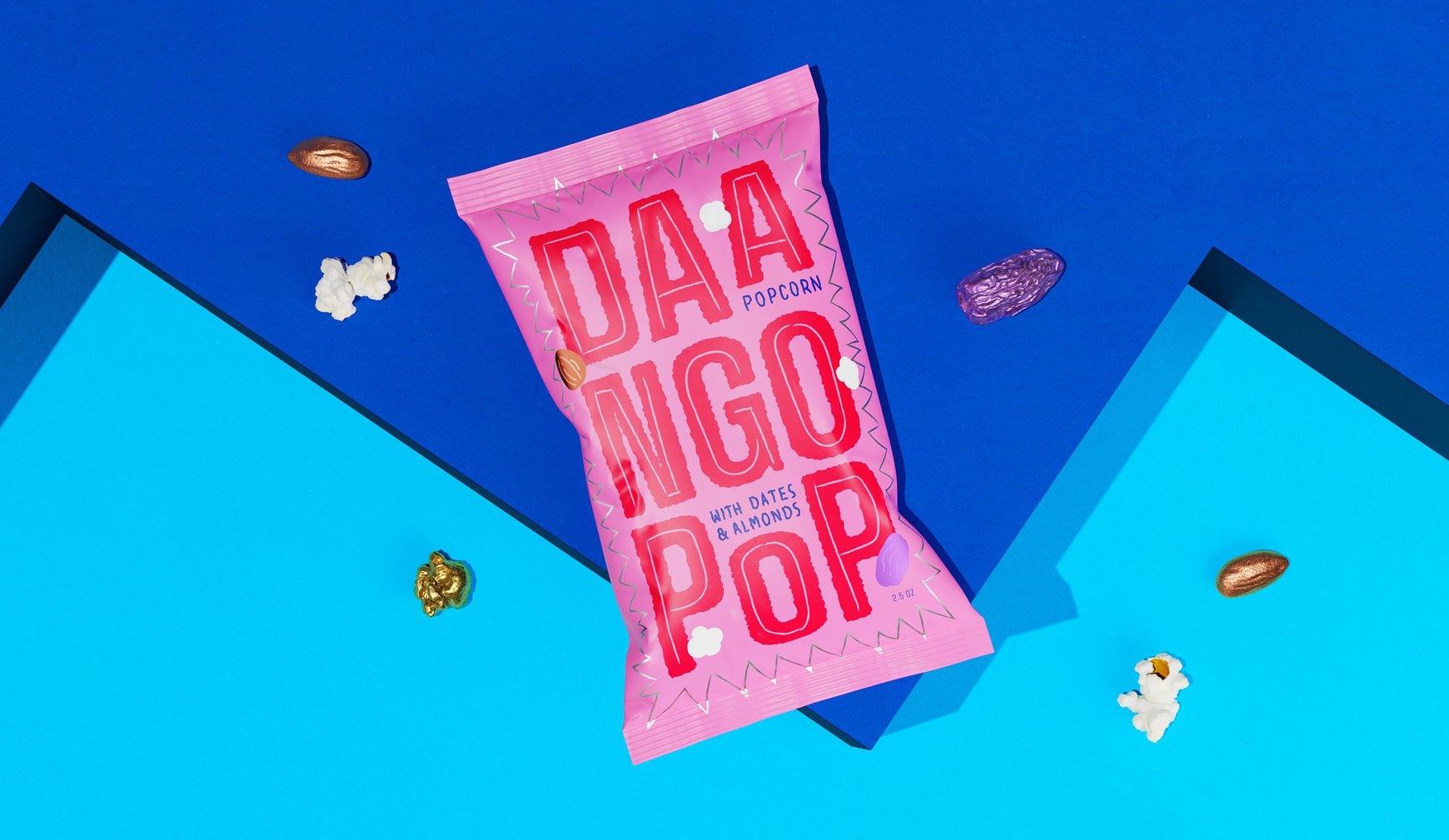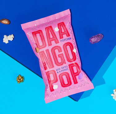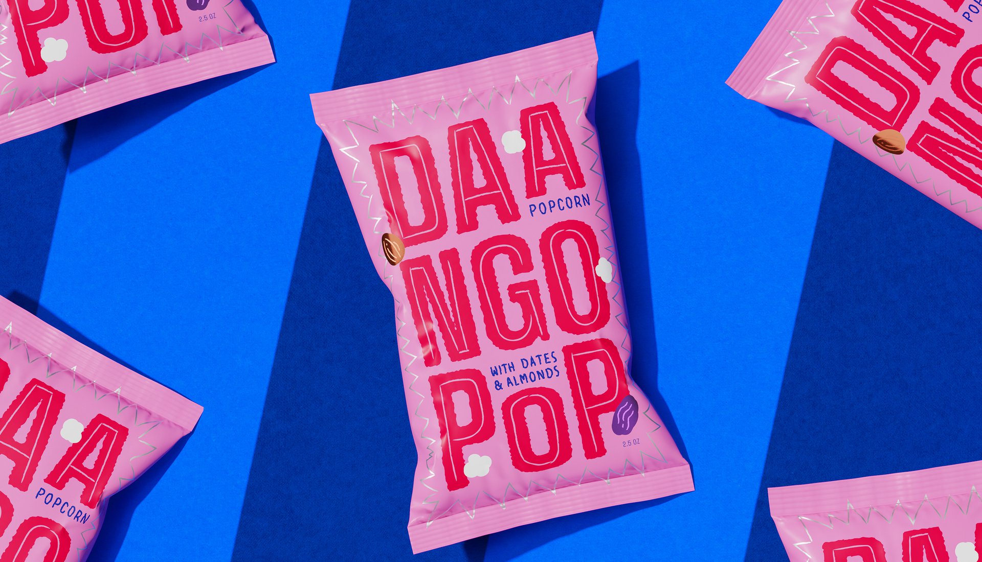
Daango Pop
Daango Pop
Making healthy snacking pop
THE STORY
When Warsame came to us with his first snacking venture, he brought more than just popcorn – he brought a fresh take on trail mix that mashed up Eastern African flavours with guilt-free snacking. Think popcorn meets dates meets almonds, all tied together with a cheeky drizzle of maple syrup. Our job? Help this flavour explosion make as much noise on shelf as it does in your mouth.
THE CHALLENGE
How do you stand out in the USA's snack aisle, where everyone's shouting for attention? We needed to create packaging that would turn heads, tell Warsame's story, and make healthy snacking feel like a party. All while making sure this Eastern African-inspired treat felt both authentic and Instagram-ready.
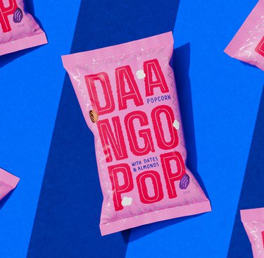
OUR APPROACH
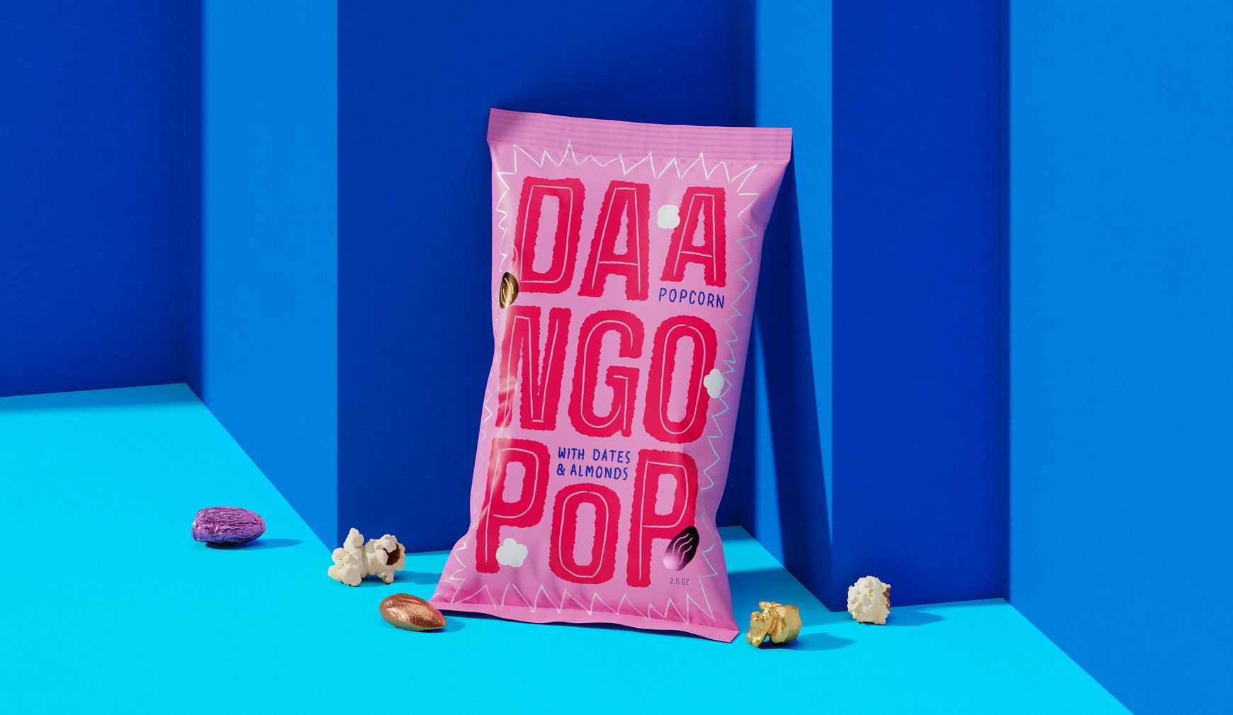
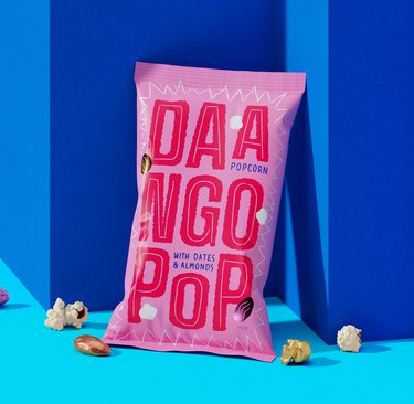
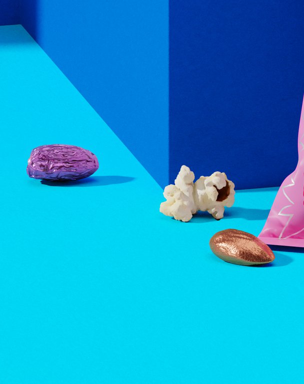
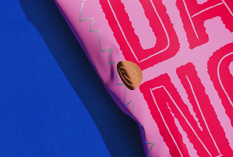
We found our inspiration in the streets of East Africa – specifically those amazing hand-painted advertisements that turn walls into works of art. We went bold with typography that doesn't just sit on the pack, it owns it. Then we scattered illustrated ingredients through the letters like they were caught in a flavour explosion.
But here's where it gets fancy: we picked out the almonds and dates in foil, making them shine like little jewels in your trail mix. Because when your snack is this special, it deserves to sparkle.
THE IMPACT
While DaangoPop hasn't made it to market yet, the design development showed how cultural authenticity and contemporary cool could come together. We created a brand concept that proved healthy snacking doesn't have to look or feel worthy – it can be bold, bright, and ready for its Instagram close-up.
When Warsame came to us with his first snacking venture, he brought more than just popcorn – he brought a fresh take on trail mix that mashed up Eastern African flavours with guilt-free snacking. Think popcorn meets dates meets almonds, all tied together with a cheeky drizzle of maple syrup. Our job? Help this flavour explosion make as much noise on shelf as it does in your mouth.
THE CHALLENGE
How do you stand out in the USA's snack aisle, where everyone's shouting for attention? We needed to create packaging that would turn heads, tell Warsame's story, and make healthy snacking feel like a party. All while making sure this Eastern African-inspired treat felt both authentic and Instagram-ready.
OUR APPROACH
We found our inspiration in the streets of East Africa – specifically those amazing hand-painted advertisements that turn walls into works of art. We went bold with typography that doesn't just sit on the pack, it owns it. Then we scattered illustrated ingredients through the letters like they were caught in a flavour explosion.
But here's where it gets fancy: we picked out the almonds and dates in foil, making them shine like little jewels in your trail mix. Because when your snack is this special, it deserves to sparkle.
THE IMPACT
While DaangoPop hasn't made it to market yet, the design development showed how cultural authenticity and contemporary cool could come together. We created a brand concept that proved healthy snacking doesn't have to look or feel worthy – it can be bold, bright, and ready for its Instagram close-up.