Jam Packed Honey
Jam Packed Honey
When surplus becomes sweet success
THE STORY
Sometimes the best ideas come with a bit of a sting. Sue and Kevin, the founders of Jam Packed, were already champions of British wildlife through their jam business when they stumbled into beekeeping. Soon they had more honey than they knew what to do with – and discovered other local beekeepers were in the same sticky situation. Instead of letting this liquid gold go to waste, they decided to create Surrey Honey, collecting surplus honey from apiaries across Surrey. Having worked with us on their jams, they knew exactly who to call for some honey-worthy packaging.
THE CHALLENGE
How do you create a brand that's simple enough to work with varying honey colours but special enough to make surplus honey feel like liquid gold? We needed to design something that would celebrate local beekeepers, showcase the natural variations in honey, and turn a potential waste product into something people would actively seek out.
OUR APPROACH
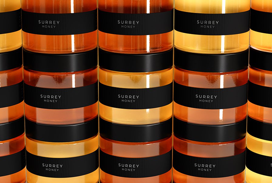
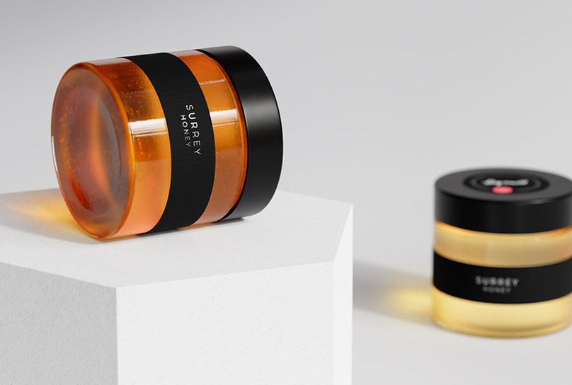
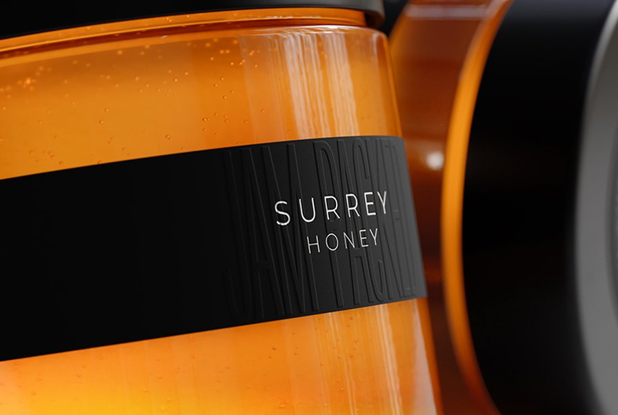
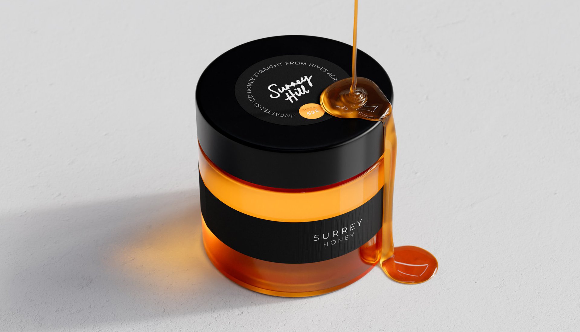
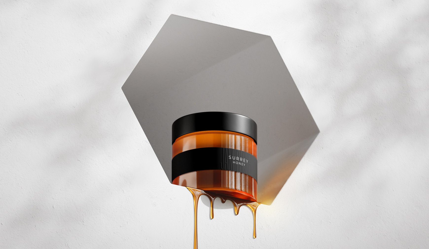
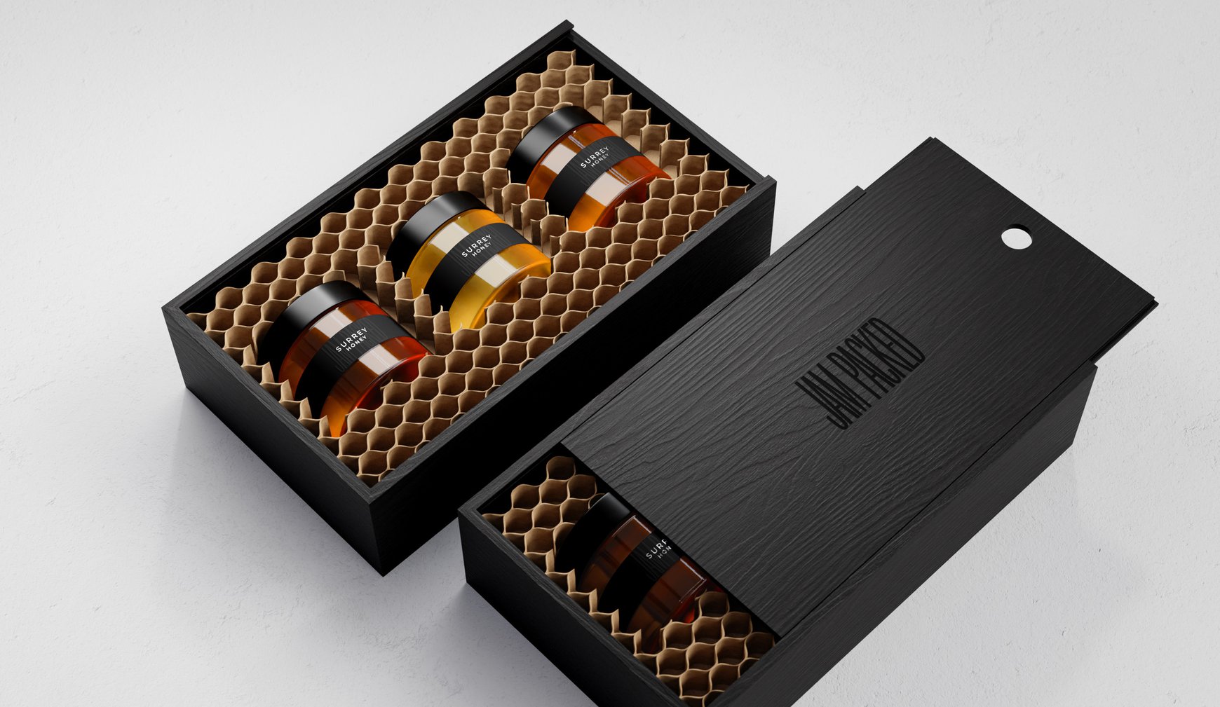
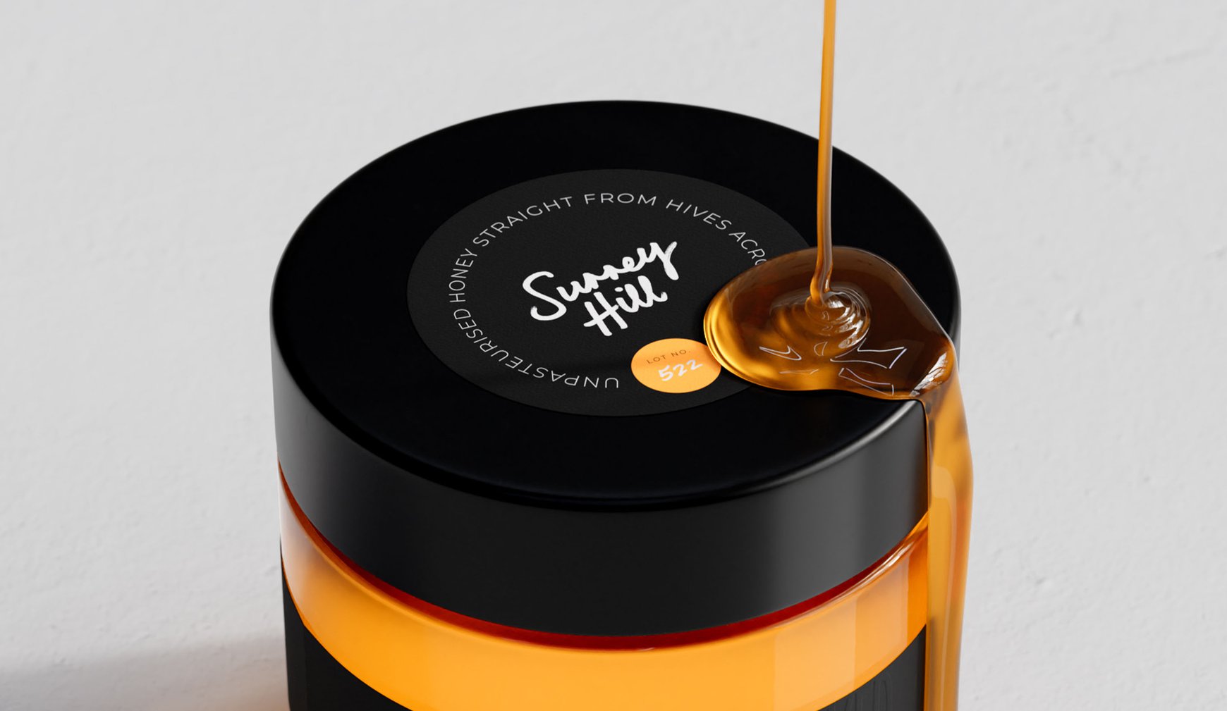
The simplest ideas are sometimes the sweetest. We created a black label and lid that, when combined with the natural honey colour, transforms each jar into a stripy tribute to the humble honeybee. But here's where it gets clever – because honey from different apiaries varies in colour (thanks to local flowers), each jar becomes uniquely beautiful. Like bees themselves, no two are quite the same.
To keep track of all our local honey heroes, we added colour-coded stickers on the lids where beekeepers can write their apiary name and hive lot number. It's a little touch that makes each jar feel properly artisanal – because when you're dealing with unpasteurised, natural honey, every batch deserves its moment to shine.
THE IMPACT
What started as surplus honey has become Surrey's sweetest success story. The packaging transforms everyday honey jars into objects of desire, while celebrating the local beekeepers who make it all possible. Proof that when good design meets good purpose, something truly special happens – and that's got everyone buzzing.
