Jigger
Jigger
India’s heart of the party
The story
Jigger is India’s first ready-to-serve shots brand, created to bring nostalgic Indian tastes to life with no mixers and no chasers. Made to be enjoyed straight up or over ice, it introduces a completely new drinking experience to the Indian alcoholic beverage world.
For co-founder Anubhav Khanna, the name ‘Jigger’ is both personal and intentional. Growing up between Punjab and Kashmir, it meant guts and spirit in Punjabi, and a term of endearment in Urdu. In bartending, it’s the simple measure tool used before pouring a drink. Together, these meanings capture the brand’s essence: heart, courage and simplicity, poured straight up.
The challenge
Our challenge was to create a brand that expressed all the emotion layered into the name while visually capturing the energy of modern Indian celebration. The identity needed to balance nostalgia, culture and contemporary style, creating a distinctive presence for a product that is entirely new in its category.
Our approach
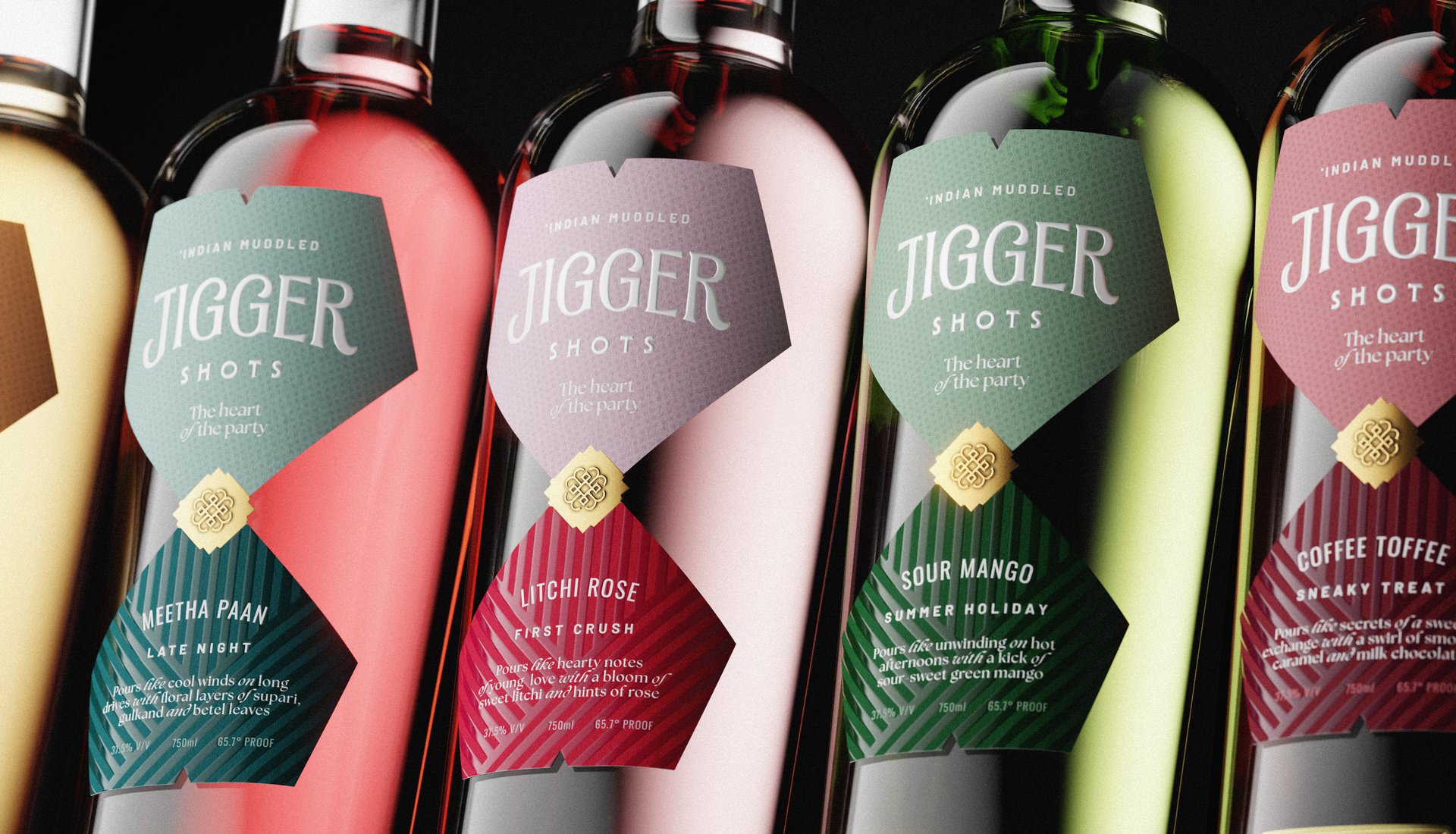
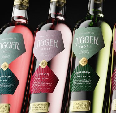
At Jigger’s core is heart, captured in the strapline ‘Heart of the Party’ and carried across every design touchpoint. Even the monogram tells this story, blending abstract hearts, individual J’s and an Indian mandala into a symbol that sits proudly at the top of the bottle.
The bottle itself is ‘dressed for the party’ with a series of visual nods to modern Indian celebration. A choker-inspired neck band features abstract hearts while a polka-dotted label hints at playful blouses or ties. Striped drapes nod to a traditional saree, while the shimmering base catches the light like an anklet. The gradient gold back label wraps the bottle in a celebratory cape, and at the crown, a gold coin adds a final touch of gifting, luck and festivity.
To express the fusion of influences, the typographic system intentionally merges contrasting and even jarring letterforms. On the back label, an illustration of hands raising in a cheers shows how Jigger can be enjoyed in its purest form: as a shot or simply over ice.
The impact
Jigger arrives as a bold, heartfelt new entrant to India’s spirits landscape. The identity captures nostalgia, culture and celebration through a visual language that feels both modern and meaningful. As founder Anubhav Khanna said, “Jigger was our chance to bottle a feeling – not just a spirit.” The design now gives that feeling a distinctive and memorable form, ready for India’s next great celebration.
Jigger is India’s first ready-to-serve shots brand, created to bring nostalgic Indian tastes to life with no mixers and no chasers. Made to be enjoyed straight up or over ice, it introduces a completely new drinking experience to the Indian alcoholic beverage world.
For co-founder Anubhav Khanna, the name ‘Jigger’ is both personal and intentional. Growing up between Punjab and Kashmir, it meant guts and spirit in Punjabi, and a term of endearment in Urdu. In bartending, it’s the simple measure tool used before pouring a drink. Together, these meanings capture the brand’s essence: heart, courage and simplicity, poured straight up.
The challenge
Our challenge was to create a brand that expressed all the emotion layered into the name while visually capturing the energy of modern Indian celebration. The identity needed to balance nostalgia, culture and contemporary style, creating a distinctive presence for a product that is entirely new in its category.
Our approach
At Jigger’s core is heart, captured in the strapline ‘Heart of the Party’ and carried across every design touchpoint. Even the monogram tells this story, blending abstract hearts, individual J’s and an Indian mandala into a symbol that sits proudly at the top of the bottle.
The bottle itself is ‘dressed for the party’ with a series of visual nods to modern Indian celebration. A choker-inspired neck band features abstract hearts while a polka-dotted label hints at playful blouses or ties. Striped drapes nod to a traditional saree, while the shimmering base catches the light like an anklet. The gradient gold back label wraps the bottle in a celebratory cape, and at the crown, a gold coin adds a final touch of gifting, luck and festivity.
To express the fusion of influences, the typographic system intentionally merges contrasting and even jarring letterforms. On the back label, an illustration of hands raising in a cheers shows how Jigger can be enjoyed in its purest form: as a shot or simply over ice.
The impact
Jigger arrives as a bold, heartfelt new entrant to India’s spirits landscape. The identity captures nostalgia, culture and celebration through a visual language that feels both modern and meaningful. As founder Anubhav Khanna said, “Jigger was our chance to bottle a feeling – not just a spirit.” The design now gives that feeling a distinctive and memorable form, ready for India’s next great celebration.


