JOUS
JOUS
Wellness After Dark
The story
JOUS is a functional fruit drink designed to sit at the intersection of wellness and nightlife. With a lower sugar content and added electrolytes, it offers a more considered way to enjoy fruit juice, whether as a daily hydration ritual or within a social setting.
Created to feel as natural at a morning yoga session as it does in a late-night music environment, JOUS introduces a new kind of duality to the category. It is a product built for balance, where health and hedonism are not opposing forces but part of the same lifestyle.
The challenge
The hydration category is saturated with bright colours, bold claims and high-energy visuals. Our challenge was to create a brand that could communicate health credentials while also appealing to a more culturally aware, socially driven audience.
We deliberately didn’t want to follow the same route as brands like Olipop and Poppi, as the category was already becoming saturated with similar-looking challenger brands. Instead of entering the space as another copycat, we wanted to create something that could stand confidently in its own lane from day one.
The identity needed to balance two distinct worlds. It had to feel credible within wellness, yet expressive enough to exist within nightlife and music culture. At the same time, it needed to carve out a unique space on the shelf and open up the possibility for the product to be perceived not just as a soft drink, but also as a mixer alternative.
Our approach
What changed was the focus: rather than leaning into the now-familiar visual cues and positioning used across the category, we built a brand with a clearer point of difference and more ownable identity. That made it easier to carve out space in-market, giving the brand a stronger chance of standing apart instead of blending into an increasingly crowded shelf. We built the brand around a sense of duality, drawing from the visual language of house music to introduce rhythm, repetition and movement into a minimal design system.
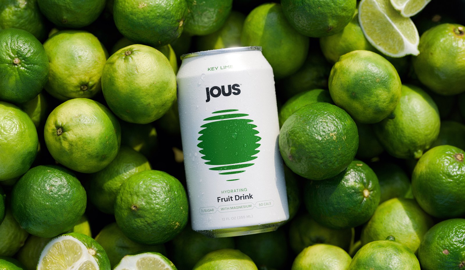
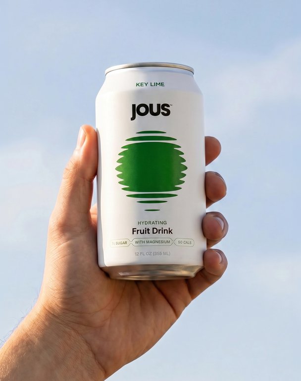
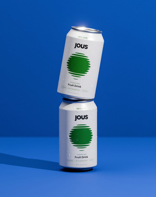
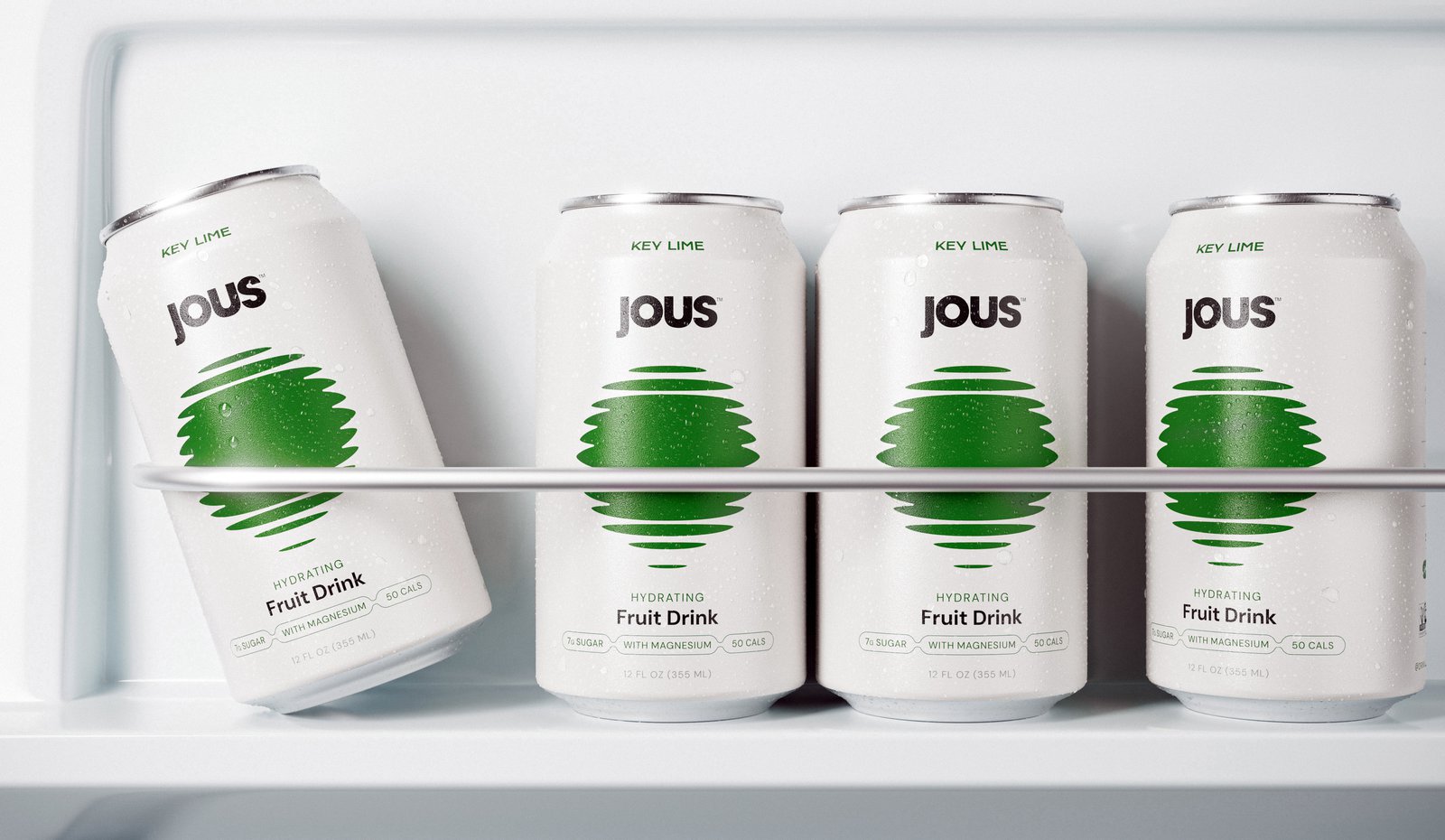
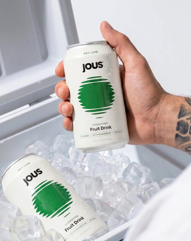
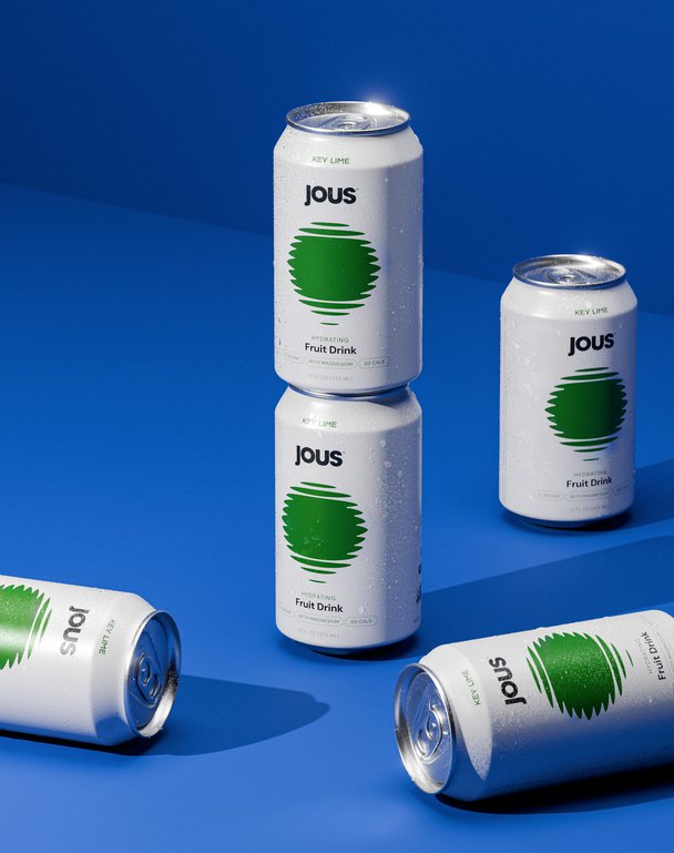
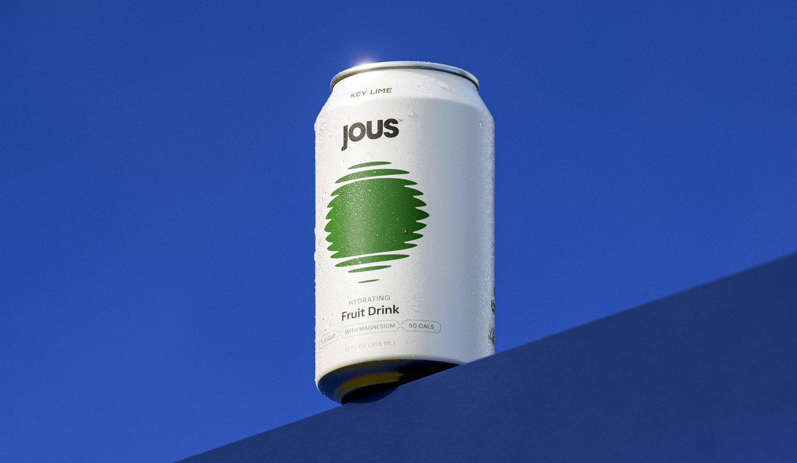
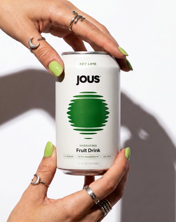
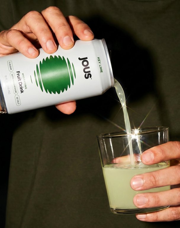
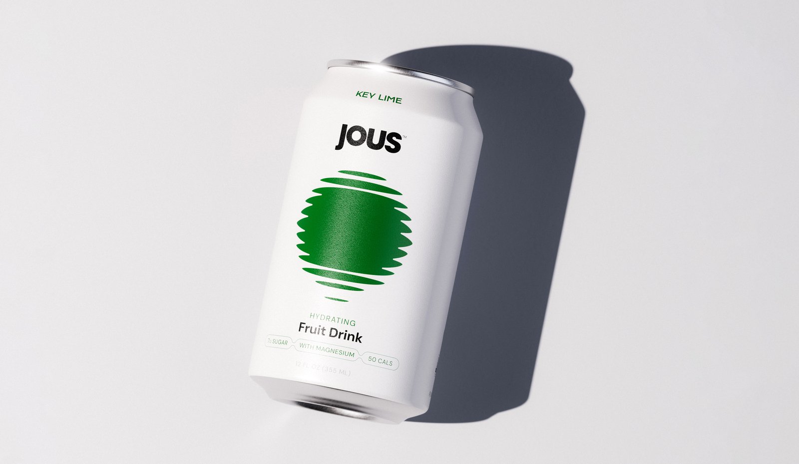
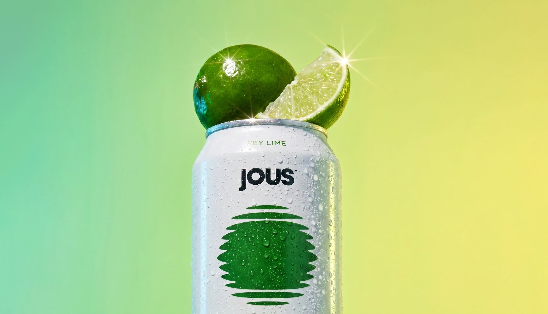
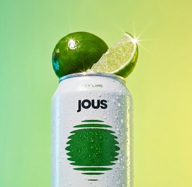
At the centre of the identity is the JOUS icon, inspired by sunlight reflecting on water. It acts as both a functional flavour signifier and a more emotive symbol of hydration, energy and escapism. This mark anchors the brand across every touchpoint.
To contrast the high-energy references, we developed a restrained and refined visual system. A pearl-toned base creates a clean, almost luminous foundation that signals health and purity, while allowing each flavour colour to stand out with clarity. This approach not only differentiates JOUS from competitors, but also creates a scalable system for future range expansion.
The overall design balances precision with atmosphere. Graphic elements nod to sound systems and club culture, while the minimal aesthetic keeps the brand grounded in wellness. This tension allows JOUS to move fluidly between contexts, from day to night, and from functional drink to social mixer.
The impact
JOUS enters the market with a distinctive point of view, redefining how a hydration brand can look, feel and behave. By bridging wellness and party culture, it creates space for a more versatile and lifestyle-driven product. The identity challenges category norms through restraint rather than excess, using simplicity to communicate health while embracing cultural cues that resonate beyond it. The result is a brand that feels contemporary, flexible and built for growth, with a visual system designed to evolve as the range expands.
JOUS is a functional fruit drink designed to sit at the intersection of wellness and nightlife. With a lower sugar content and added electrolytes, it offers a more considered way to enjoy fruit juice, whether as a daily hydration ritual or within a social setting.
Created to feel as natural at a morning yoga session as it does in a late-night music environment, JOUS introduces a new kind of duality to the category. It is a product built for balance, where health and hedonism are not opposing forces but part of the same lifestyle.
The challenge
The hydration category is saturated with bright colours, bold claims and high-energy visuals. Our challenge was to create a brand that could communicate health credentials while also appealing to a more culturally aware, socially driven audience.
We deliberately didn’t want to follow the same route as brands like Olipop and Poppi, as the category was already becoming saturated with similar-looking challenger brands. Instead of entering the space as another copycat, we wanted to create something that could stand confidently in its own lane from day one.
The identity needed to balance two distinct worlds. It had to feel credible within wellness, yet expressive enough to exist within nightlife and music culture. At the same time, it needed to carve out a unique space on the shelf and open up the possibility for the product to be perceived not just as a soft drink, but also as a mixer alternative.
Our approach
What changed was the focus: rather than leaning into the now-familiar visual cues and positioning used across the category, we built a brand with a clearer point of difference and more ownable identity. That made it easier to carve out space in-market, giving the brand a stronger chance of standing apart instead of blending into an increasingly crowded shelf. We built the brand around a sense of duality, drawing from the visual language of house music to introduce rhythm, repetition and movement into a minimal design system.
At the centre of the identity is the JOUS icon, inspired by sunlight reflecting on water. It acts as both a functional flavour signifier and a more emotive symbol of hydration, energy and escapism. This mark anchors the brand across every touchpoint.
To contrast the high-energy references, we developed a restrained and refined visual system. A pearl-toned base creates a clean, almost luminous foundation that signals health and purity, while allowing each flavour colour to stand out with clarity. This approach not only differentiates JOUS from competitors, but also creates a scalable system for future range expansion.
The overall design balances precision with atmosphere. Graphic elements nod to sound systems and club culture, while the minimal aesthetic keeps the brand grounded in wellness. This tension allows JOUS to move fluidly between contexts, from day to night, and from functional drink to social mixer.
The impact
JOUS enters the market with a distinctive point of view, redefining how a hydration brand can look, feel and behave. By bridging wellness and party culture, it creates space for a more versatile and lifestyle-driven product. The identity challenges category norms through restraint rather than excess, using simplicity to communicate health while embracing cultural cues that resonate beyond it. The result is a brand that feels contemporary, flexible and built for growth, with a visual system designed to evolve as the range expands.