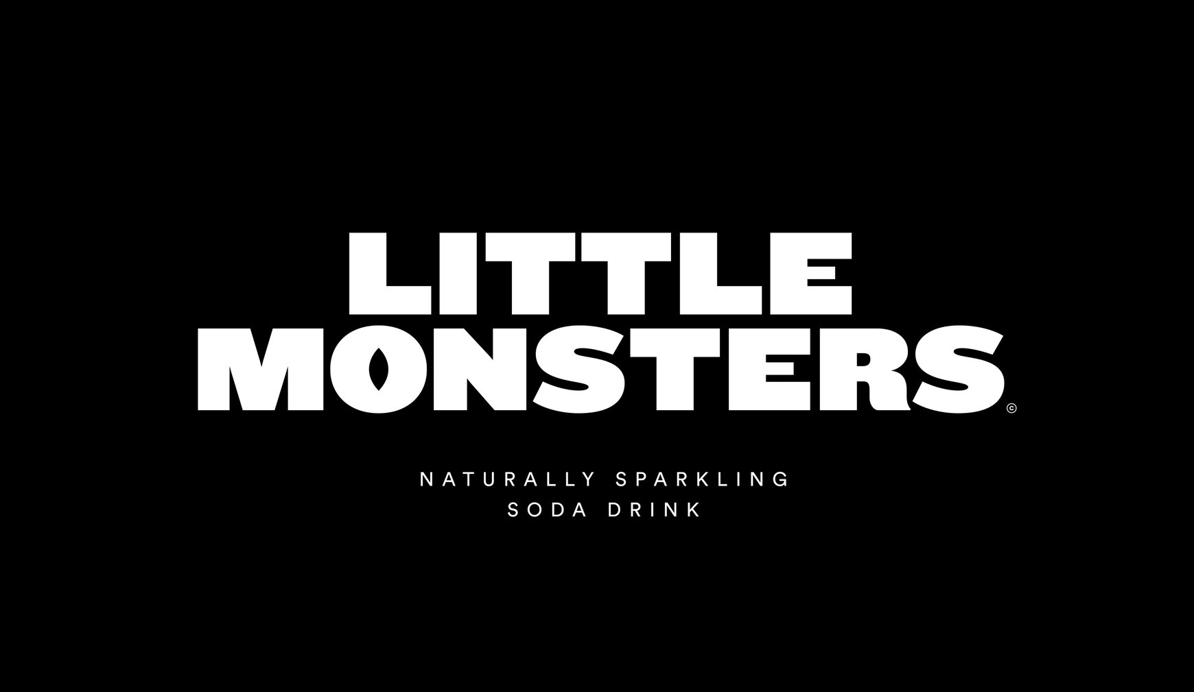
Little Monsters
Little Monsters
Where good ingredients get bad attitudes
THE STORY
When Adam looked at his 10-year-old nephew's drink options, he saw a problem: everything healthy looked like it was designed for yoga moms, and everything cool was packed with nasties. This sparked an idea for a drink that could be both good for kids and actually cool enough for them to want it. We explored how to create a brand that would make healthy drinks stop being the boring choice.
THE CHALLENGE
How do you make healthy drinks speak kid instead of kale? Our design exploration needed to create something that would stand out in a sea of packaging, give healthy drinks some attitude, and still get parent approval. The kind of drink that would make kids feel awesome about making better choices.
OUR APPROACH
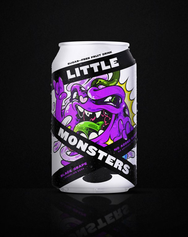
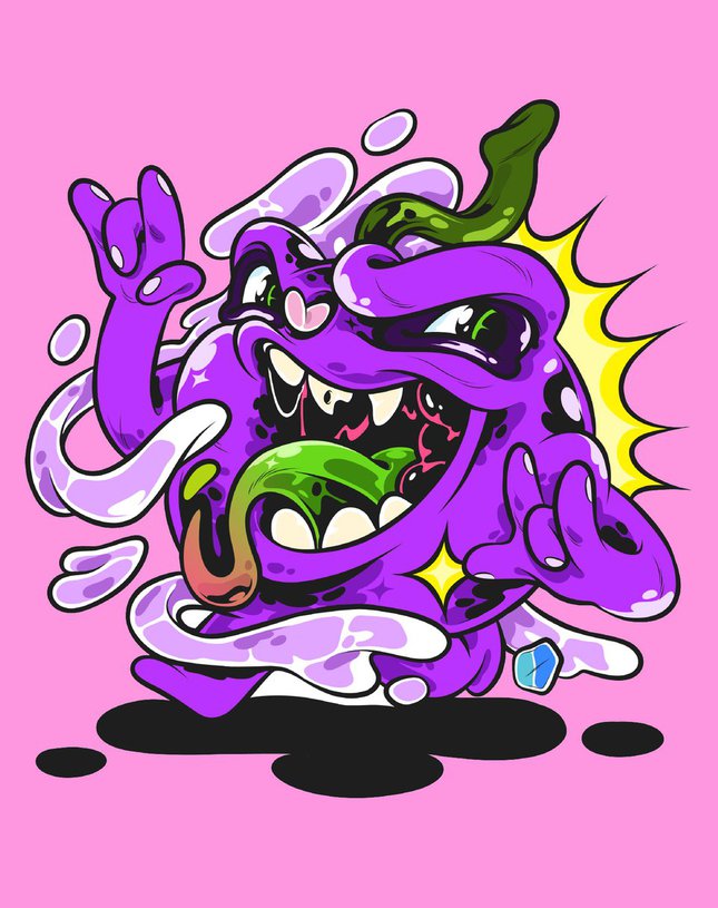
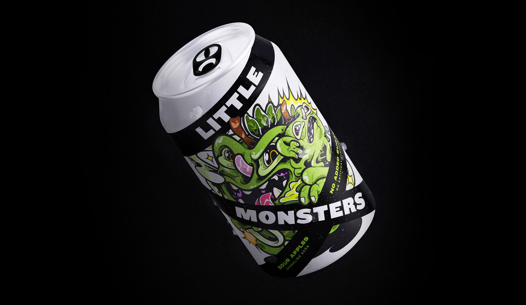
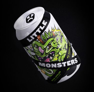
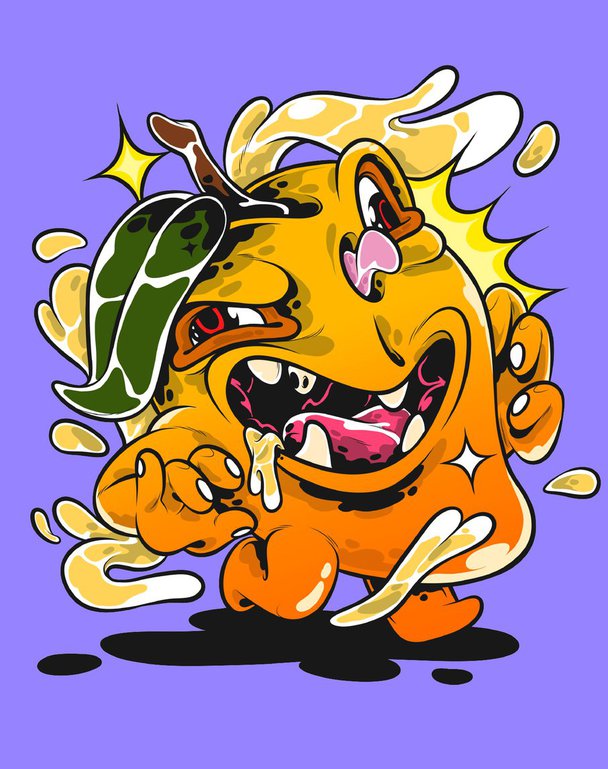
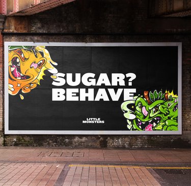
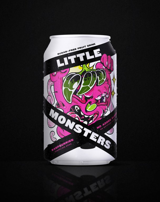
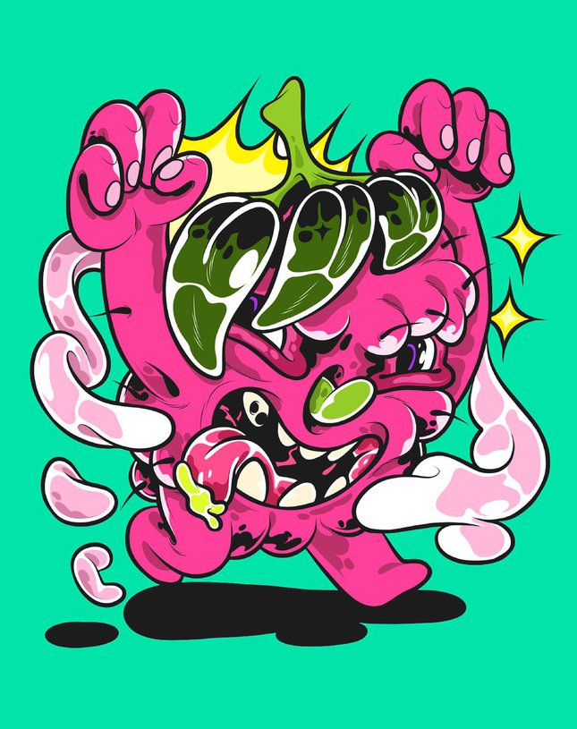
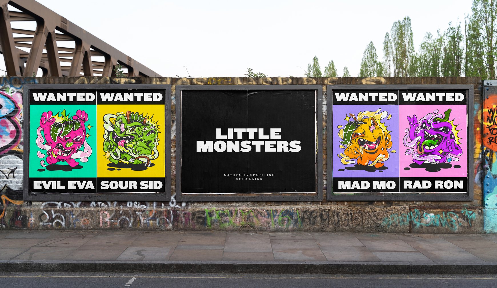
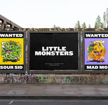
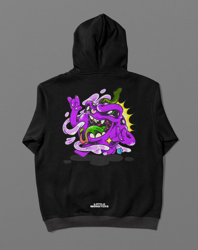
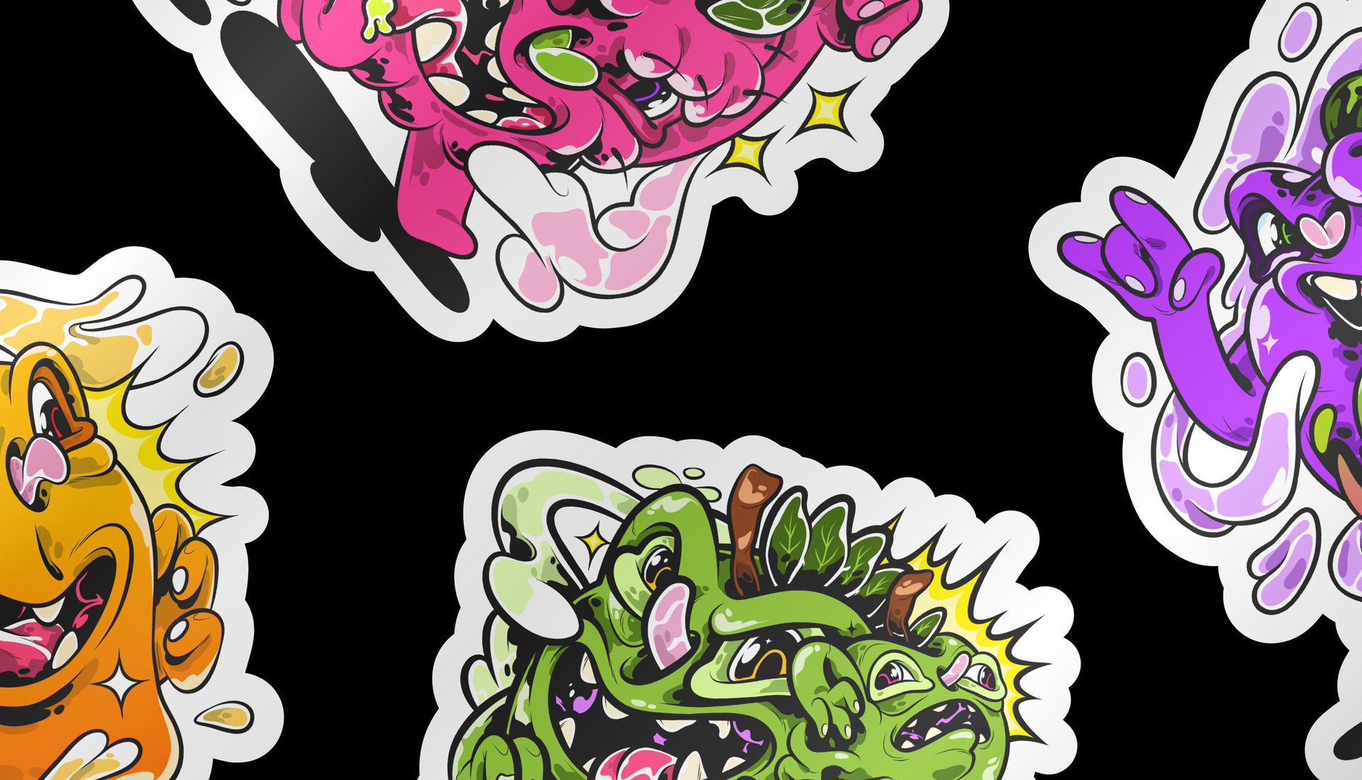
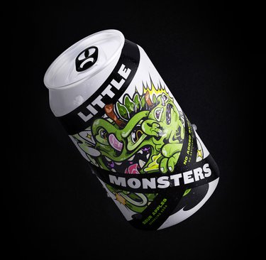
First up, we created the name 'Little Monsters' – a cheeky nod to both kids' occasional meltdowns and the nasty ingredients we were kicking out. Then we went full attitude with the design. We created a crew of mischievous fruit characters, each with their own rebellious personality, cordoned off by hazard tape from places they're banned.
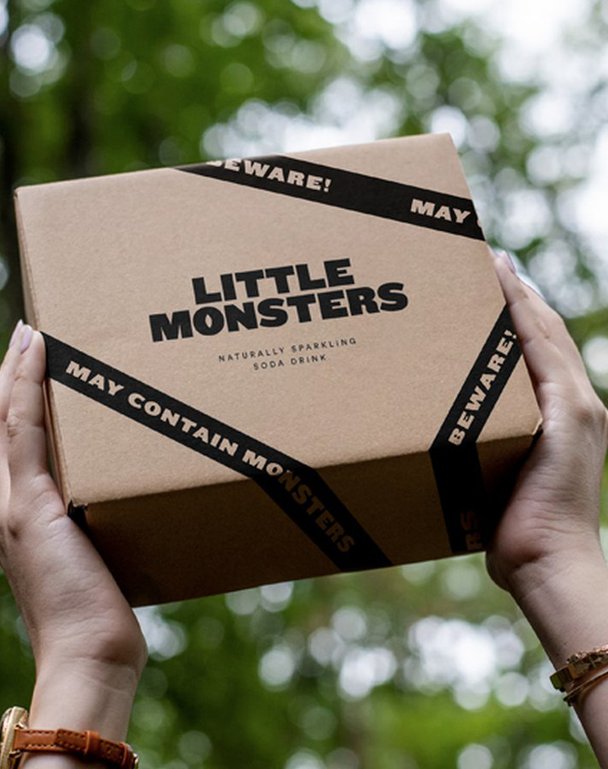
We scattered 'monster' easter eggs throughout – a hidden eye in the logo, another in the pull tab – making each pack a little adventure in itself. Each character was designed to be distinctive and collectible, because great design should be fun to discover.
THE IMPACT
This design concept shows how healthy products don't have to play it safe to play it good. By giving wholesome ingredients an attitude adjustment, we created a brand blueprint that proves healthy drinks can be cool enough for kids and clean enough for parents.
When Adam looked at his 10-year-old nephew's drink options, he saw a problem: everything healthy looked like it was designed for yoga moms, and everything cool was packed with nasties. This sparked an idea for a drink that could be both good for kids and actually cool enough for them to want it. We explored how to create a brand that would make healthy drinks stop being the boring choice.
THE CHALLENGE
How do you make healthy drinks speak kid instead of kale? Our design exploration needed to create something that would stand out in a sea of packaging, give healthy drinks some attitude, and still get parent approval. The kind of drink that would make kids feel awesome about making better choices.
OUR APPROACH
First up, we created the name 'Little Monsters' – a cheeky nod to both kids' occasional meltdowns and the nasty ingredients we were kicking out. Then we went full attitude with the design. We created a crew of mischievous fruit characters, each with their own rebellious personality, cordoned off by hazard tape from places they're banned.
We scattered 'monster' easter eggs throughout – a hidden eye in the logo, another in the pull tab – making each pack a little adventure in itself. Each character was designed to be distinctive and collectible, because great design should be fun to discover.
THE IMPACT
This design concept shows how healthy products don't have to play it safe to play it good. By giving wholesome ingredients an attitude adjustment, we created a brand blueprint that proves healthy drinks can be cool enough for kids and clean enough for parents.