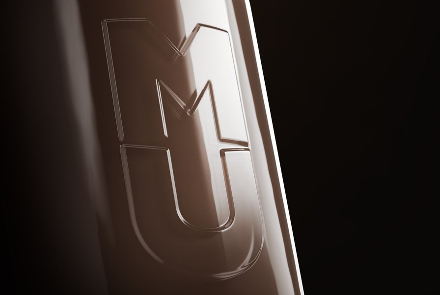
MU
MU
A moo-vement is beginning
THE STORY
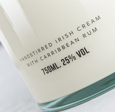
As plant-based milk takes over our coffee shops and fridge space, real dairy is having an identity crisis. But what if that crisis was actually an opportunity? We explored how to turn Irish Cream Liqueur from your grandma's guilty pleasure into a modern luxury, because sometimes the best way forward is to embrace your creamy roots, or however the saying goes.
THE CHALLENGE
How do you make dairy feel demure in a world gone oat-milk-crazy? Our design exploration needed to transform Irish Cream from dated to desirable, celebrate its dairy heritage without feeling old-fashioned, and make indulgence feel intentional. All while keeping it sophisticated enough for a new generation of drinkers.
OUR APPROACH
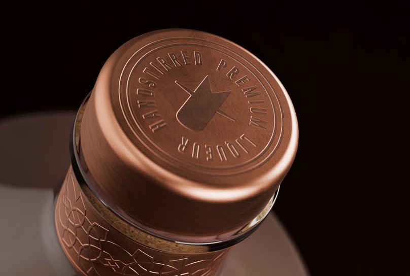
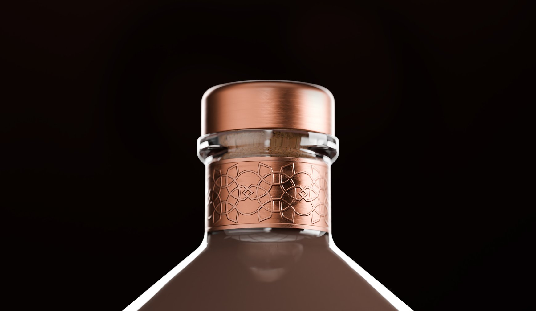
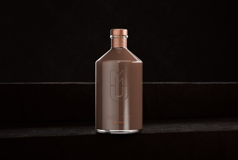
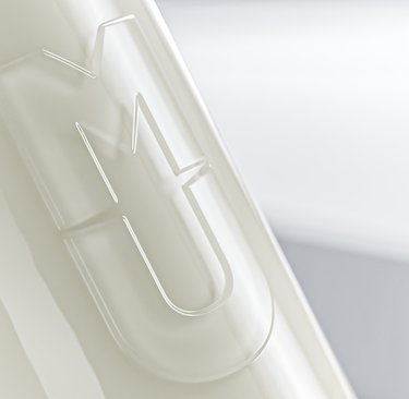
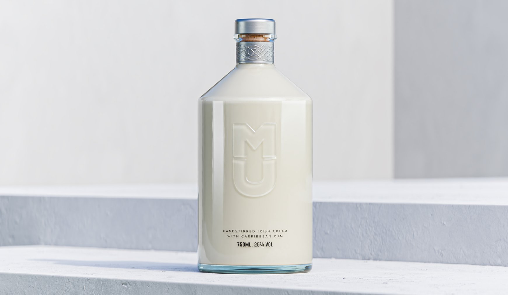
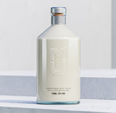
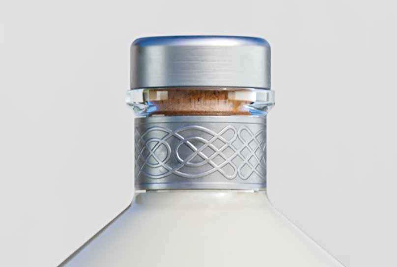
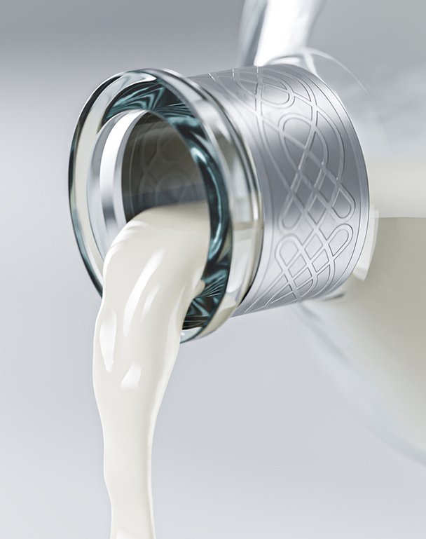
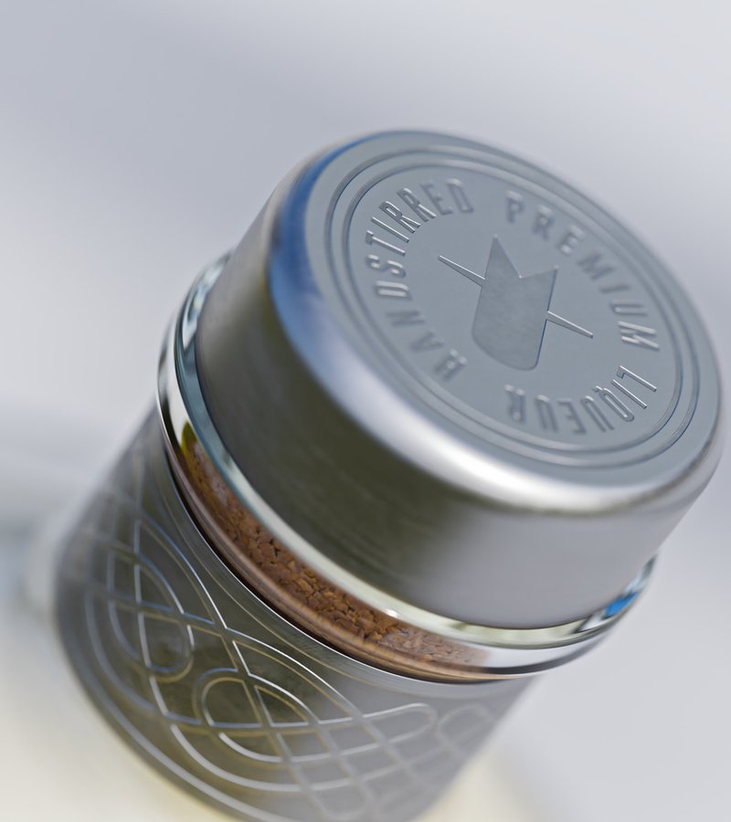
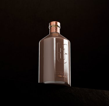
We stripped everything back to let the product's creamy nature shine through. The bottle design plays with tradition in a modern way – think milk churn meets modern sculpture. We wove in an Irish knot around the neck, nodding to its heritage and the creamy nature of the product, but the real magic happens in the logo.
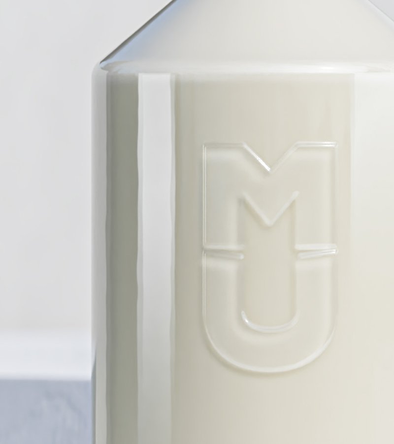
Using negative space between the letters, we created a subtle cow's head that reveals itself like a little secret. It's the kind of detail that makes you go 'oh, nice' when you spot it – because occasionally the best design elements are the ones you discover rather than the ones that shout at you.
THE IMPACT
This design concept shows how traditional products could reclaim their space in a changing market. By embracing dairy's indulgent side rather than fighting against it, we created a blueprint for how heritage brands might evolve – proving that sometimes your biggest 'weakness' can become your greatest strength.
As plant-based milk takes over our coffee shops and fridge space, real dairy is having an identity crisis. But what if that crisis was actually an opportunity? We explored how to turn Irish Cream Liqueur from your grandma's guilty pleasure into a modern luxury, because sometimes the best way forward is to embrace your creamy roots, or however the saying goes.
THE CHALLENGE
How do you make dairy feel demure in a world gone oat-milk-crazy? Our design exploration needed to transform Irish Cream from dated to desirable, celebrate its dairy heritage without feeling old-fashioned, and make indulgence feel intentional. All while keeping it sophisticated enough for a new generation of drinkers.
OUR APPROACH
We stripped everything back to let the product's creamy nature shine through. The bottle design plays with tradition in a modern way – think milk churn meets modern sculpture. We wove in an Irish knot around the neck, nodding to its heritage and the creamy nature of the product, but the real magic happens in the logo.
Using negative space between the letters, we created a subtle cow's head that reveals itself like a little secret. It's the kind of detail that makes you go 'oh, nice' when you spot it – because occasionally the best design elements are the ones you discover rather than the ones that shout at you.
THE IMPACT
This design concept shows how traditional products could reclaim their space in a changing market. By embracing dairy's indulgent side rather than fighting against it, we created a blueprint for how heritage brands might evolve – proving that sometimes your biggest 'weakness' can become your greatest strength.


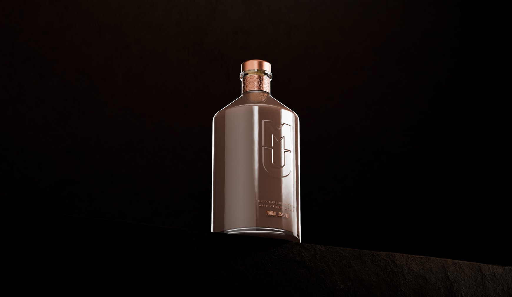
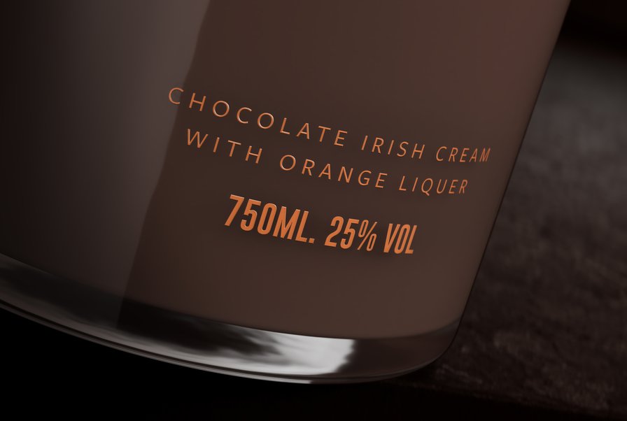
When chocolate orange meets Irish cream
Ever wondered what happens when you give a classic Irish cream a festive twist?
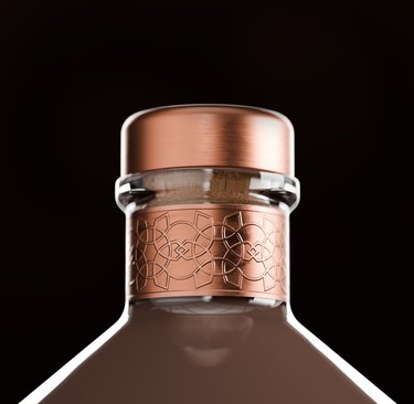
We did just that with MU's limited edition Chocolate Orange. Taking our original milk urn bottle design, we dressed it up for the holidays – think brushed copper details that sparkle like fresh orange zest against rich chocolate-coloured liqueur. We kept the clever cow head hidden in the logo (because some good things are worth looking for) but gave the Irish knot a snowflake makeover. Because if you're going to do festive, you might as well do it with style.
The Irish knot design, with a festive twist on the traditional, pays homage to the Irish Cream Liqueur inside. Inspired by the intricate delicacy of a snowflake, it brings a note of sophistication and festive cheer to the packaging.