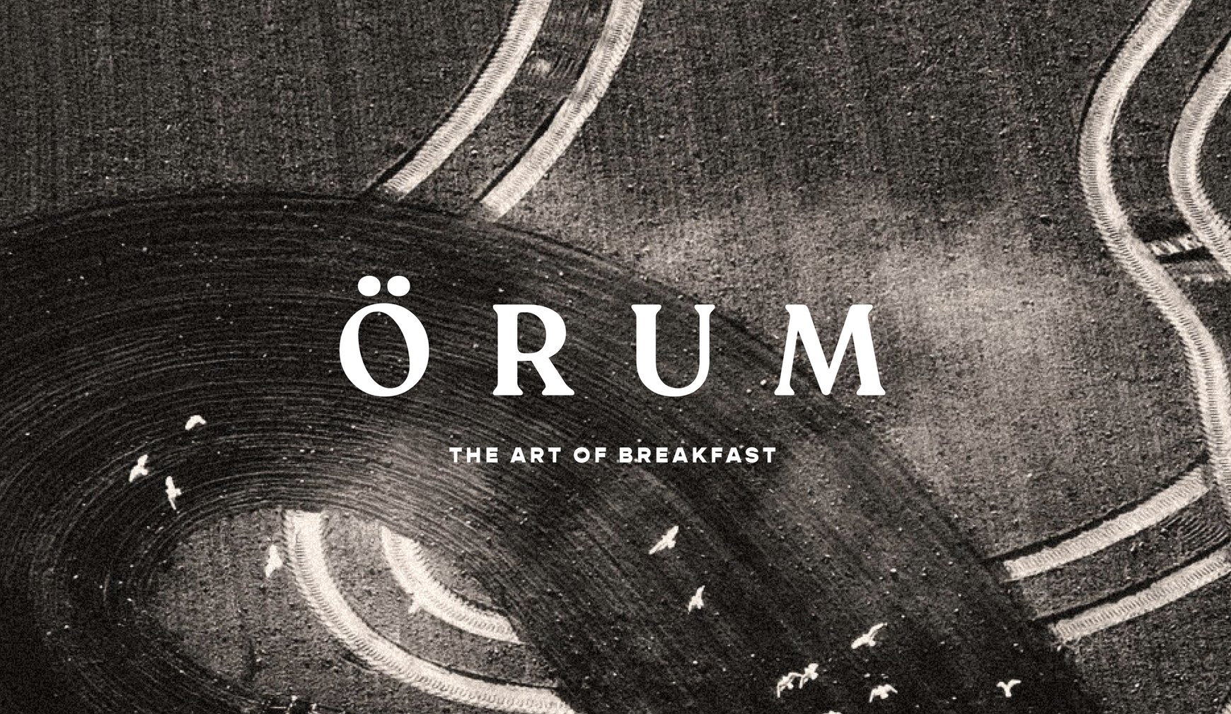
Örum
Örum
A taste of Scandinavia
THE STORY
Örum is the offshoot of Örum119, a premium Swedish breakfast brand that brings the tradition of ‘long breakfasts’ from hotel stays to breakfast tables at home. Rooted in the Scandinavian philosophy of slowing down and savouring the moment, Örum invites customers to enjoy their mornings and set themselves up for the day in the best way possible.
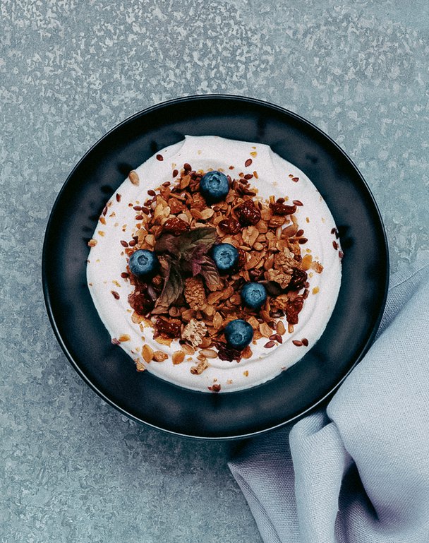
Inspired by this way of living, Örum’s granola, muesli and porridge are handcrafted at their farm bakery at Örum 119, a boutique hotel, using fresh and locally sourced ingredients straight from the hotel garden. The brand blends thoughtful hospitality with quality produce, transforming breakfast into a daily ritual rather than a rushed routine.
THE CHALLENGE
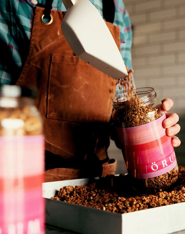
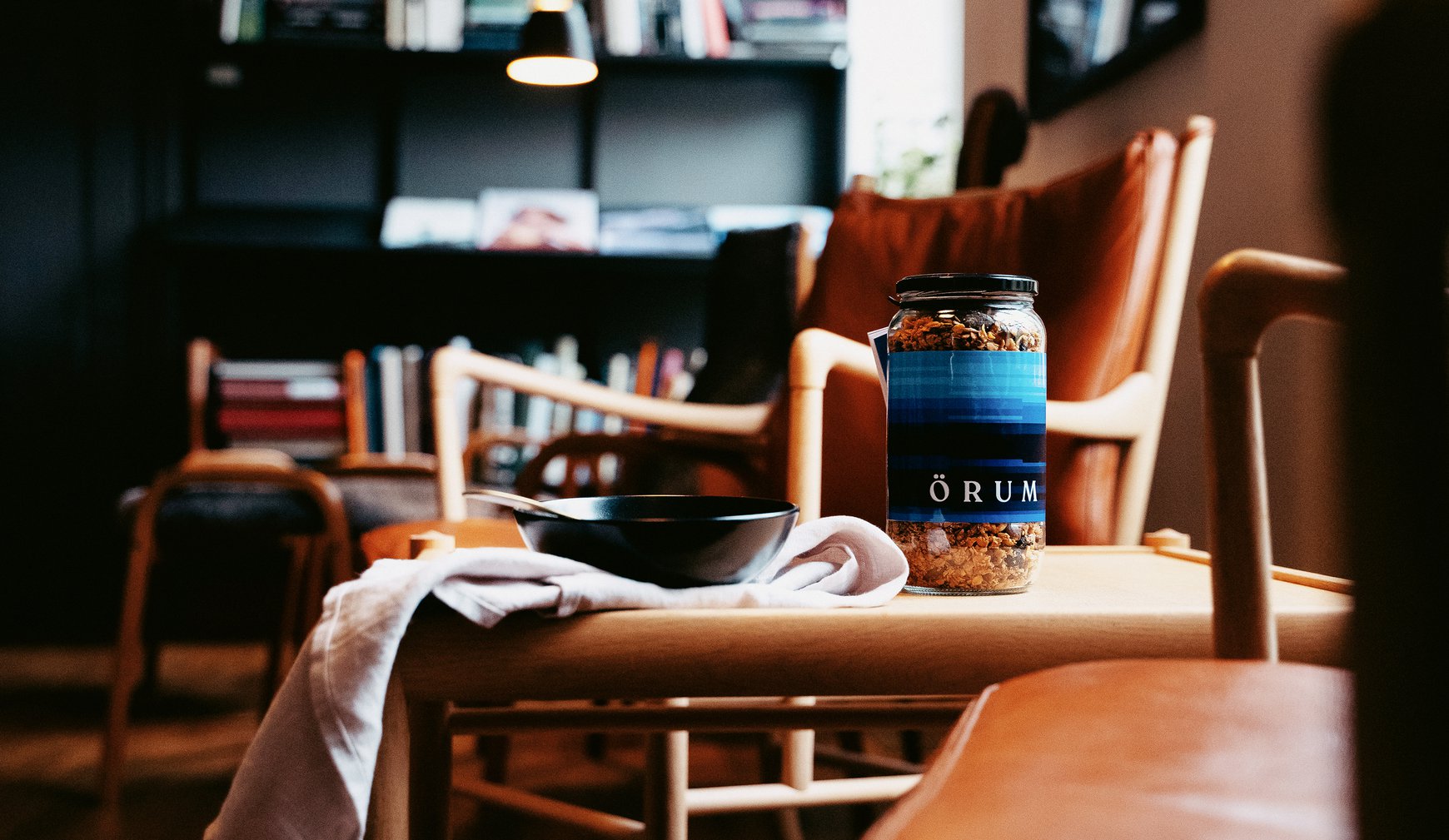
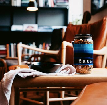
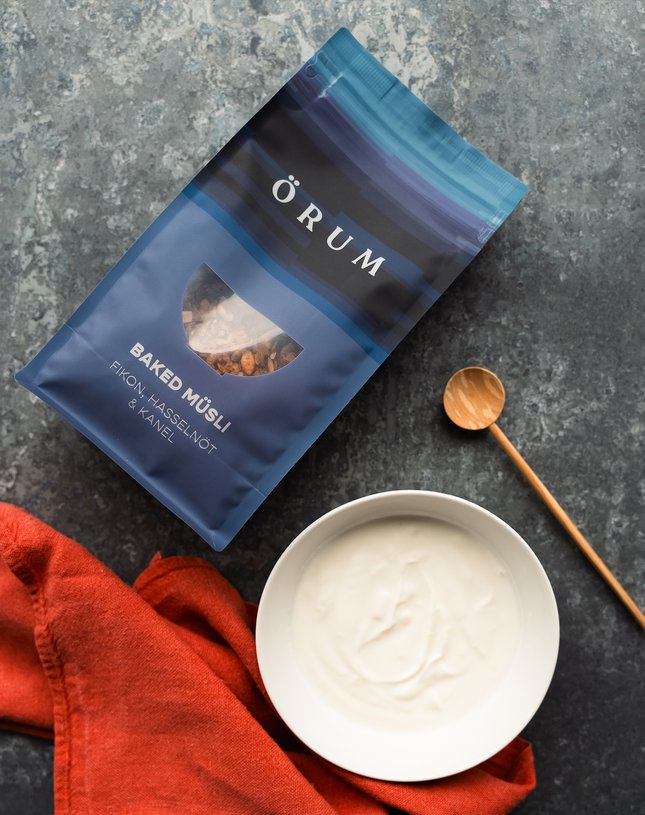
The brief was clear: create packaging that feels less like conventional food packaging and more like homeware, something beautiful enough to be proudly displayed on the breakfast table. The solution also needed to balance practicality and sustainability, supporting both at-home use and convenient refilling without compromising on premium appeal.
OUR APPROACH
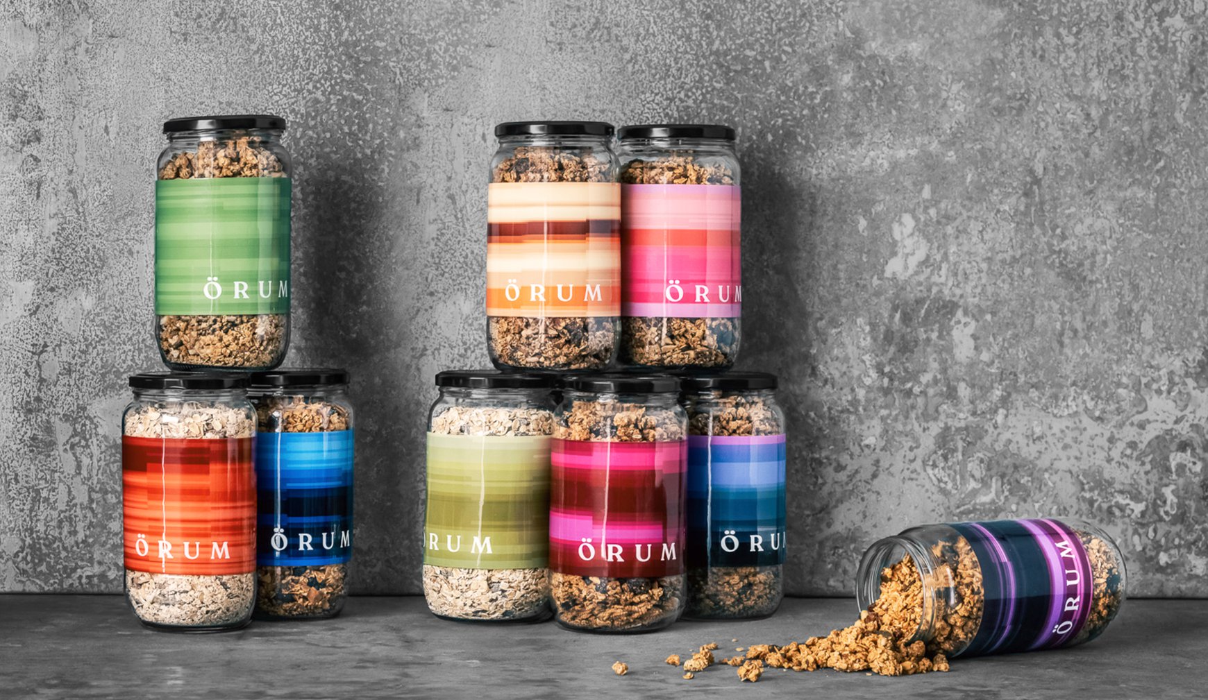
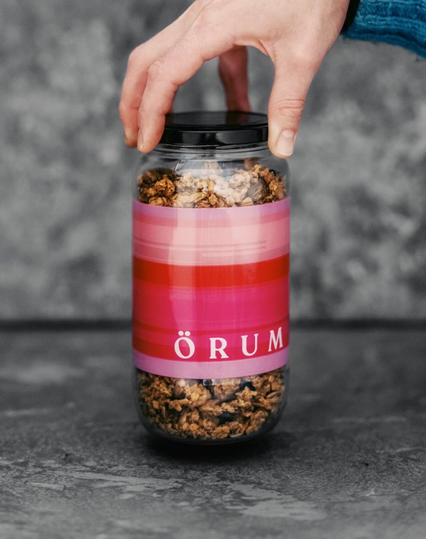
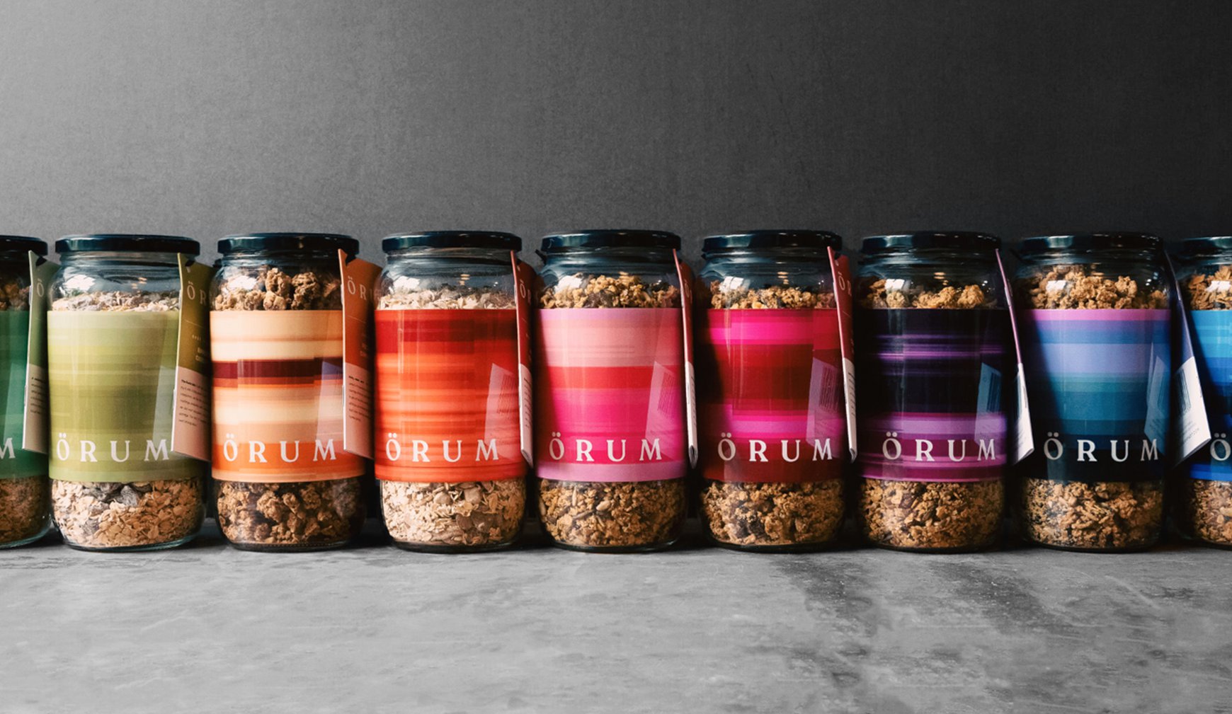
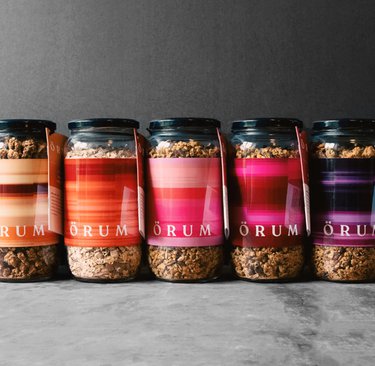
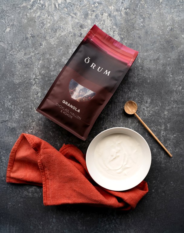
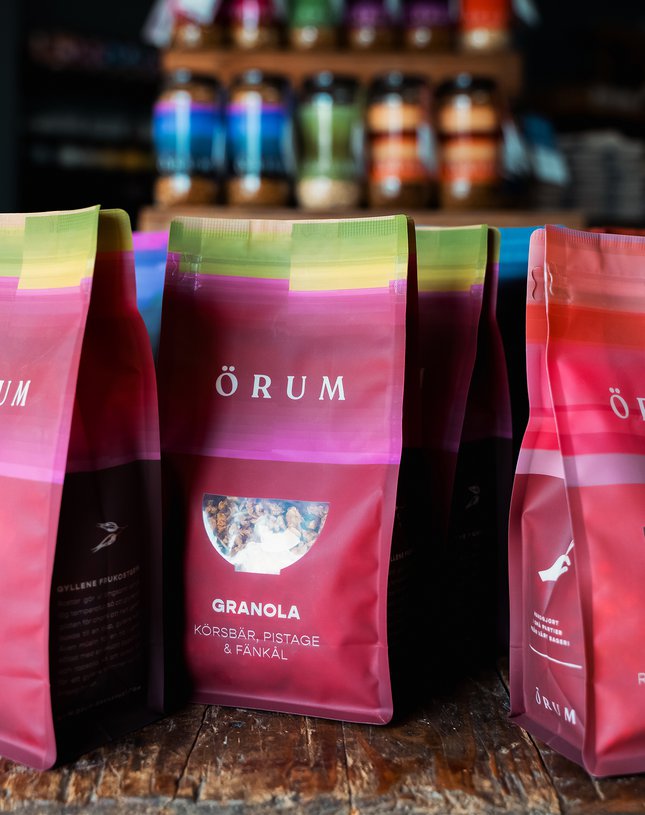
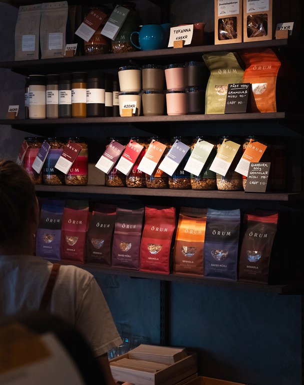
We developed a two-format packaging system: a reusable glass jar designed for the home, and a refill packet that offers both convenience and a more sustainable option. A key part of the creative concept was visually expressing Örum’s ingredients and its philosophy of elongating breakfast.
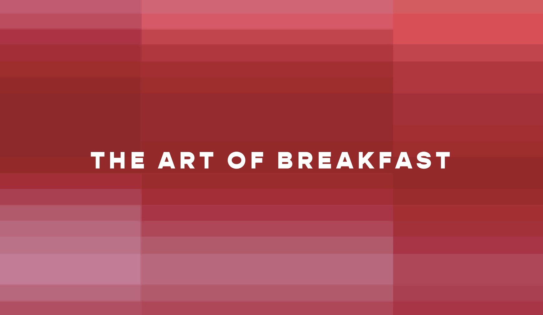
We took an image of the main ingredient within the product, extracted a sliver and then expanded it into the pixelated colour pattern. The pattern is both modern and playful, visually representing the concept of stretching time and savouring every monment, similar to the idea of a long Swedish breakfast. The resulting identity feels contemporary yet warm, balancing Scandinavian minimalism with a sense of play.
THE IMPACT
The final packaging elevates Örum beyond traditional breakfast products, positioning it as a lifestyle brand rooted in ritual, quality and considered design. By transforming packaging into an object designed to live on the table rather than be hidden in a cupboard, the system reinforces the brand’s core message: slow down, savour the moment, and make breakfast something worth lingering over. The dual-format approach also strengthens sustainability credentials while maintaining a premium presence, ensuring Örum’s long breakfast philosophy extends from farm to table, and beyond.
Örum is the offshoot of Örum119, a premium Swedish breakfast brand that brings the tradition of ‘long breakfasts’ from hotel stays to breakfast tables at home. Rooted in the Scandinavian philosophy of slowing down and savouring the moment, Örum invites customers to enjoy their mornings and set themselves up for the day in the best way possible.
Inspired by this way of living, Örum’s granola, muesli and porridge are handcrafted at their farm bakery at Örum 119, a boutique hotel, using fresh and locally sourced ingredients straight from the hotel garden. The brand blends thoughtful hospitality with quality produce, transforming breakfast into a daily ritual rather than a rushed routine.
THE CHALLENGE
The brief was clear: create packaging that feels less like conventional food packaging and more like homeware, something beautiful enough to be proudly displayed on the breakfast table. The solution also needed to balance practicality and sustainability, supporting both at-home use and convenient refilling without compromising on premium appeal.
OUR APPROACH
We developed a two-format packaging system: a reusable glass jar designed for the home, and a refill packet that offers both convenience and a more sustainable option. A key part of the creative concept was visually expressing Örum’s ingredients and its philosophy of elongating breakfast.
We took an image of the main ingredient within the product, extracted a sliver and then expanded it into the pixelated colour pattern. The pattern is both modern and playful, visually representing the concept of stretching time and savouring every monment, similar to the idea of a long Swedish breakfast. The resulting identity feels contemporary yet warm, balancing Scandinavian minimalism with a sense of play.
THE IMPACT
The final packaging elevates Örum beyond traditional breakfast products, positioning it as a lifestyle brand rooted in ritual, quality and considered design. By transforming packaging into an object designed to live on the table rather than be hidden in a cupboard, the system reinforces the brand’s core message: slow down, savour the moment, and make breakfast something worth lingering over. The dual-format approach also strengthens sustainability credentials while maintaining a premium presence, ensuring Örum’s long breakfast philosophy extends from farm to table, and beyond.