Saluti Flavours
Saluti Flavours
Making summer external
THE STORY
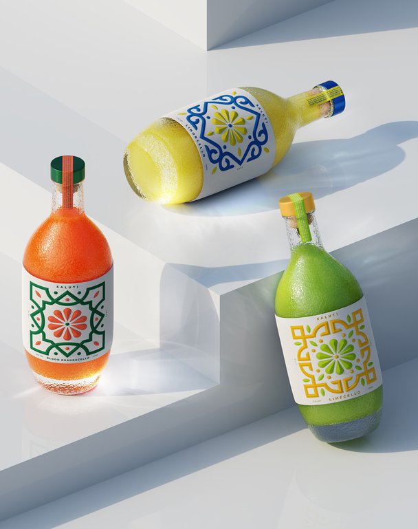
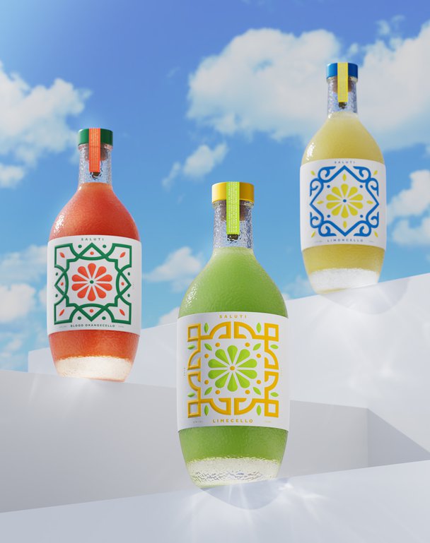
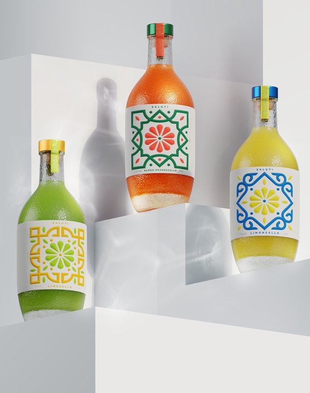
Building on our original Saluti concept's success, we explored how a citrus-based spirits brand could evolve. This design exploration imagined not just one, but two new additions: Blood Orange and Lime-Cello – each bringing their own personality while maintaining the brand's distinctive character.
THE CHALLENGE
How do you expand a design system while maintaining its soul? Our task was to envision how new flavours could stand confidently alone while creating a harmonious family. Each variant needed its own personality while contributing to a larger brand story.
OUR APPROACH
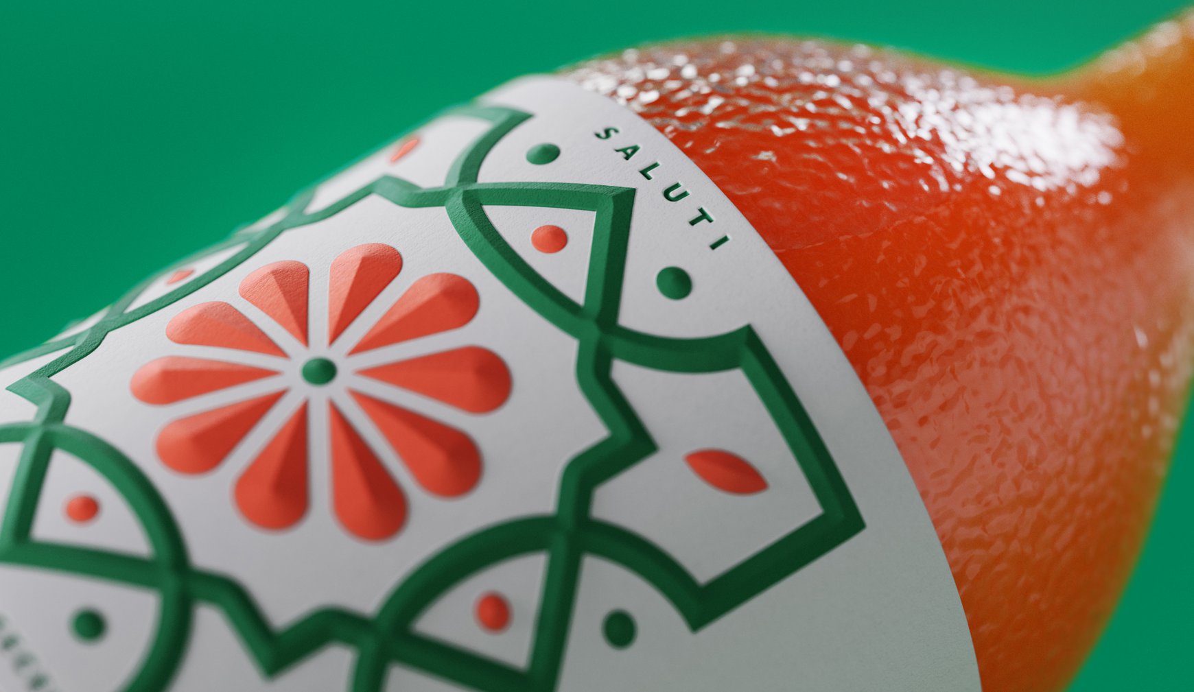
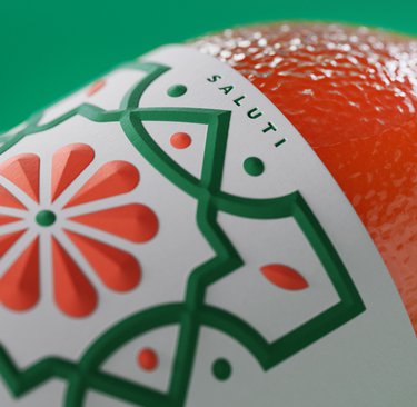
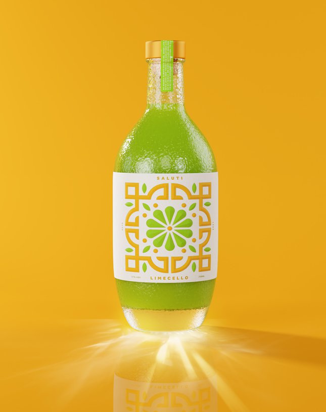
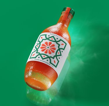
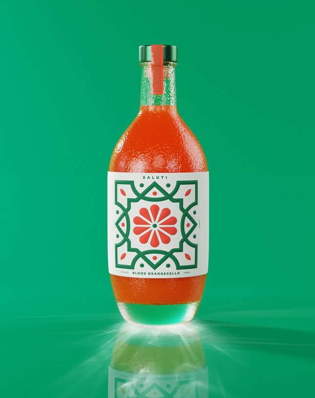
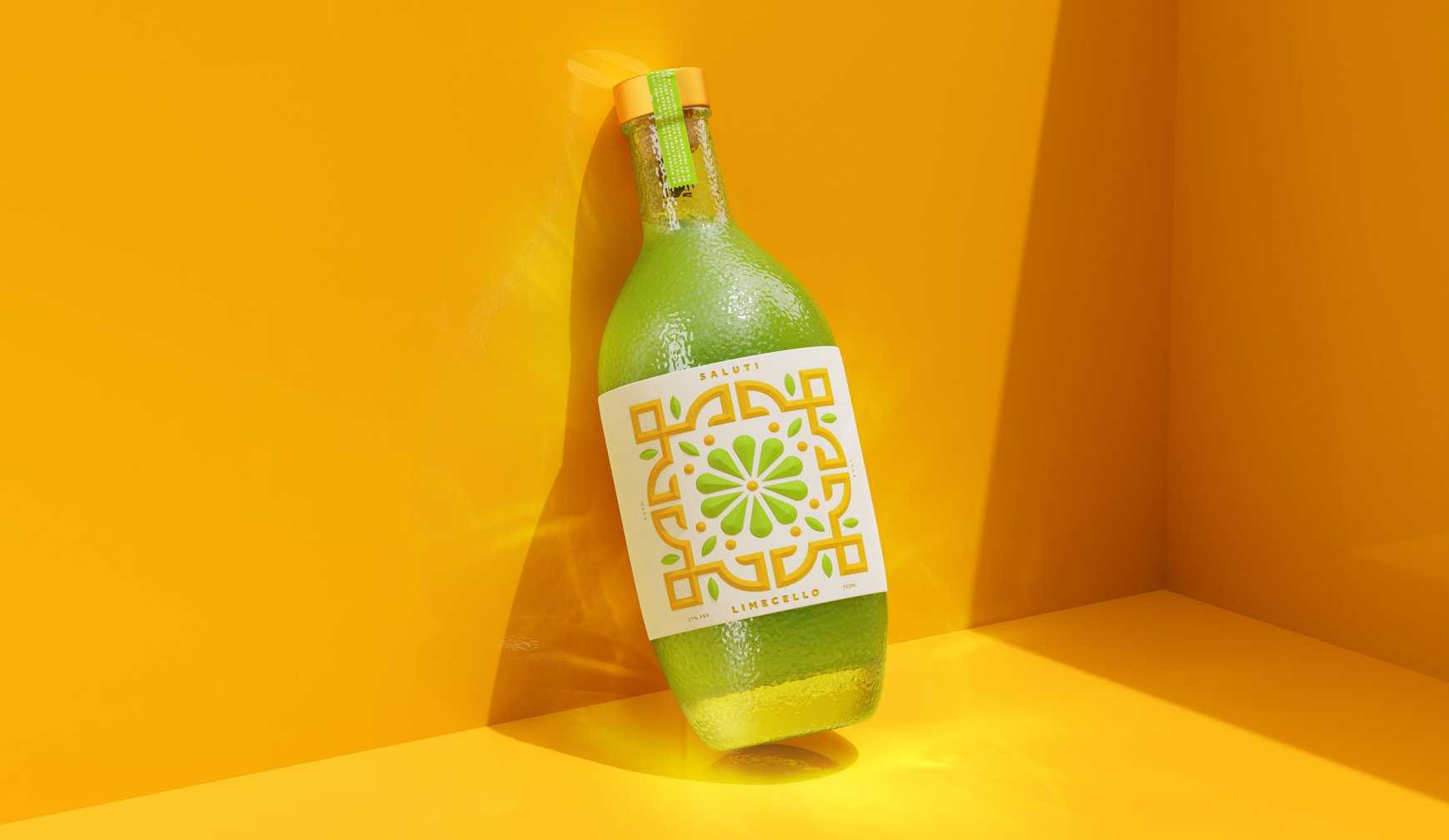
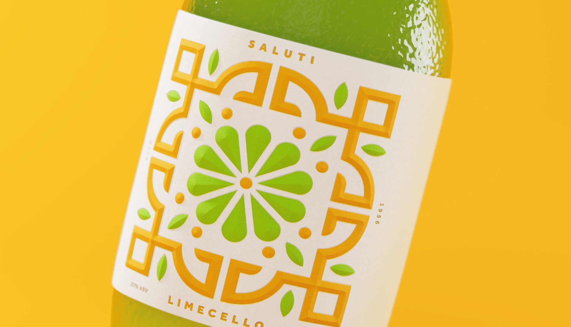
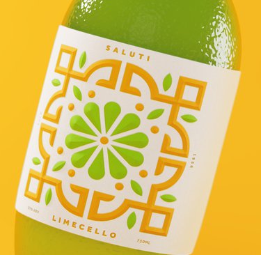
We used the familiar curve of our bottle design, inspired by citrus skin texture, as our canvas. For each variant, we created distinctive tile designs that celebrate the unique character of each fruit. The Lime-Cello radiates with vibrant green patterns that capture its crisp tartness, while Blood Orange combines leafy greens with deep reds to mirror nature's own artwork.
At the heart of each design sits an abstract citrus shape, creating a visual anchor that unifies the range. The neck label echoes fruit stickers found in Mediterranean markets, stamping each bottle with authenticity.
THE IMPACT
Our design exploration demonstrates how thoughtful brand architecture can flex and grow. By turning each citrus variety into its own artistic expression, we created a system that celebrates individuality while maintaining family ties – proving that good design, like good spirits, brings things together.
Building on our original Saluti concept's success, we explored how a citrus-based spirits brand could evolve. This design exploration imagined not just one, but two new additions: Blood Orange and Lime-Cello – each bringing their own personality while maintaining the brand's distinctive character.
THE CHALLENGE
How do you expand a design system while maintaining its soul? Our task was to envision how new flavours could stand confidently alone while creating a harmonious family. Each variant needed its own personality while contributing to a larger brand story.
OUR APPROACH
We used the familiar curve of our bottle design, inspired by citrus skin texture, as our canvas. For each variant, we created distinctive tile designs that celebrate the unique character of each fruit. The Lime-Cello radiates with vibrant green patterns that capture its crisp tartness, while Blood Orange combines leafy greens with deep reds to mirror nature's own artwork.
At the heart of each design sits an abstract citrus shape, creating a visual anchor that unifies the range. The neck label echoes fruit stickers found in Mediterranean markets, stamping each bottle with authenticity.
THE IMPACT
Our design exploration demonstrates how thoughtful brand architecture can flex and grow. By turning each citrus variety into its own artistic expression, we created a system that celebrates individuality while maintaining family ties – proving that good design, like good spirits, brings things together.