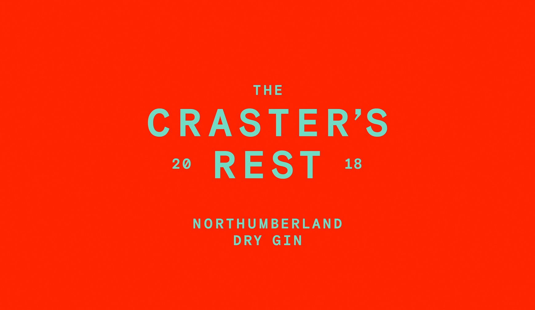
The Craster's Rest
The Craster's Rest
Where Dutch courage meets design
THE STORY
Hidden in the salty air of Craster, a small fishing town in Northumbria, lies a story worth telling. For generations, local fishers had been brewing their own gin, adding a pinch of sea salt for that extra bit of 'Dutch courage' before facing the brutal North Sea. This tale of tradition and bravery inspired our exploration of how a modern gin brand could capture centuries of fishing heritage in a bottle.
THE CHALLENGE
How do you bottle a town's history? Our design concept needed to do more than just look good on a shelf – it needed to tell the story of Craster's fishing heritage, honour a secret recipe passed down through generations, and create something that felt as authentic as the community it represented.
OUR APPROACH
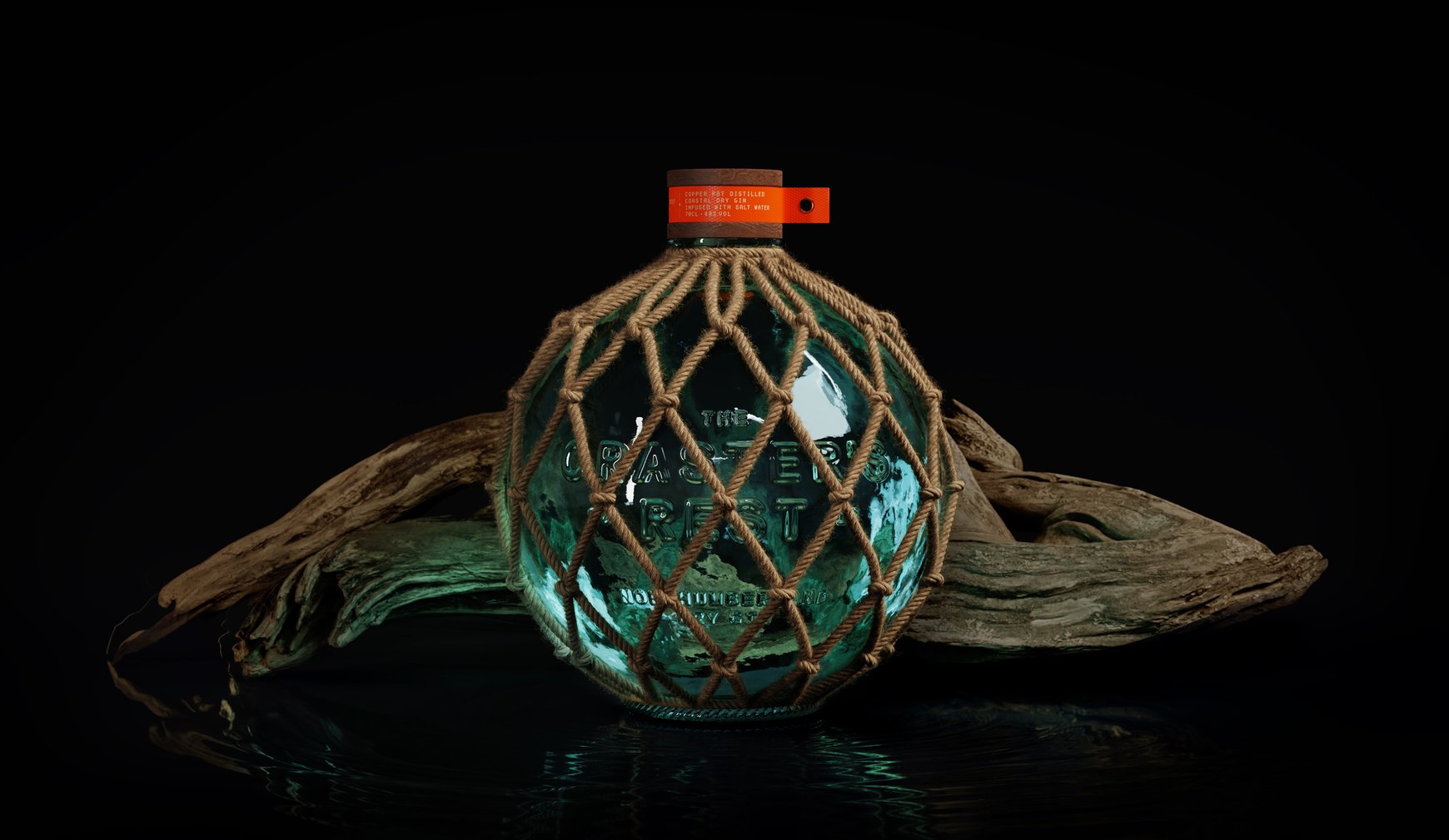
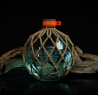
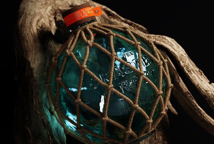
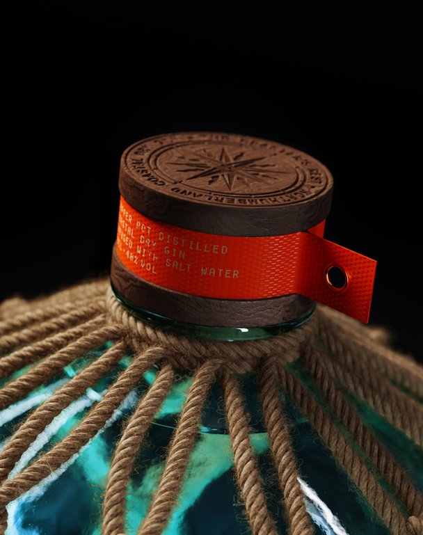
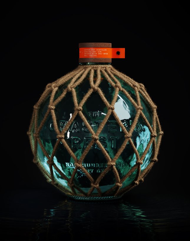
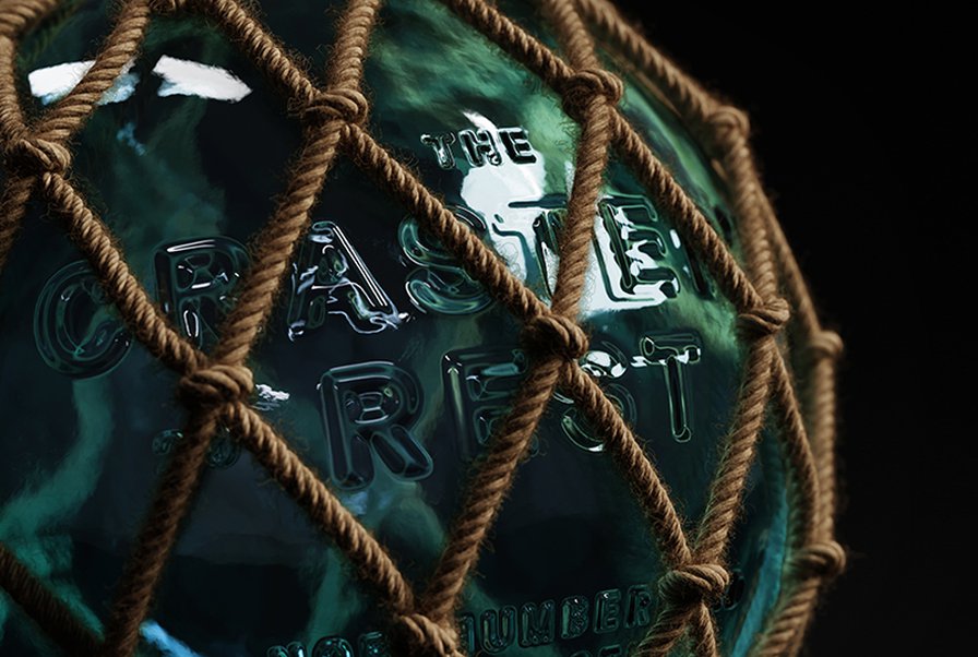
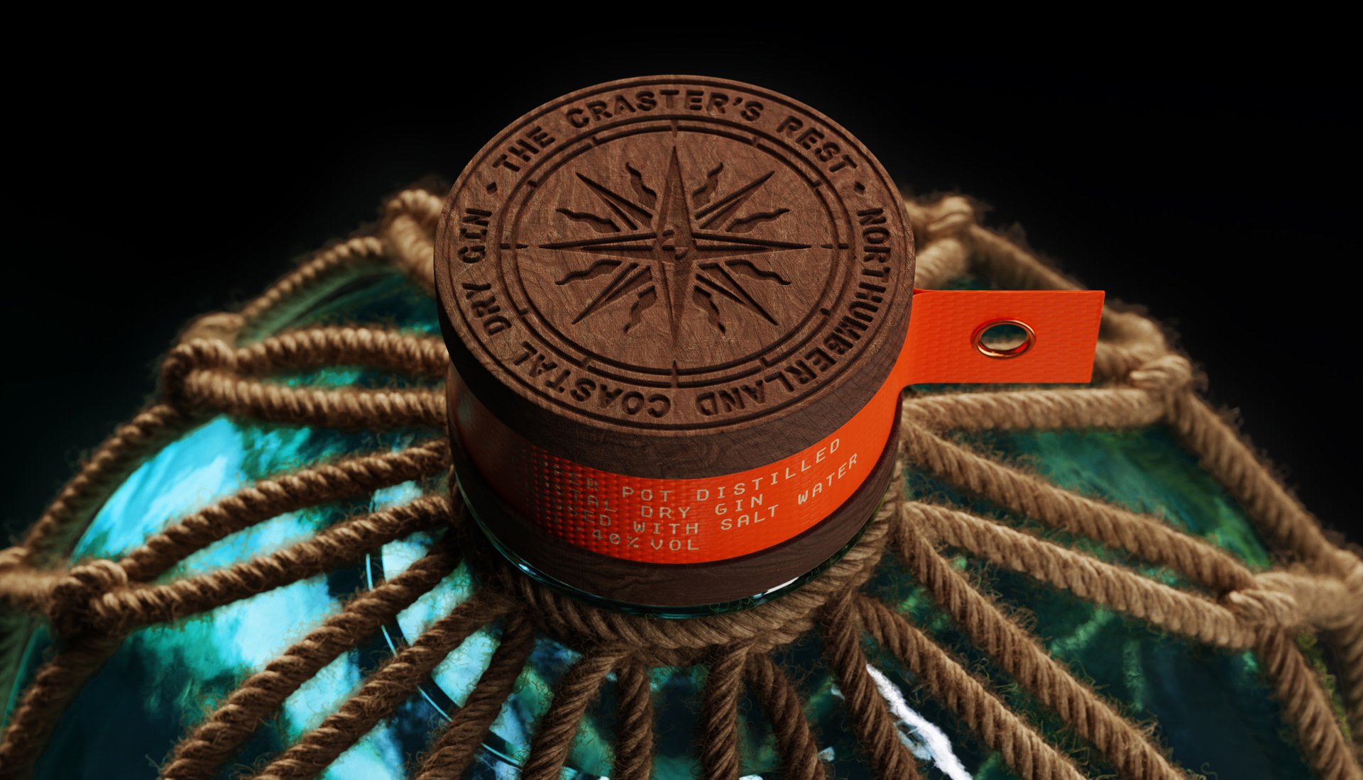
We started with the name – 'The Craster's Rest' – inspired by an old sailor's tale that the town only truly rests when its fishers return safely. But it was the bottle design where things got really interesting. Looking at old fishing equipment, we found our hero: glass buoys from the 1900s, used to keep fishing nets afloat.
Taking this inspiration, we designed a bottle that mirrors these buoys, complete with heavy knotted rope casing. It's not just decoration – it's a functional protective nod to how these buoys were actually used. Every detail was considered to create something that would feel at home both in a modern bar and a fisherman's cabin.
THE IMPACT
This design exploration shows how rich stories can inspire rich design. By diving deep into Craster's fishing heritage, we created a concept that proves sometimes the best way forward is to look back – especially when there's a secret gin recipe involved.
Hidden in the salty air of Craster, a small fishing town in Northumbria, lies a story worth telling. For generations, local fishers had been brewing their own gin, adding a pinch of sea salt for that extra bit of 'Dutch courage' before facing the brutal North Sea. This tale of tradition and bravery inspired our exploration of how a modern gin brand could capture centuries of fishing heritage in a bottle.
THE CHALLENGE
How do you bottle a town's history? Our design concept needed to do more than just look good on a shelf – it needed to tell the story of Craster's fishing heritage, honour a secret recipe passed down through generations, and create something that felt as authentic as the community it represented.
OUR APPROACH
We started with the name – 'The Craster's Rest' – inspired by an old sailor's tale that the town only truly rests when its fishers return safely. But it was the bottle design where things got really interesting. Looking at old fishing equipment, we found our hero: glass buoys from the 1900s, used to keep fishing nets afloat.
Taking this inspiration, we designed a bottle that mirrors these buoys, complete with heavy knotted rope casing. It's not just decoration – it's a functional protective nod to how these buoys were actually used. Every detail was considered to create something that would feel at home both in a modern bar and a fisherman's cabin.
THE IMPACT
This design exploration shows how rich stories can inspire rich design. By diving deep into Craster's fishing heritage, we created a concept that proves sometimes the best way forward is to look back – especially when there's a secret gin recipe involved.