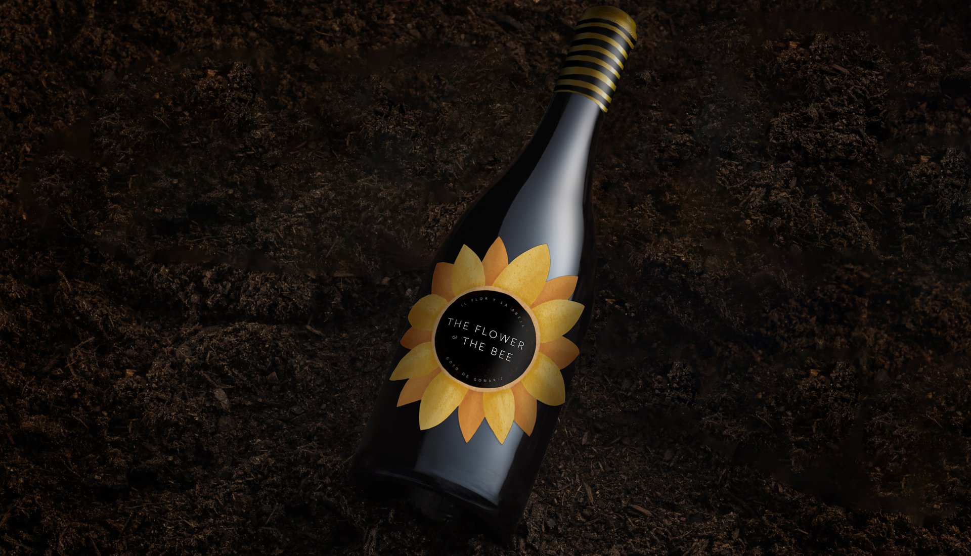
The Flower & The Bee
The Flower & The Bee
Making wine labels work harder
THE STORY
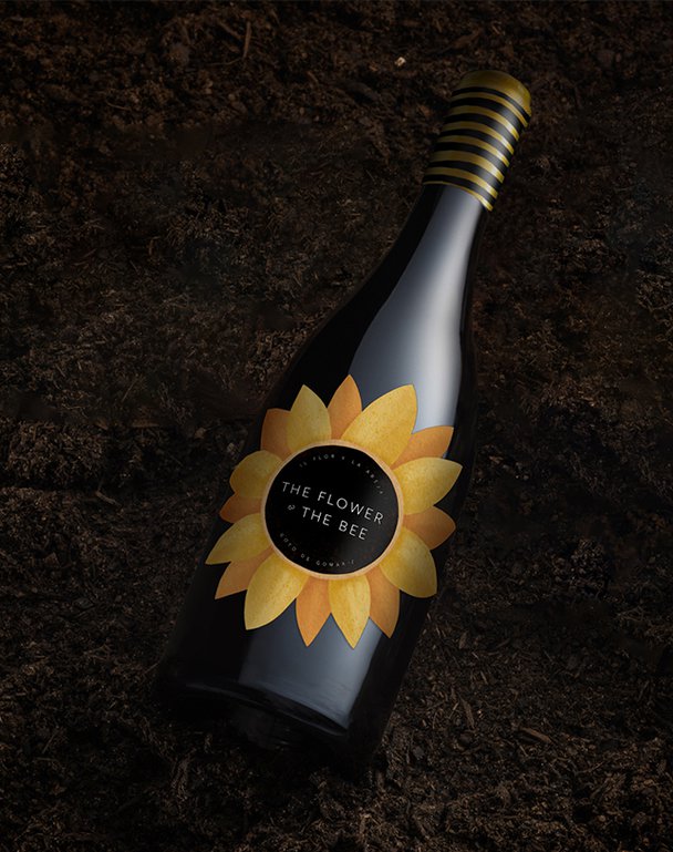
Deep in Spain's Gomariz valley, something special is happening. A young vineyard is doing things differently - handpicking their Treixadura grapes, keeping things sustainable, and creating a home for local wildlife. They called their wine 'The Flower and the Bee' as a nod to their eco-friendly approach. Our job? Turn that commitment to nature into a design worth buzzing about.
THE CHALLENGE
How do you make sustainability look sophisticated on a wine shelf? We needed to create a label that would tell an environmental story without looking like a science textbook, celebrate the relationship between flowers and bees, and still look like something you'd want to serve at dinner.
OUR APPROACH
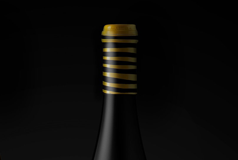
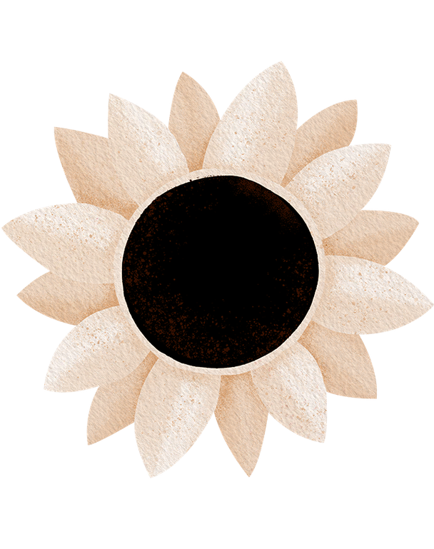
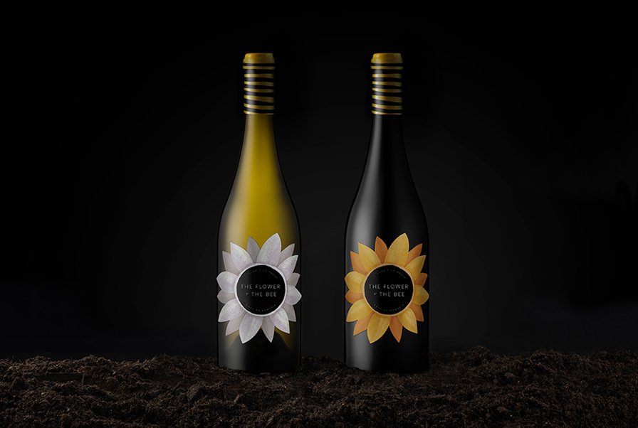
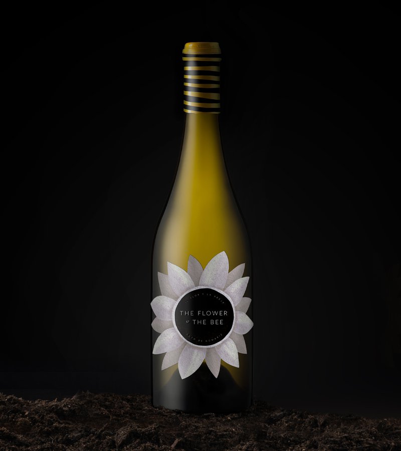
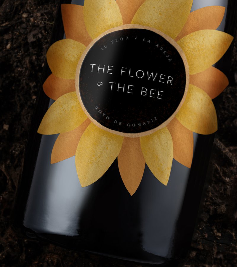
We turned the whole bottle into a storytelling canvas. The clever bit? We transformed the ampersand into a minimalist bee - a small detail that creates big impact. The brand mark plays it cool in the background, letting our statement labels do the talking.
Each label works like a tiny chapter in the vineyard's story, showing how good wine and good environmental practices go hand in hand.
THE IMPACT
The result is more than just another pretty wine label - it's proof that sustainable stories can be told with style. By turning every element of the packaging into part of the narrative, we've created a bottle that stands out on shelves while standing up for something bigger.
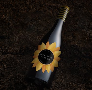
Deep in Spain's Gomariz valley, something special is happening. A young vineyard is doing things differently - handpicking their Treixadura grapes, keeping things sustainable, and creating a home for local wildlife. They called their wine 'The Flower and the Bee' as a nod to their eco-friendly approach. Our job? Turn that commitment to nature into a design worth buzzing about.
THE CHALLENGE
How do you make sustainability look sophisticated on a wine shelf? We needed to create a label that would tell an environmental story without looking like a science textbook, celebrate the relationship between flowers and bees, and still look like something you'd want to serve at dinner.
OUR APPROACH
We turned the whole bottle into a storytelling canvas. The clever bit? We transformed the ampersand into a minimalist bee - a small detail that creates big impact. The brand mark plays it cool in the background, letting our statement labels do the talking.
Each label works like a tiny chapter in the vineyard's story, showing how good wine and good environmental practices go hand in hand.
THE IMPACT
The result is more than just another pretty wine label - it's proof that sustainable stories can be told with style. By turning every element of the packaging into part of the narrative, we've created a bottle that stands out on shelves while standing up for something bigger.