Danu
Danu
Less filler, more flavour
The story
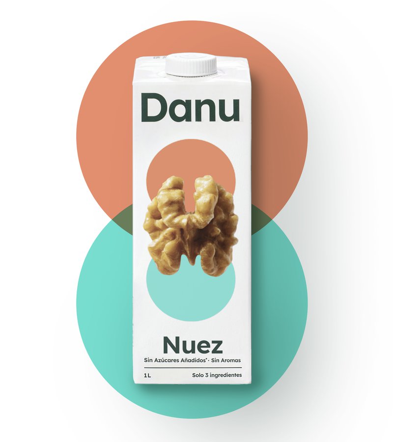
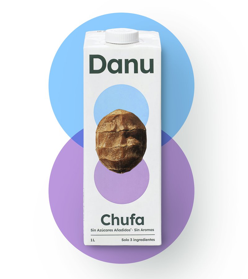
The plant-based milk aisle is getting crowded. While most brands are busy adding to their drinks with all sorts of additions, Danu is taking a refreshingly different approach. This Spanish nut milk brand is going back to basics - more nuts, fewer fillers, maximum flavour. Their philosophy is beautifully straightforward: chuck in more nuts, keep the ingredient list short and sweet, and let quality do the talking.
The challenge
Create a brand that celebrates simplicity in a category that often tries too hard. How do you make 'less is more' feel like 'more is better'? Our challenge was to bring Danu's stripped-back philosophy to life visually, making simplicity the hero in a cluttered category.
Our approach
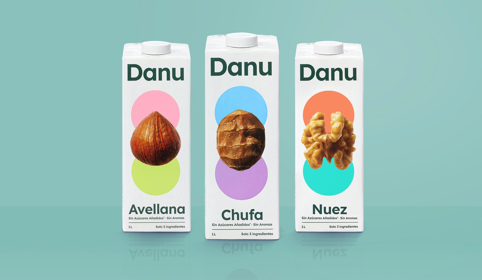
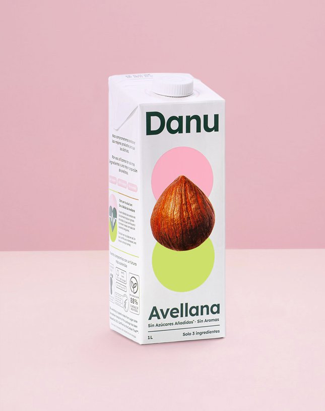
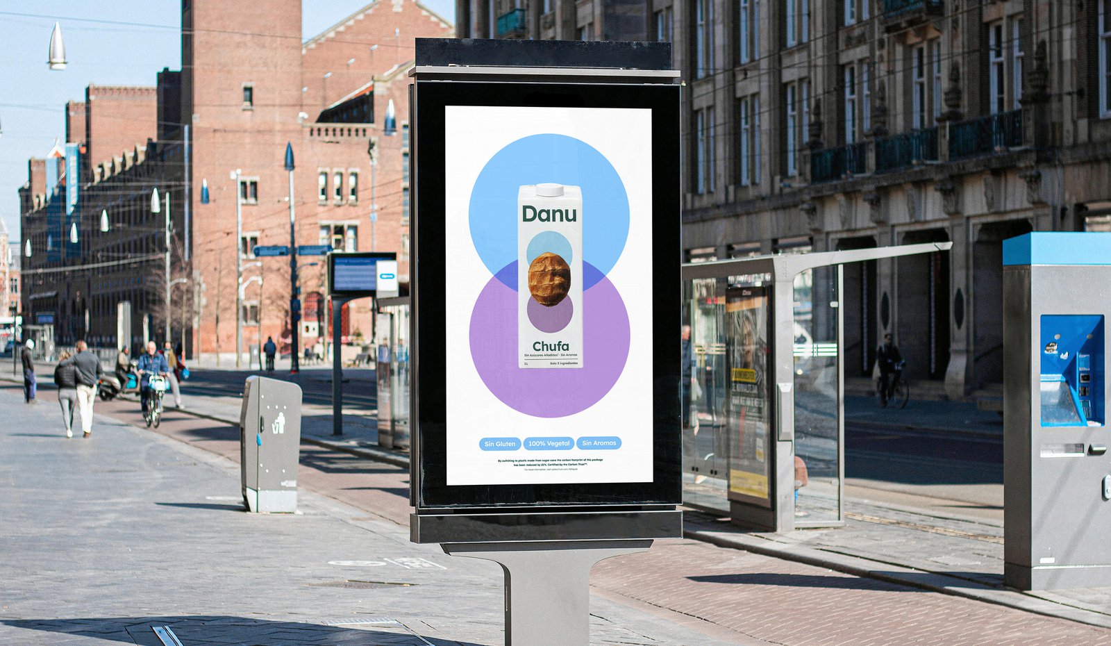
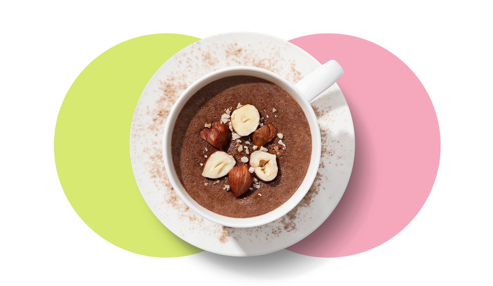
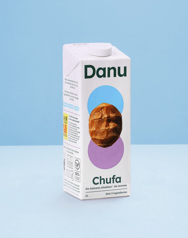
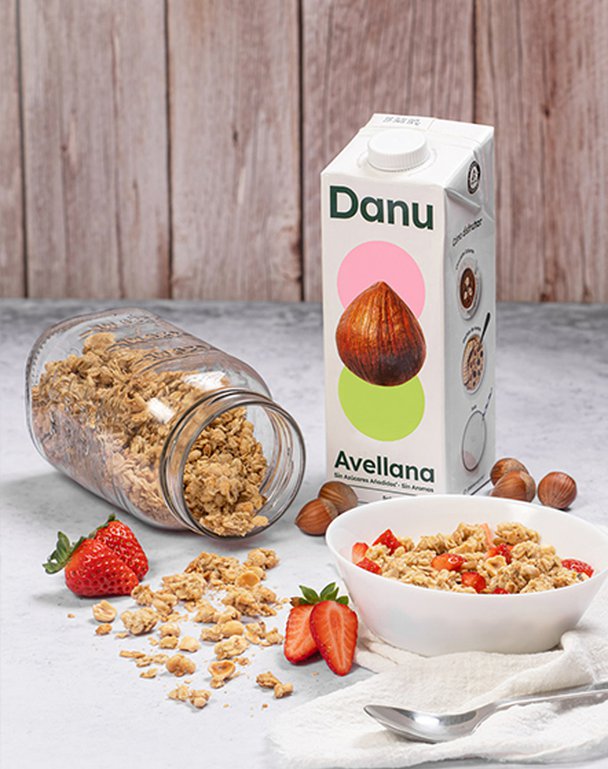
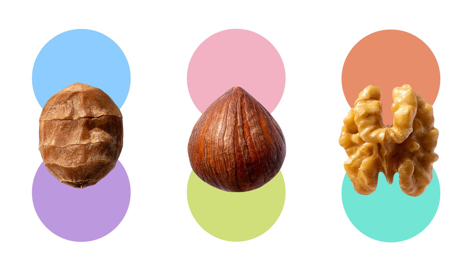
The design is deliciously minimal, just like the ingredients list. A hero nut takes centre stage on every pack - making no confusion about what's inside. The logo and supporting graphics have been purposefully stripped back to their simplest forms, creating a visual echo of the product's 'less is more' mantra. Every design element has been carefully considered to reflect Danu's core truth: the best things in life don't need complications.
The impact
What we've created isn't just another alternative milk - it's a category rebel that's impossible to ignore. The stripped-back aesthetic makes a bold statement where others clutter, creating a proper breath of fresh air for the category. It's honest, confident simplicity that lets the product's purity shine through and stands out by doing less, not more.
The plant-based milk aisle is getting crowded. While most brands are busy adding to their drinks with all sorts of additions, Danu is taking a refreshingly different approach. This Spanish nut milk brand is going back to basics - more nuts, fewer fillers, maximum flavour. Their philosophy is beautifully straightforward: chuck in more nuts, keep the ingredient list short and sweet, and let quality do the talking.
The challenge
Create a brand that celebrates simplicity in a category that often tries too hard. How do you make 'less is more' feel like 'more is better'? Our challenge was to bring Danu's stripped-back philosophy to life visually, making simplicity the hero in a cluttered category.
Our approach
The design is deliciously minimal, just like the ingredients list. A hero nut takes centre stage on every pack - making no confusion about what's inside. The logo and supporting graphics have been purposefully stripped back to their simplest forms, creating a visual echo of the product's 'less is more' mantra. Every design element has been carefully considered to reflect Danu's core truth: the best things in life don't need complications.
The impact
What we've created isn't just another alternative milk - it's a category rebel that's impossible to ignore. The stripped-back aesthetic makes a bold statement where others clutter, creating a proper breath of fresh air for the category. It's honest, confident simplicity that lets the product's purity shine through and stands out by doing less, not more.