Gibloux
Gibloux
An iconic design for an iconic cheese
THE STORY
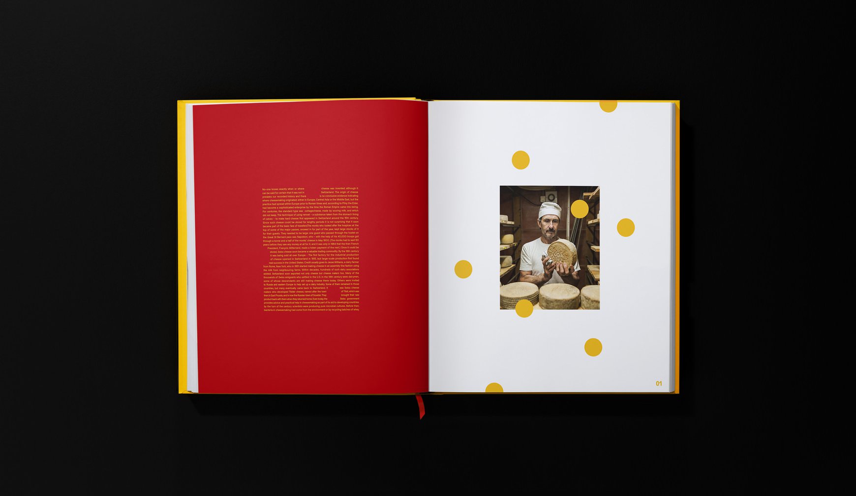
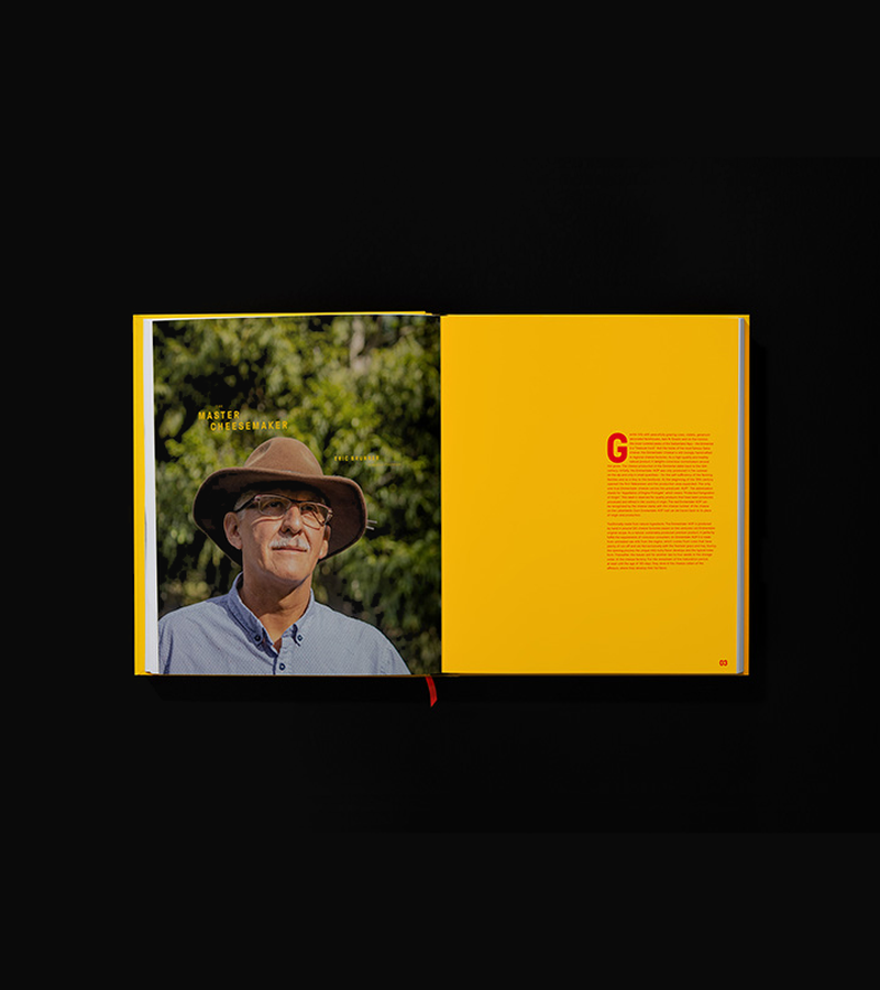
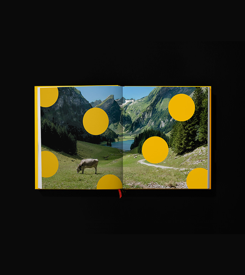
Inspired by a master cheesemaker's journey and Swiss heritage, we explored how Emmental's most distinctive feature – its holes – could become the cornerstone of a contemporary premium brand. This concept imagined how traditional cheese-making could be elevated through design that honours both craft and character.
THE CHALLENGE
How do you create a distinctive brand for a cheese that everyone knows? Our design exploration needed to balance premium positioning with playful personality, respect Swiss heritage while feeling contemporary, and most importantly – transform Emmental's famous holes from a feature into a brand asset.
OUR APPROACH
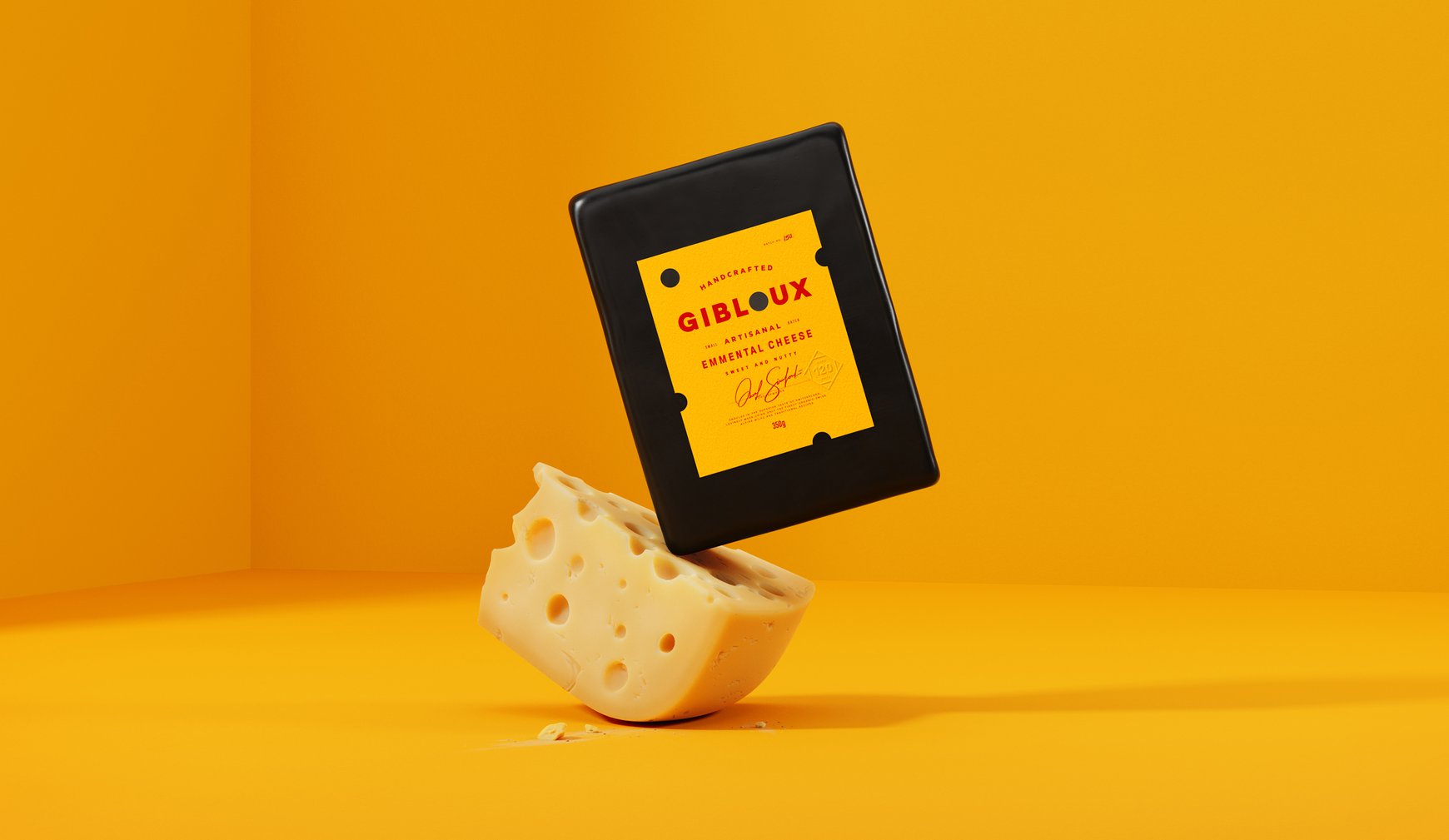
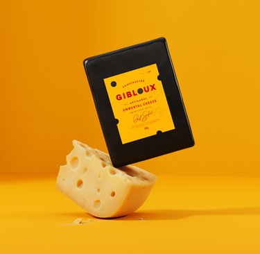
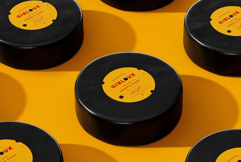
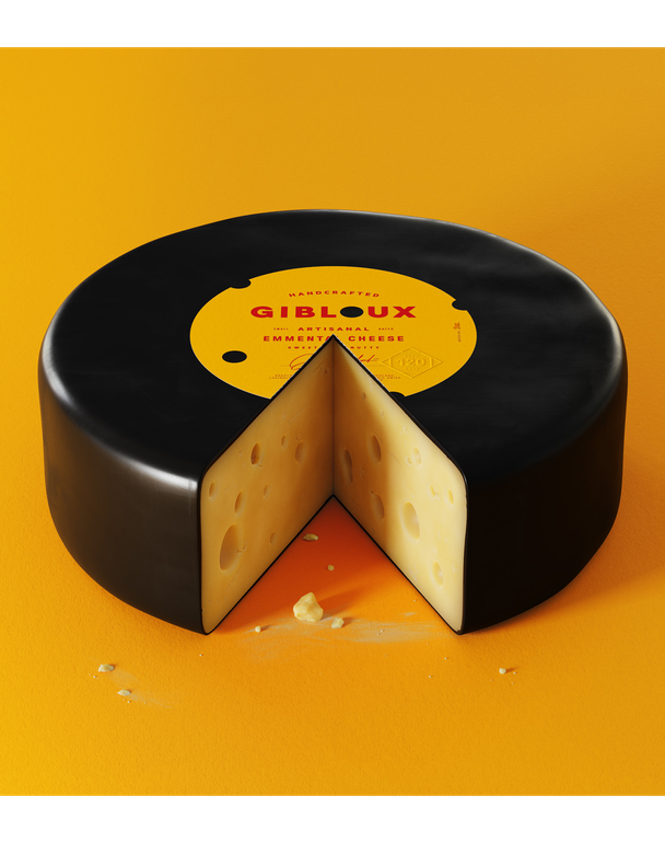
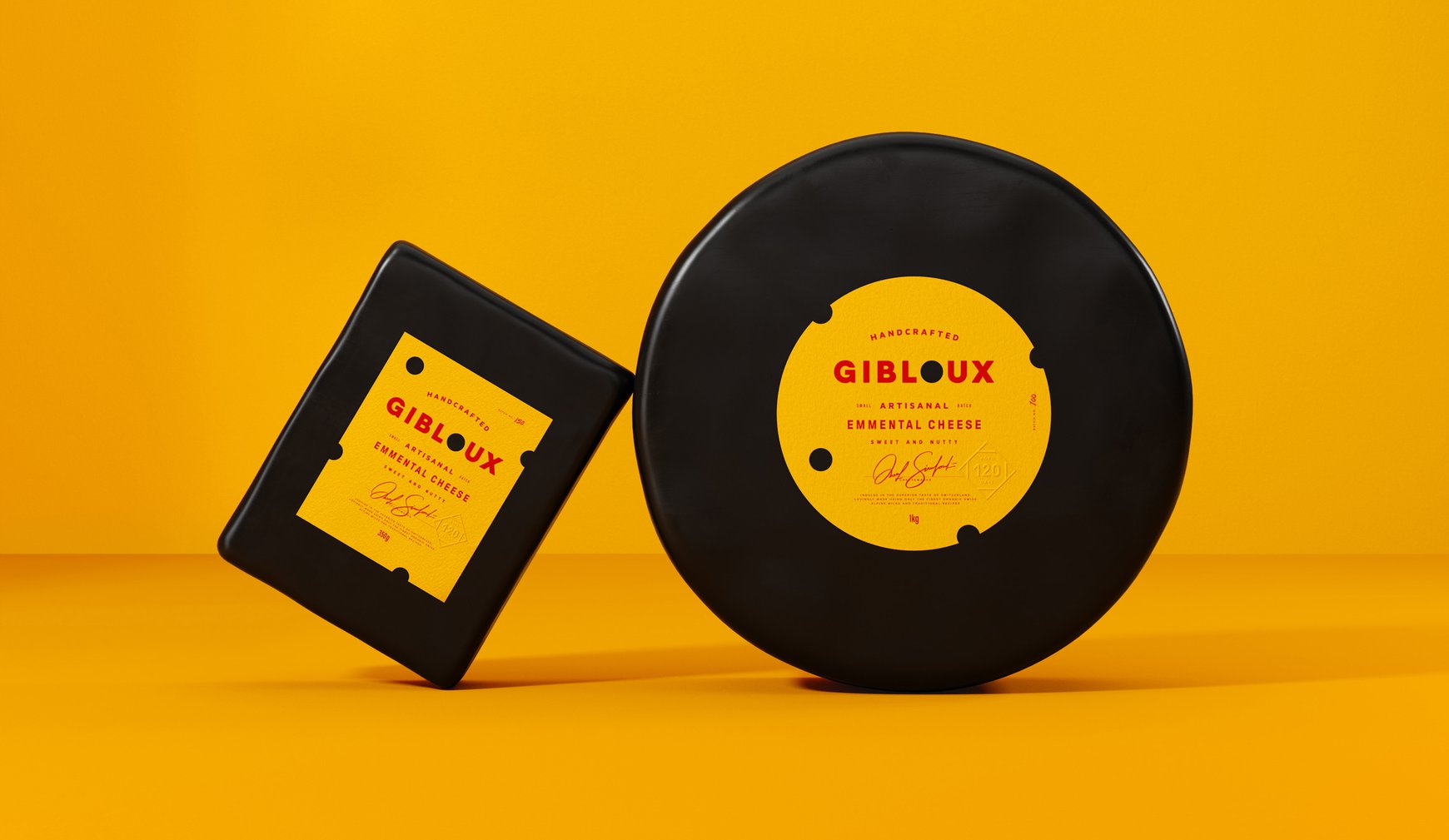
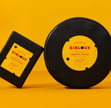
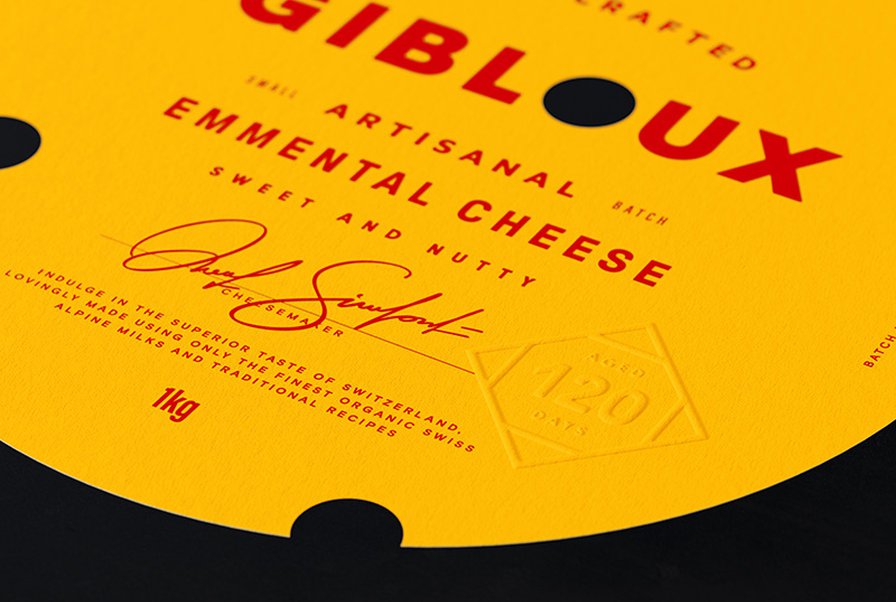
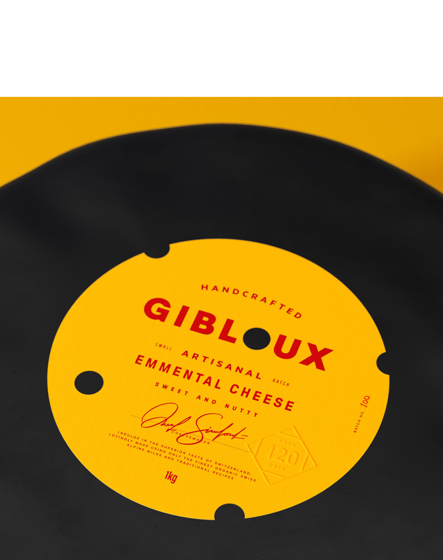
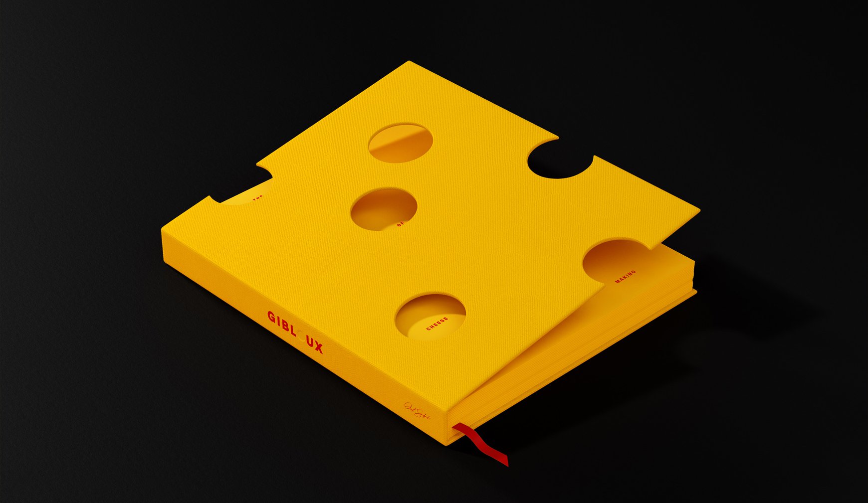
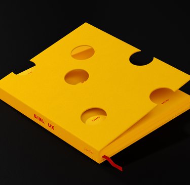
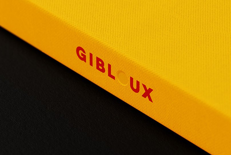
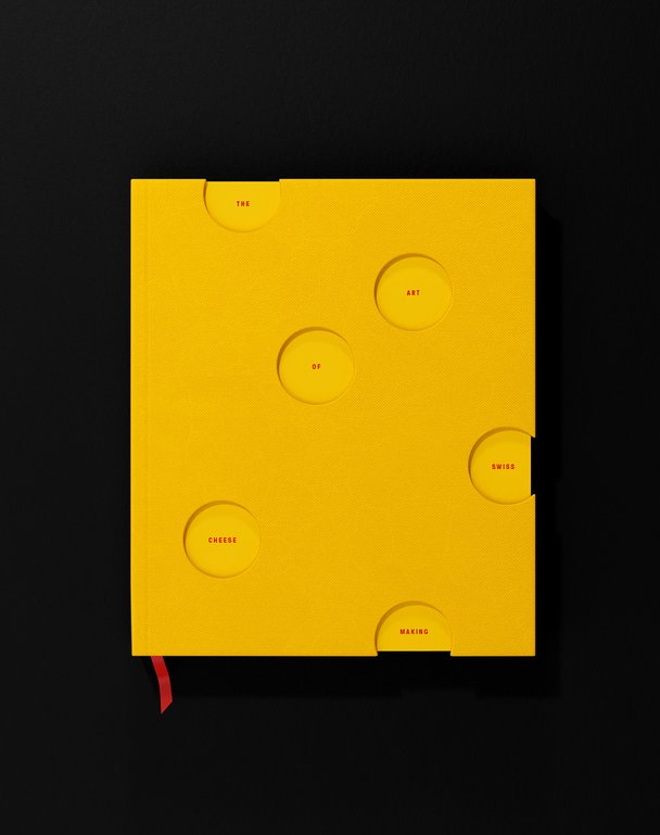
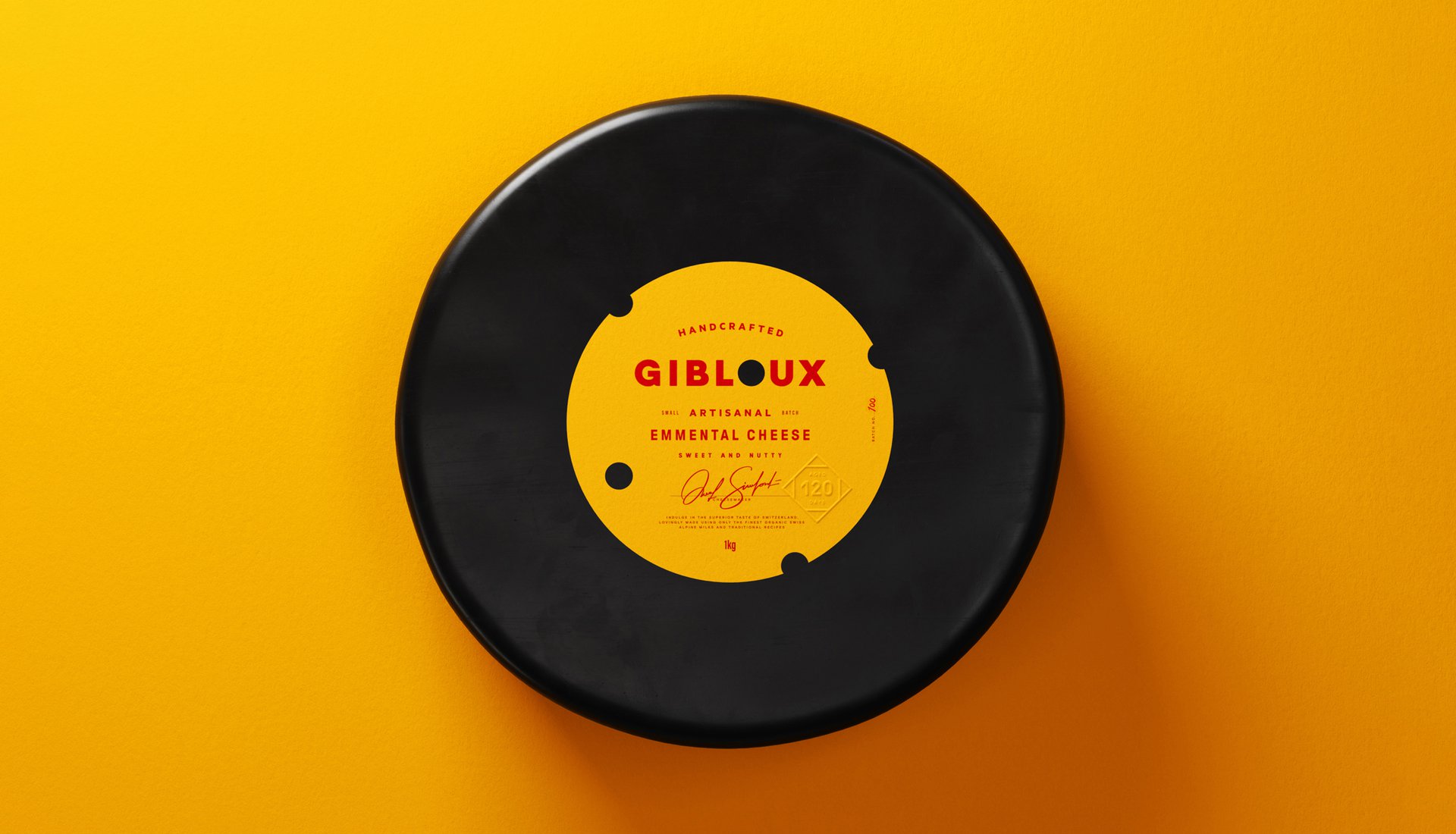
We created the name Gibloux, rooted in the Fribourg region of Switzerland. The visual identity draws from the region's flag and crest, using traditional Swiss yellow, red, and black to ground the brand in authenticity. For typography, we looked to aged whisky labels, elevating the cheese to the premium position it deserves. Our breakthrough came when we turned Emmental's distinctive holes into a design feature – using disruptive die cuts throughout the packaging to create a playful nod to the cheese itself.
THE IMPACT
This design study shows how a product's distinctive characteristic can become its greatest brand asset. By turning holes into a design feature, we've demonstrated how thoughtful design can transform the familiar into something unexpected – creating a system that could work across packaging, books, and retail environments.
Inspired by a master cheesemaker's journey and Swiss heritage, we explored how Emmental's most distinctive feature – its holes – could become the cornerstone of a contemporary premium brand. This concept imagined how traditional cheese-making could be elevated through design that honours both craft and character.
THE CHALLENGE
How do you create a distinctive brand for a cheese that everyone knows? Our design exploration needed to balance premium positioning with playful personality, respect Swiss heritage while feeling contemporary, and most importantly – transform Emmental's famous holes from a feature into a brand asset.
OUR APPROACH
We created the name Gibloux, rooted in the Fribourg region of Switzerland. The visual identity draws from the region's flag and crest, using traditional Swiss yellow, red, and black to ground the brand in authenticity. For typography, we looked to aged whisky labels, elevating the cheese to the premium position it deserves. Our breakthrough came when we turned Emmental's distinctive holes into a design feature – using disruptive die cuts throughout the packaging to create a playful nod to the cheese itself.
THE IMPACT
This design study shows how a product's distinctive characteristic can become its greatest brand asset. By turning holes into a design feature, we've demonstrated how thoughtful design can transform the familiar into something unexpected – creating a system that could work across packaging, books, and retail environments.