Jam Packed
Jam Packed
Small batch, big impact
THE STORY
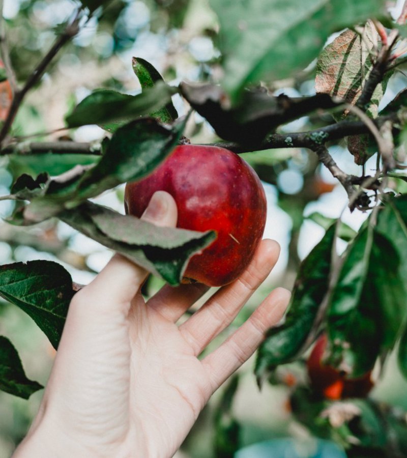
This is what happens when great jam meets greater purpose. Jam Packed Preserves started life in a humble allotment, making award-winning preserves that put supermarket jams to shame (seriously, they pack in way more fruit). But they're not just about making better jam – they're on a mission to support British farmers, wildlife, and those unsung heroes of the food world: pollinators. They came to us ready to level up their brand without losing their soul.
THE CHALLENGE
How do you take a small-but-mighty brand and give it packaging that matches its big heart and even bigger flavour? We needed to create something that would stand out on shelves, show off their commitment to quality, and tell their conservation story – all while making people really, really want to eat some jam.
OUR APPROACH
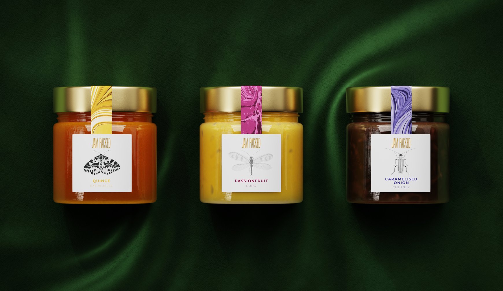
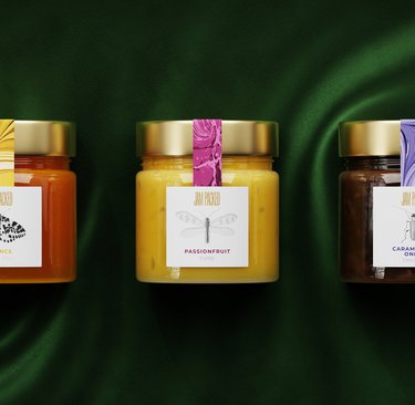
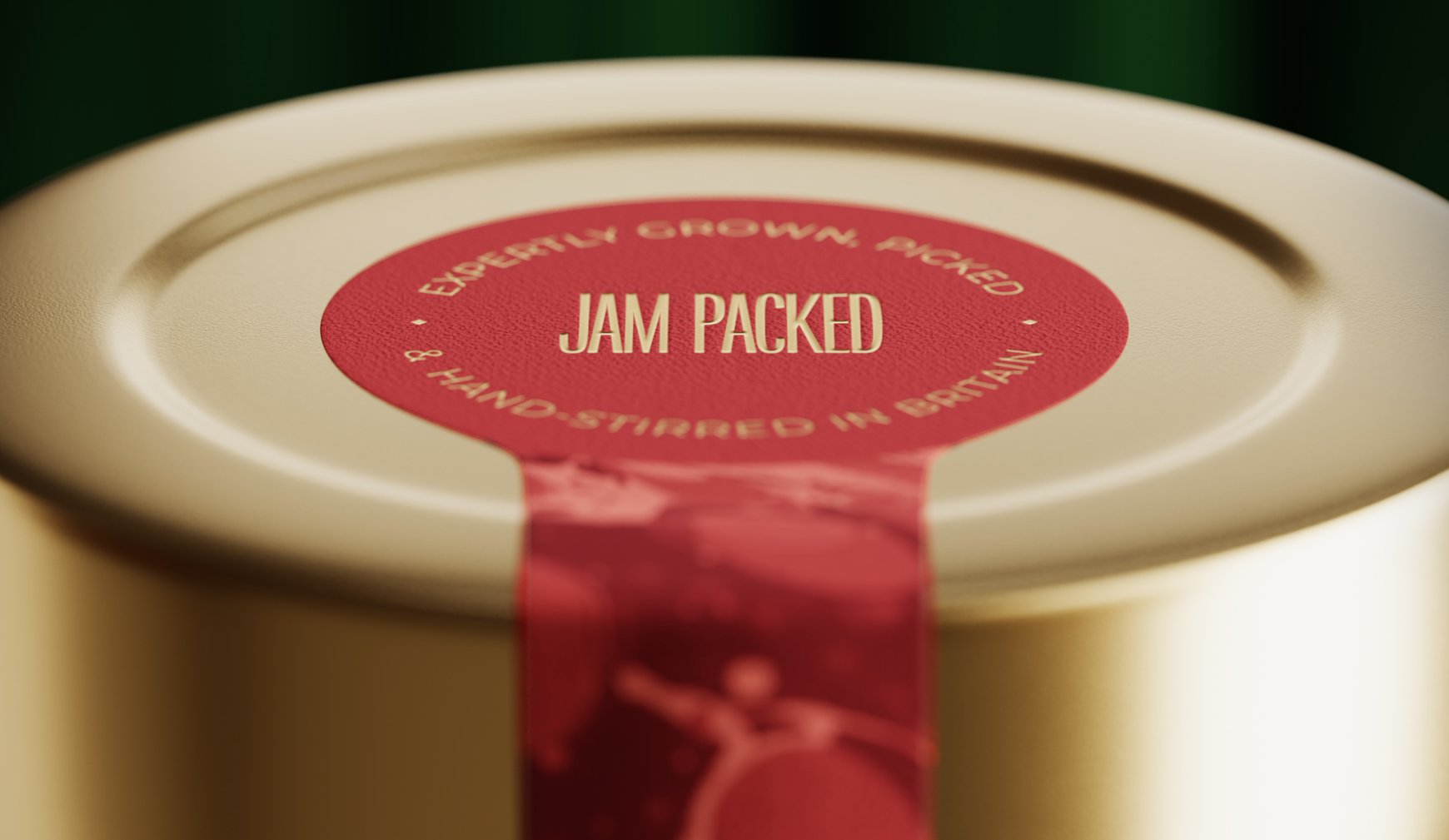
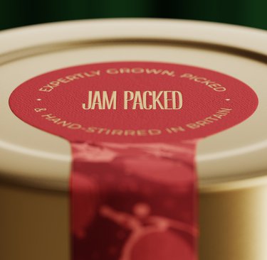
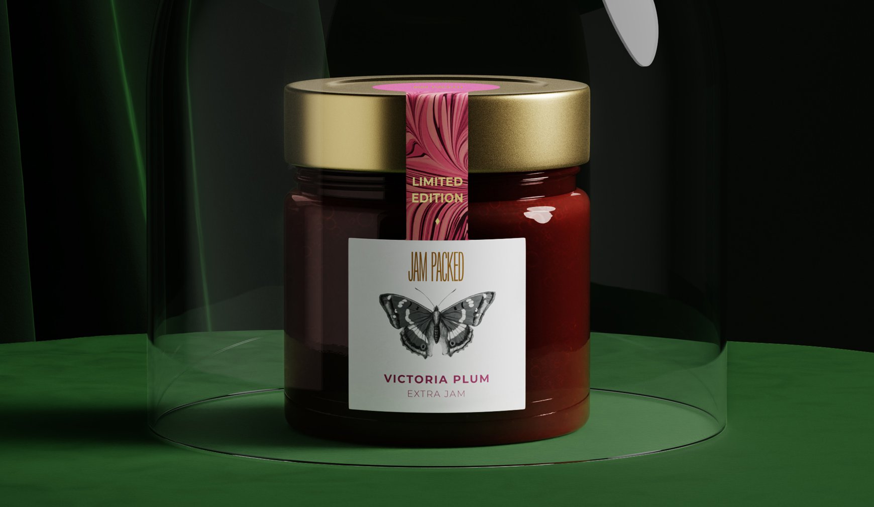
We started with their name – Jam Packed. It was too good not to play with. We created a condensed wordmark that looks like it's literally bursting at the seams, just like their jars (trust us, they don't skimp on fruit).
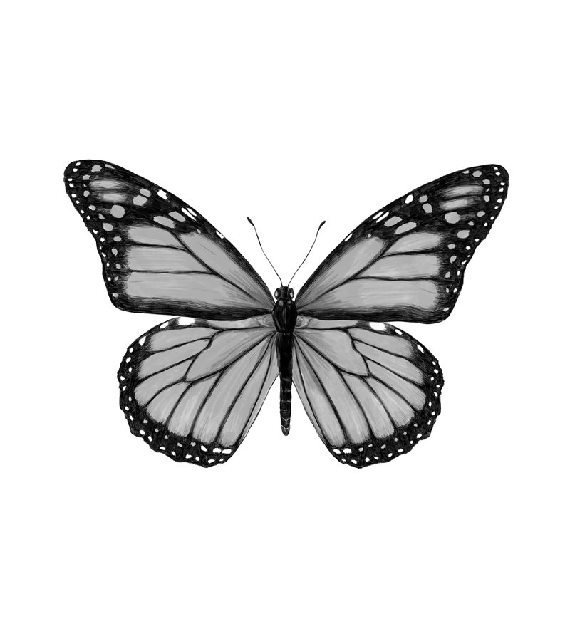
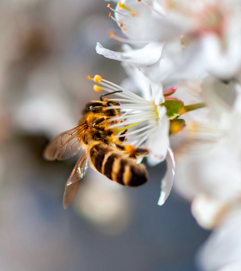
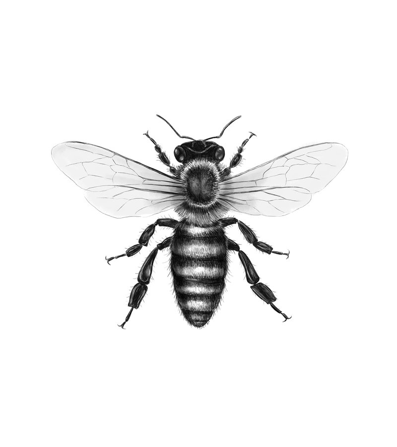
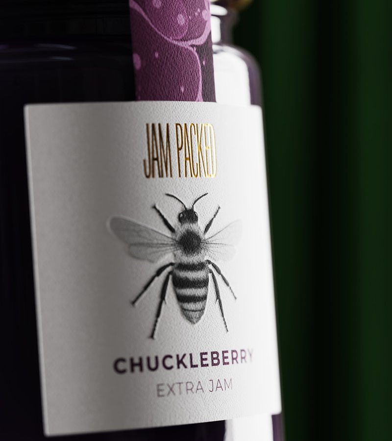
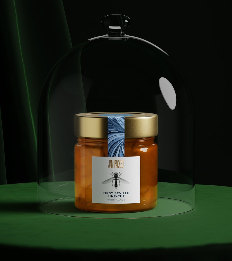
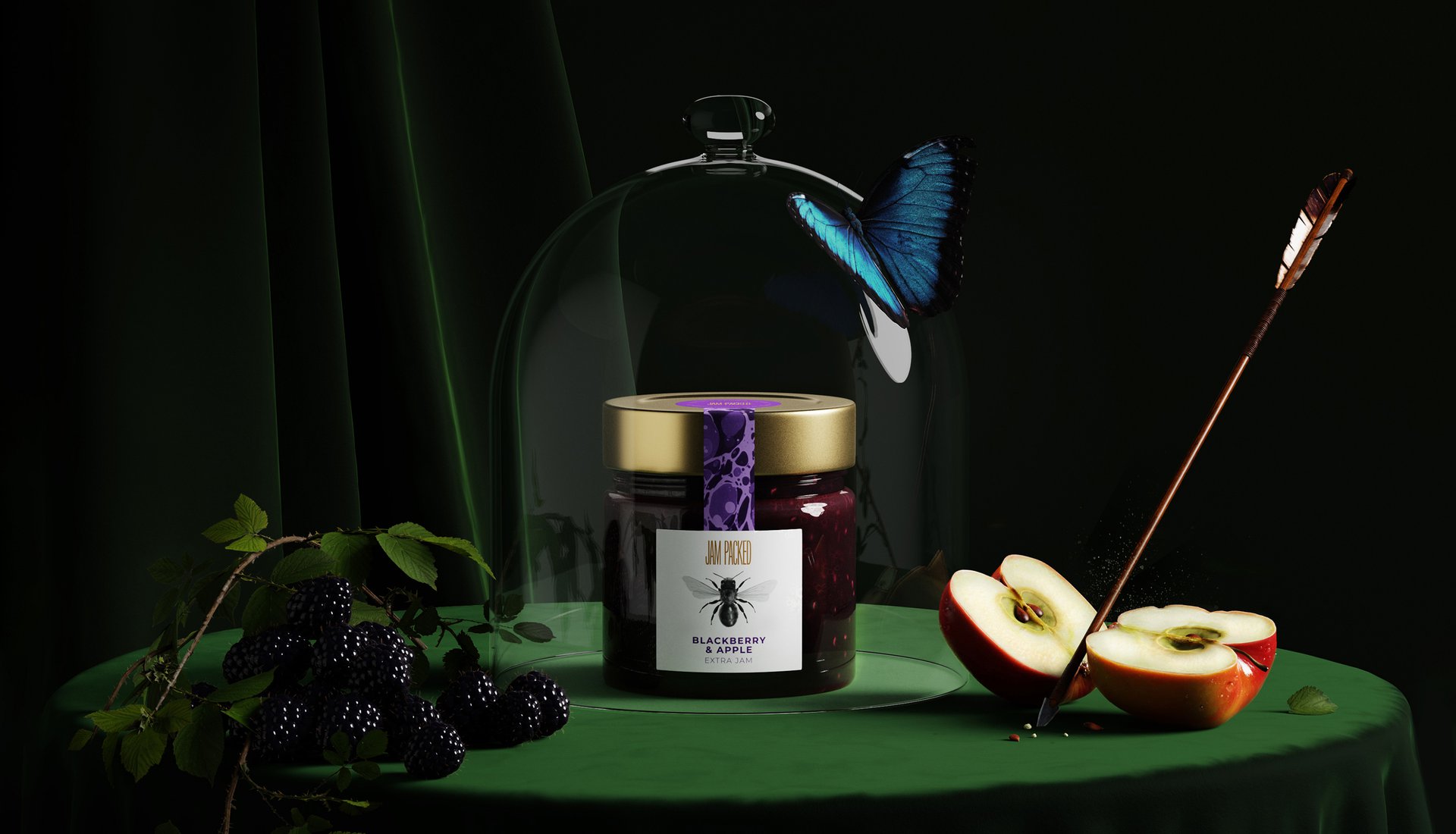
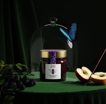
Each pack features a hand-illustrated British insect – the real MVPs of our food system. We made these pollinators the heroes of our design because, without them, we wouldn't have any jam to pack.
THE IMPACT
The result? A design system that's premium enough to justify the price point (proper fruit ain't cheap), but with enough character to tell the story of where great food really comes from.
This is what happens when great jam meets greater purpose. Jam Packed Preserves started life in a humble allotment, making award-winning preserves that put supermarket jams to shame (seriously, they pack in way more fruit). But they're not just about making better jam – they're on a mission to support British farmers, wildlife, and those unsung heroes of the food world: pollinators. They came to us ready to level up their brand without losing their soul.
THE CHALLENGE
How do you take a small-but-mighty brand and give it packaging that matches its big heart and even bigger flavour? We needed to create something that would stand out on shelves, show off their commitment to quality, and tell their conservation story – all while making people really, really want to eat some jam.
OUR APPROACH
We started with their name – Jam Packed. It was too good not to play with. We created a condensed wordmark that looks like it's literally bursting at the seams, just like their jars (trust us, they don't skimp on fruit).
Each pack features a hand-illustrated British insect – the real MVPs of our food system. We made these pollinators the heroes of our design because, without them, we wouldn't have any jam to pack.
THE IMPACT
The result? A design system that's premium enough to justify the price point (proper fruit ain't cheap), but with enough character to tell the story of where great food really comes from.