MINIPOP!
MINIPOP!
Small kernel, big attitude
THE STORY
Sometimes the best things come in small packages – just ask Sam and Laura from Popcorn Shed. They discovered an ancient grain that pops into the most adorable mini kernels you've ever seen. But they knew that in a world of supersize snacks, these tiny treasures needed a brand as bold as their flavour. That's when they asked us to help their little guys make a big noise.
THE CHALLENGE
How do you make something small stand out in a category that's all about bigger is better? We needed to create a sub-brand that would turn being mini from a weakness into a superpower, grab attention on crowded shelves, and make people root for the little guy. All while keeping it part of the Popcorn Shed family.
OUR APPROACH
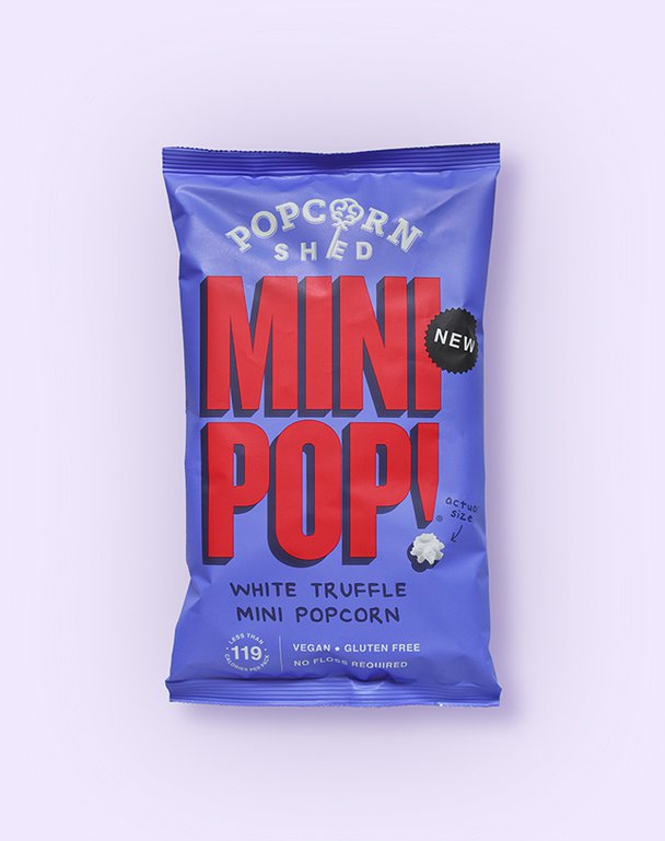
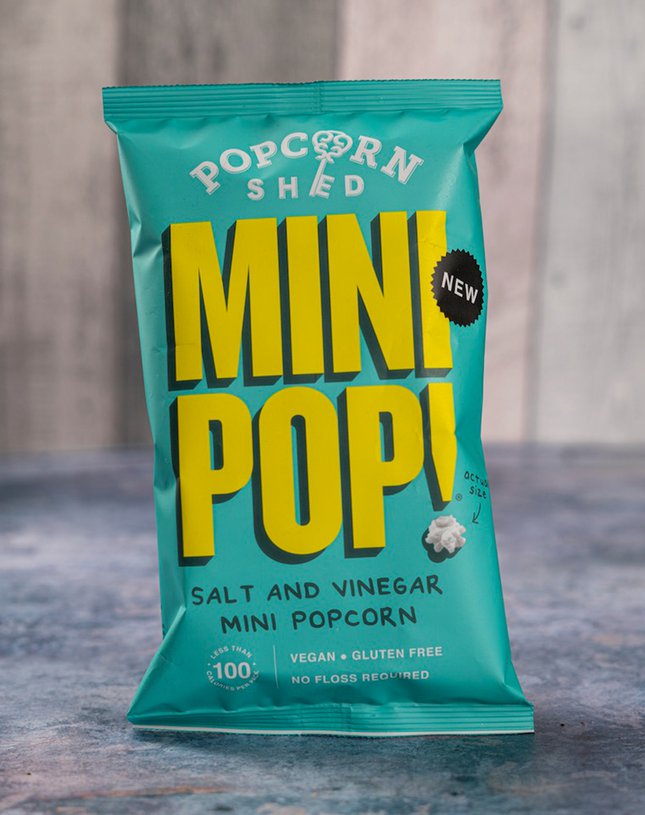
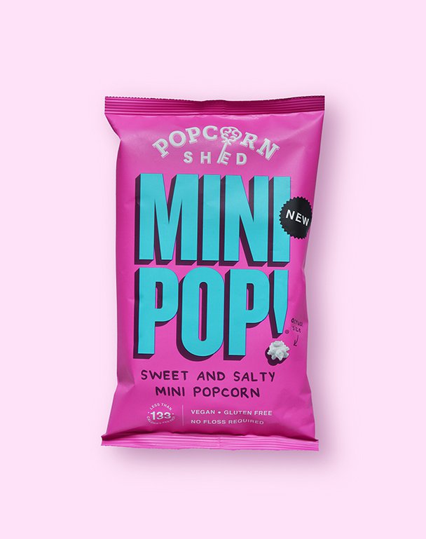
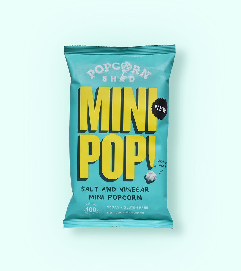
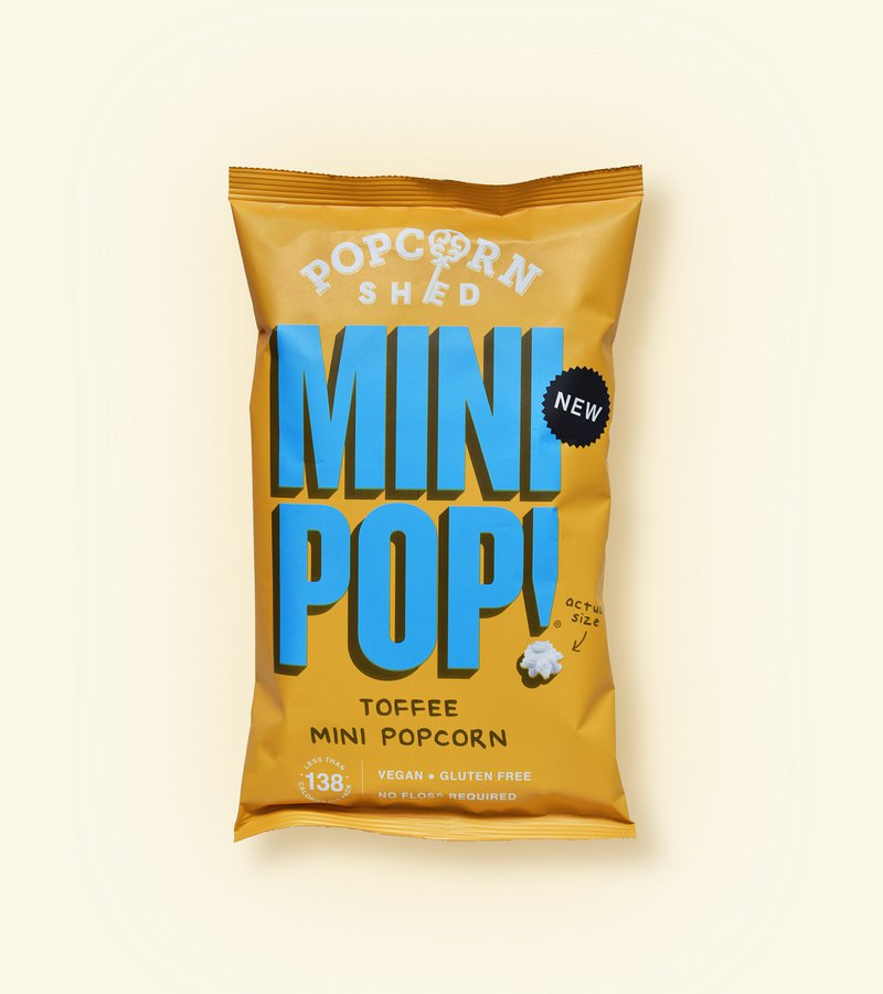
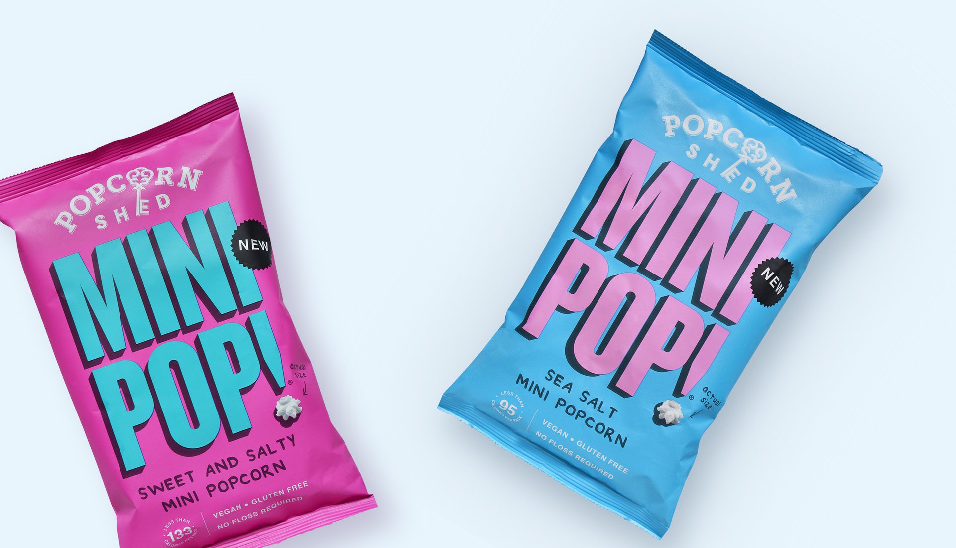
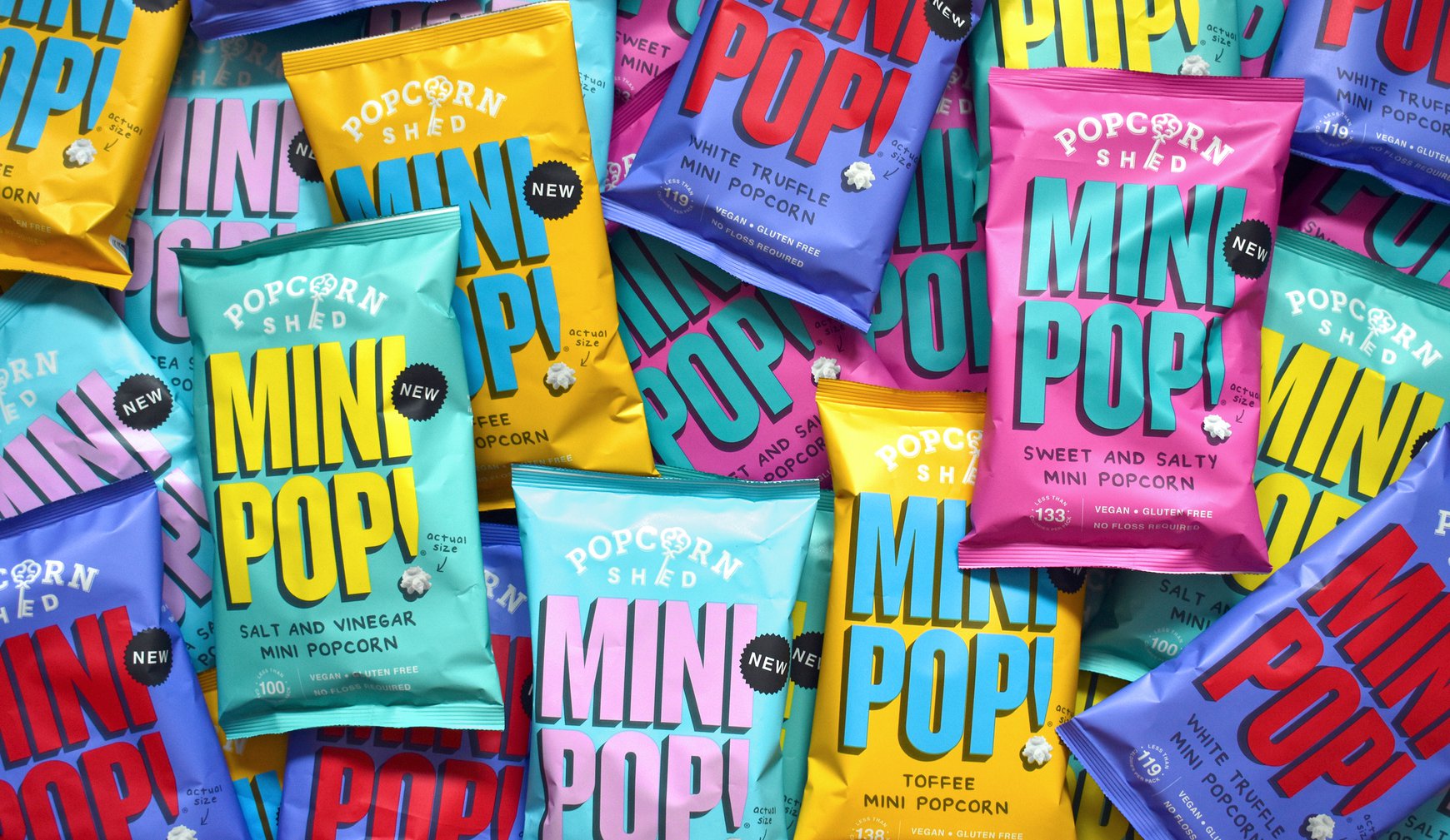
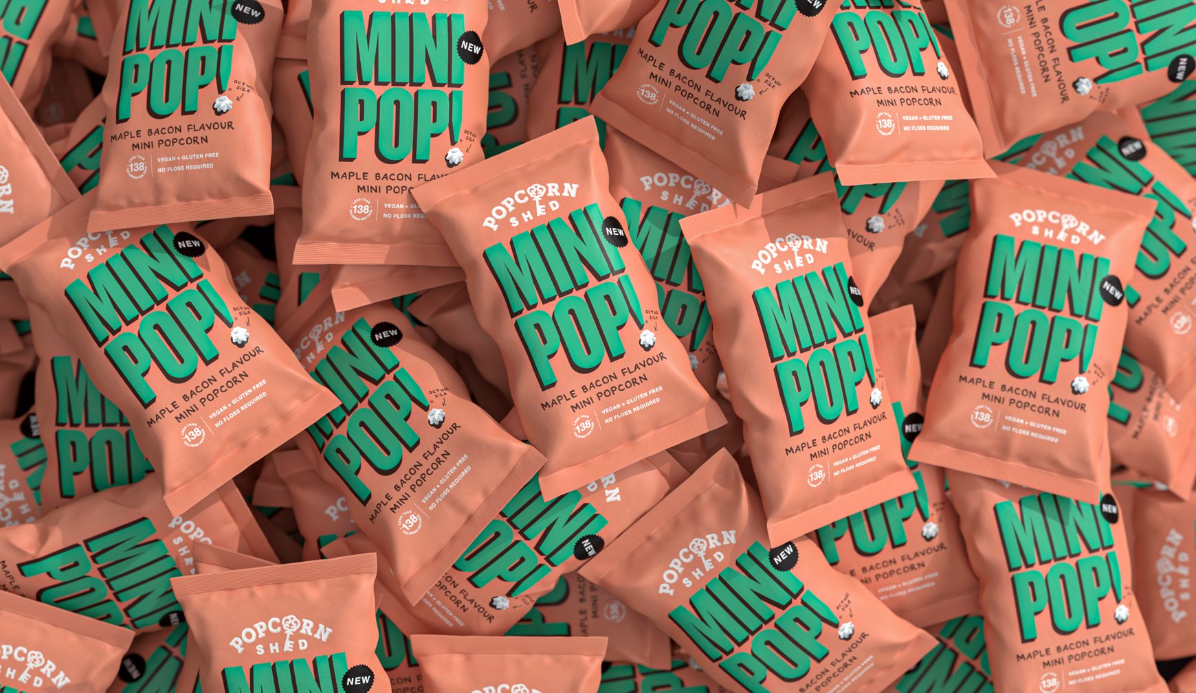
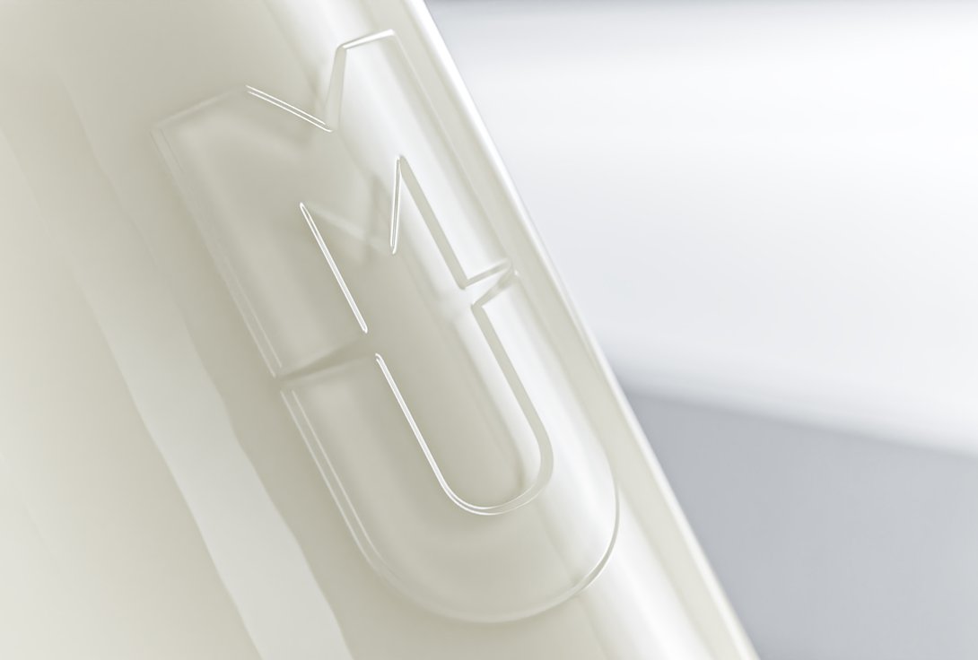
We started with a simple truth: mini things can be mighty. From there, MINIPOP! was born (yes, the exclamation mark is essential – small things need to shout LOUDER!). We created packaging that's anything but small, with pop-art typography that owns every inch of space it gets.
The design is unapologetically bold, using vibrant colours that practically jump off the shelf. Because when you're the smallest popcorn in the snack aisle, you better have the biggest personality.
THE IMPACT
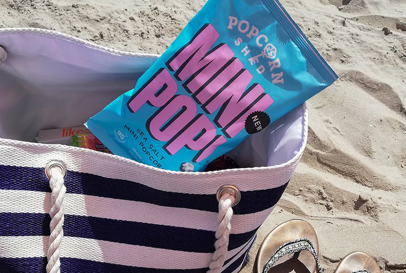
Turns out size really doesn't matter – attitude does. MINIPOP! didn't just make it onto shelves, it made it into Sainsbury's, proving that sometimes the smallest voices can make the biggest noise. These tiny kernels are now popping up everywhere (pun absolutely intended), showing that with the right brand behind you, even the littlest products can make a mighty impact.
