Three Dots
Three Dots
When quiet speaks volumes
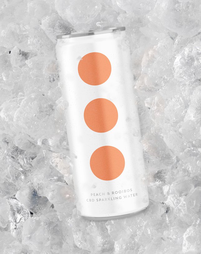
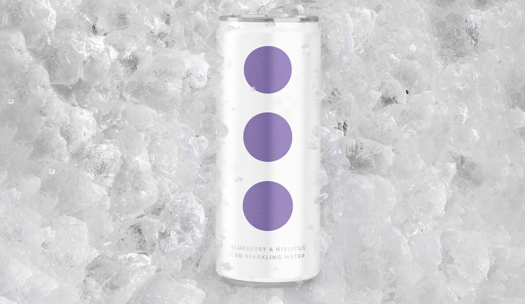
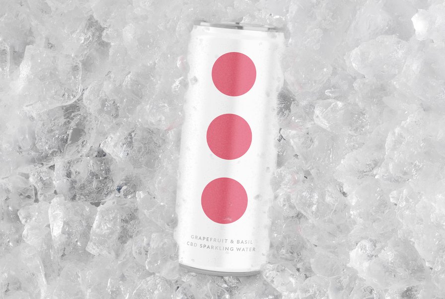
THE STORY
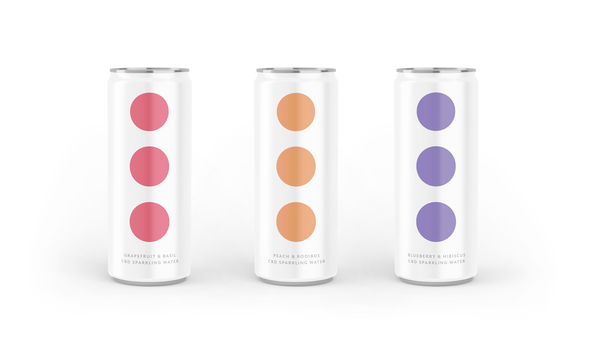
In a world where every brand seems to be shouting for attention, we explored what would happen if one just... didn't. Three Dots CBD sparkling water has an interesting mission: help stressed-out people find a moment of calm. Our response? Create packaging that's like a deep breath on a shelf.
THE CHALLENGE
How do you stand out by staying quiet? Our design exploration needed to cut through the noise by whispering, create intrigue without showing off, and make CBD drinks feel less 'wellness warrior' and more 'welcome break'. All while being bold enough to break category rules.
THE APPROACH
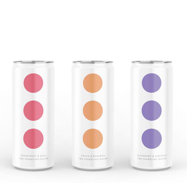
We did something a bit brave here - we left the brand name off the packaging entirely. Yep, you read that right. Instead, we let three simple dots do all the talking. It's what we call 'pull branding' - making people lean in closer rather than shouting at them from the shelf.
The whole design is an exercise in confident restraint. It's like that person at a party who doesn't need to make noise to be noticed - they're interesting precisely because they're not trying so hard.
THE IMPACT
This design concept shows what happens when you dare to turn down the volume. By challenging the category's 'look at me' approach, we created a case study for how brands might connect with overwhelmed consumers. Turns out the best way to get noticed in a noisy world might just be to whisper.
In a world where every brand seems to be shouting for attention, we explored what would happen if one just... didn't. Three Dots CBD sparkling water has an interesting mission: help stressed-out people find a moment of calm. Our response? Create packaging that's like a deep breath on a shelf.
THE CHALLENGE
How do you stand out by staying quiet? Our design exploration needed to cut through the noise by whispering, create intrigue without showing off, and make CBD drinks feel less 'wellness warrior' and more 'welcome break'. All while being bold enough to break category rules.
THE APPROACH
We did something a bit brave here - we left the brand name off the packaging entirely. Yep, you read that right. Instead, we let three simple dots do all the talking. It's what we call 'pull branding' - making people lean in closer rather than shouting at them from the shelf.
The whole design is an exercise in confident restraint. It's like that person at a party who doesn't need to make noise to be noticed - they're interesting precisely because they're not trying so hard.
THE IMPACT
This design concept shows what happens when you dare to turn down the volume. By challenging the category's 'look at me' approach, we created a case study for how brands might connect with overwhelmed consumers. Turns out the best way to get noticed in a noisy world might just be to whisper.